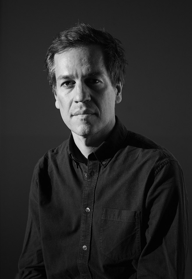
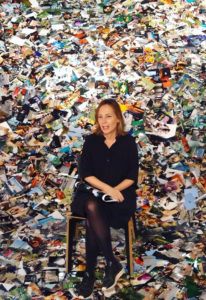
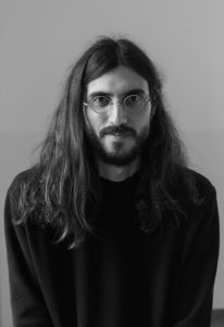
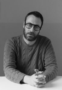
Serge Rompza is co-founder of NODE together with Anders Hofgaard, a design studio based in Berlin and Oslo.
The studio works collaboratively across various media for a diverse range of clients from individuals to institutions, focusing on print, identity, exhibition and interactive work.
Since 2010, Serge has been a guest professor at the Master’s in Editorial Design and conducts a workshop on content creation for editorial projects where the designer is as well the author.
Hi Serge, it’s so nice to see you back in Barcelona!
It’s nice to see you too!
I feel like it’s already a tradition to see you around here this time of the year.
Definitely! I’m here because of the annual workshop I teach at Elisava. I think I started doing this workshop in 2009 and never stopped since.
That’s so cool, we actually know each other from the 2011 workshop. Just so you know, this interview is not going to be about it specifically, it’s more about you and the work you do at NODE.
Ok, let’s do this!
My first question is about your origins. Have you always known you would become a designer or was there something in your upbringing that led you into this profession?
My story may sound a bit like a cliché because my mother was a Middle School teacher and my father is an artist. He does this thing called “art concret” (concrete art), which is a movement that emerged in the 1930’s.
Serge’s father is the well known german artist Sigurd Rompza. The term concrete art became famous in the 1930 “Manifesto of Concrete Art”, in which Theo Van Doesburg stated that there was “nothing more concrete or more real than a line, a colour, or a plane”. This abstract movement, that advocated for Art to free itself from reality-based representations and symbolic meanings, was later consolidated by Swiss artist Max Bill. According to Bill, the aim of concrete art was “to represent abstract thoughts in a sensuous and tangible form”.
Growing up, I was always surrounded by artists-friends who visited us, coming from countries like the Netherlands or the United Kingdom. Aside from his artistic practice, my father was also a teacher at different Art Universities, he enjoyed writing about Art and at our house we had a lot of books on the subject. He used to take me and my brother to exhibitions where we would sometimes feel a bit pressured, because he insisted in informing and supporting our experience in everything connected to the visual. I would say that at the start I had a love-hate relationship with Art, but I also had a natural interest for drawing and painting, which I had been doing it from a very young age and started taking more seriously in my teens.
Did you have any existential crisis?
I was very confused when I had to decide what I wanted to pursue. Architecture and Sciences were on the table, Art was too but my father warned me that only one out of a hundred of his art students were able to live from art professionally. Understandably, my parents wanted me to make a “safe” choice, a profession from which I could live from. I ended up enrolling at an Art Academy in Saarbrücken, where I come from, but the experience wasn’t as fulfilling as I expected. I felt it was too close to everything I already knew… the environment was a little bit closed and the teaching staff were people who had been working there their whole life, since the sixties basically. So I started looking for schools abroad, mainly in London, like Central St. Martins or the London College of Printing, and some in the United States.
Parsons University?
Yes, and CalArts on the West Coast. I received big packages from them, I got in. However, at the time I was doing an internship in Düsseldorf and two guys at an exhibition opening told me to check out a small academy in Amsterdam: Gerrit Rietveld Academie. These were pre-internet times, the end of the nineties, so the way to get more information about a school was to go there and see it for yourself. What impressed me the most when I visited Rietveld Academie for the first time was the lack of hierarchies, you could immediately and easily talk to students and teachers, who would show you their work and made you feel very welcome. This was the opposite of my experience in London, where everything was more bureaucratic: you had to apply for a permission card to enter the building and return four days later with an appointment. London was also a much more expensive option, so I was immediately impressed by the openness at Rietveld Academie and applied there.
This is where you met your partner at NODE, Anders Hofgaard.
Yes. Anders’ story is curious because he already had a successful professional life before coming to Rietveld Academie, he had his own new media studio with a couple of other people in Oslo called Virtual Garden. They were designing websites in the late nineties, he was a successful art director and making a good living from his job, but for some reason he felt the need to leave that life and go back to Art school. At Rietveld I noticed him because he was the first guy I ever saw using a flat screen, nobody had laptops at the time and he had the Palm pilot. Once, I bumped into him in front of the academy and it seemed like he was talking to himself, though in fact he was talking with his headphones connected to his phone — this was super weird, no one was used to seeing this kind of stuff! He made quite an impression on me, Anders was this tech guy who did interesting projects. One day he approached me to work on a project after school, a website. We did something very experimental, almost like an analog approach to a website. I thought to myself that what we were doing was a bit strange, but he was fun to work with and from then on we decided to make projects together.
What were the most valuable learnings during this period of your life?
I feel very lucky because my time at Rietveld coincides with a legendary group of teachers: Linda Van Deursen, Jop Van Bennekom, Experimental Jetset, Gerard Unger, Frans Oosterhof. Frans was the kind of teacher who would bring ten books to class and tell you “Look at this, it might interest you”. He usually presented us things that were unknown to us but that were somehow related to other things we liked, so he would notice that and broaden our scope of interests.
As students we were encouraged to make experimental projects and I liked the fact that we would never work on a concrete subject, like making an identity for a company. Instead, teachers would present us topics like Nothingness or Rock band and you’d have to find your own way to make a project out of that, generate content yourself.
You were taught to develop your own voice, to make let’s say more authorial work.
Yes, but that’s also because teaching at the time was more art-oriented. Design programs today have become much more specific.
After finishing my studies I was offered a job as a Junior Art Director at a design studio called Vandejong. Anders and I had decided we would start our own studio, but he was a year behind me, so we had to wait until he graduated. Vandejong was a very good experience because it was an opportunity for me to work within a studio structure of about 15 people. They gave me a lot of freedom from the beginning, they would just trust me and give me a lot of responsibility. I worked for clients like Foam, a photography museum that also publishes Foam magazine, or the Amsterdam Film museum, for which we developed a film festival identity. I had a really good time there, but I also learned that I preferred working within a smaller studio structure. At an agency, the designer doesn’t have much control over the outcome, which sometimes made me feel uncomfortable.
Then NODE Berlin Oslo started in 2003. Why did you choose to be based in these cities?
After living in Amsterdam, Anders and I wanted to go to a city that would be more raw and unexplored, where maybe we could also find a playground to try other things. Anders went to Berlin after graduating to participate in a two-month workshop with Anschlaege, who was doing some artistic interventions in big empty buildings in Hellersorf (East Berlin), along with other city-planning related projects that gathered many designers. I guess Anders fell in love with the city and when I visited him I was also convinced that Berlin could be a good place for us.
In the beginning, our “business plan” (laughs) was to be in Berlin, work for Norwegian clients and move back and forth. However things didn’t quite go as planned, for a number of reasons: flights were super expensive, it could cost you about 400 euros to go to Norway, low-cost companies only appeared three or four years later; the living cost in Berlin was super cheap in comparison to other cities, but clients also expected our prices to be much cheaper, which was annoying; and finally dealing with clients long-distance was sometimes a bit difficult. We ultimately decided to open a studio space in Oslo, so that NODE could have a real presence there.
Has the studio always been just the two of you?
There are two ways to start working professionally: by yourself or with a partner. If you start with a partner, it’s almost like a marriage situation: you’ll be sitting 12 hours a day next to each other. In our case, we were even sharing an apartment in the beginning, we’d go to parties together and then go to work together… so it was almost a 24/7 situation. It wasn’t always easy, even though we are both quite democratic and pragmatic people. At some point we started considering bringing in a third person to try to ease the pressure of working one to one. We had a partner in Berlin for about two years and around 2009, six years after the studio’s foundation, we made the move to base our studio in Oslo with three other people, who joined as partners. This change of scale and structure was something we needed to try out, but eventually we went back to our original set up of just the two of us collaborating on distance and trying to find projects that interested us.
I also know you usually have interns or younger designers in your teams.
Yes, we had interns helping us out from the beginning. Our first intern was a student from the Estonian Academy of Arts, who was recommended to us by our friend and fellow Rietveld classmate Kristjan Mändmaa. For a longer period we had a strong connection to Estonia because of Kristjan. At school he was this super cool, very smart and interesting guy who was eager to learn about the education system in the Netherlands. He ended up running the graphic design department at the Estonian Academy of Arts, where we have been invited to teach a few times. We also worked with him on a project for the identity of the city of Tallinn, which we made with Radim Peško.
Most of our interns are now designers making really interesting work. For instance, today my partner Anders is in Brussels meeting with Mads (Freund Brunse) from Or Type. He was our intern in Berlin a long time ago. I also recall people like Raquel Pinto…
Yes, Raquel is doing great work in Lisbon, she has her own studio.
…and Yassin Baggar, who later founded FATYPE.
I can send you a list with references because it’s interesting to see what these young designers are doing now. I have to say that it was super inspiring to work with these people because they came from so many different places, like Estonia, Portugal, Italy, Switzerland, Denmark… It’s cool to have these new inputs from different cultures in our studio.
Serge sent me the list as he promised, check it out:
Jasmina Begovic
Johan Elmehag
Björn Giesecke
Janis Gildein
David Gobber
Timo Hinze
Philipp Hollinger
Jihee Lee
Nell May
Maria Muuk
Louise Kelpe
Sara Risvaag
Ann-Krstin Stølan
Easton West
Lisa Pepita Weiss
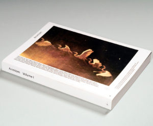
I would now like to shift the conversation a little bit to have some insight on your latest projects. You have recently redesigned the Centre for Advanced Visual Studies (CAVS). I’m very curious to know how you approached one of the most incredible archives in the world.
The Center for Advanced Visual Studies was founded in 1967 by György Kepes to bring artists from around the world to collaborate with MIT’s community of scientists and engineers. By crossing creative and scientific disciplines, CAVS has delivered revolutionary investigations that set new directions in technological approaches to interactive and human-centered projects. We owe this institution a lot of our now seemingly inherited ability to interact with screens and digital environments.
The story behind this project starts with Gediminas Urbonas, the former director of ACT — the MIT program for Art, Culture and Technology —, and his wife and also teacher at ACT, Nomeda Urbonas. They are two Lithuanian artists with whom we collaborate very often at the studio. The first time we worked together was in 2008 as part of their contribution to the Lithuanian Pavilion at the Venice Art biennial, then again when they were curators for the Lithuanian Pavilion at the 2018 Architecture Biennale, and even right now we are working on a few projects, like an online project for the Critical Zones Exhibition at ZKM in Karlsruhe. They commissioned us and Bengler (a digital consultancy from Oslo) to do this website because we think very much alike, both content and design-wise.
When we started discussing ideas, we thought it would be great to go to MIT and get to work directly with the Archive. This idea came to life in the shape of a small residency during which Anders, Bengler and I had the opportunity to debate and present the project in real time to all kinds of people, not only to those who were currently working with the archive, but also to people who had been in touch with the Centre for Advanced Visual Studies in the past. To give you a few examples, we talked to former MIT teachers from the 1960’s; Gediminas took me to the house where Otto Piene used to live (he was the director who succeeded György Kepes) and where I met his widow, Elizabeth. She gave us a tour of the house, we looked through their collection and we talked a lot about Heritage. She was also a part of the Centre of Advanced Visual Studies as a student of Piene, therefore she gave us a very personal insight of the project. It was amazing!
I feel that’s the kind of once in a lifetime experience any artist or designer wouldn’t mind living, I’m really jealous right now!
I’m thankful for the fact that the MIT staff was really helpful throughout the whole process: they’ve put us in context, brought people in, involved the students, took us to interesting places, like the MIT Museum Studio and Compton Gallery, where we met with former CAVS fellow Seth Riskin. Yet the cherry on top was when I was given permission to take an amazing collection of CAVS posters that were in a box ready to be discharged: the lack of space in the Archive room forced the staff to keep only two copies of each poster ever designed in the department, so I literally grabbed all the “leftovers” and took them with me on the plane.
Brilliant!
And how did you end up putting all the inputs you were given into a practical approach?
In order to find a link between the Archive and the website, we organised a workshop with everyone involved focused on building a cartography of the Archive. Of course we couldn’t use any of the real material to do it, but we were lucky to meet Andrew Goodman, the person who’s been in charge of digitalising the whole Archive for the past years. Because of his work, we were able to print all the digitalised work (we made it analogue again) and displayed it across a big space inside the ACT building. It took us about a day to map and structure the content, but this was a really successful task. This very physical experience, where people were thinking and interacting with the work at the same time, made it much easier to discuss things. Many of the debates that came up were totally unexpected, it was very interesting.
Once the residency was finished we started investigating MIT archive websites, only to find out that most of them were rather unattractive, difficult to browse and uninviting to explore their content. Almost like Wikipedia.
I see, not exciting at all.
Exactly. One of our main challenges was to find a way to create an interaction that would allow the user to explore the material, but also experience some serendipity moments, unexpected encounters that would lead him/her to new discoveries.
We also had to take into consideration the legacy of the CAVS and in this case Muriel Cooper’s work was a huge inspiration to the project. We stumbled upon some of her early nineties investigations where she was exploring how to structure, navigate and browse through data in a three dimensional space. There’s actually a video of her making a presentation:
Because it was impossible for her to make it interactive at the time (coding was not as advanced as it is today), this work was a prototype to how data visualisation could work in space and on screen, which was really progressive thinking. We took this idea to Bengler and after long discussions we turned it into the approach for the website.
This was translated into a spatial interaction, where we can choose to navigate along three different axes and cross our path with random artworks too.
Yes, this was partly related to this Muriel Cooper’s 1994 prototype, though it was a big challenge to code it, it was hard to adapt the desktop experience to the mobile version.
We worked mainly with two layers: a more exploratory one on the surface and a more functional one on deeper stages of the experience. The latter is entwined with the database, involves a sort of lightbox system to find references, artists’ timelines and so on. The user can choose to either just navigate the surface or actually try to find something very specific.
On this website it is visible the energy spent in finding creative ways of data visualisation. As I was exploring it, I found a timeline displaying all the collaborators from the archive, which was absolutely beautiful. What mindset do you think is needed to convey a digital environment?
The development of a digital project should always depart from its data and data structure. The main work is to structure data, then find out the possibilities of interrelations between the content, and finally define the hierarchies to be built. If you have a project with a lot of material, then this is the work that needs to be done first.
Now at NODE we are trying to redo our own website, which has been really poorly updated for the past ten years. We still upload new projects that you can see on the front-end, but at the back-end a lot of things are out of date and just don’t make much sense anymore.
On your current website you have this “showcase” concept…
Which we are trying to work against. We want to avoid the prevailing portfolio approach that consists in taking five nice photos of a project that show the best possible side of the work. We are more keen to the idea that a project may have material from five different sources: you may have mobile photos, maybe a written article, a reproduction or even an email conversation. Why don’t we show everything? Isn’t it more interesting to know a project from many perspectives?
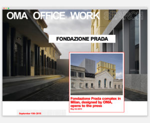
I think this concept actually links us to the work you did for OMA, am I right? You designed a website that reloads content every 30 minutes. That’s very innovative in a way too.
Maybe it is innovative for a corporate website. In contrast to the MIT website, this project aimed to represent a huge company with strong hierarchies, so it was crucial to work closely with one of OMA’s partners. Rem Koolhas has been involved in the process as well.
OMA is the Office for Metropolitan Architecture, a Dutch architectural firm founded in 1975 by world-renowned architects Rem Koolhaas and Elia Zenghelis, along with Madelon Vriesendorp and Zoe Zenghelis. Amongst their famous projects are the Seattle Central Library, Casa da Música in Oporto and the Netherlands Embassy in Berlin. Rem Koolhas is also known as a disruptive thinker, having his books Delirious New York: A Retroactive Manifesto for Manhattan(1978) and S,M,L,XL(designed by Bruce Mau in 1995), been considered true milestones in the history of Architecture.
One of the ideas we started off with was exploring the fact that people walk into OMA’s buildings all over the world, take photos and share them on social media — most people are probably tourists, but still it’s interesting to find different points of view of OMA’s work all over the internet. As a result, the homepage of OMA’s website displays and reloads content from different sources, integrated with social media, something that was quite a bold move for such a big company at the time. I must say this content is not randomly loaded because OMA wanted to have some control over what is communicated, so they have editors “curating” the content in advance. Another thing that I love about the homepage, and nobody knows this, is that you can scroll it down until the 1970’s. It’s a 400-meter long page of content related to OMA’s legacy.
In scrolling terms that’s similar to an infinite scroll.
Yes… but only until the 1970’s! Probably nobody will ever scroll until the end…
Regarding the functional aspect, the website has some built-in tools that I find very interesting: we designed a filter sensitive to concepts like “20% sports – 40% environment”; we developed a visual display of data that helps the user to, for example, visualise the amount of projects Rem Koolhas has been involved in since 1978. In this last example you can’t really find out more about the projects specifically, it’s just a graphic representation of their amount that also displays related information about the people involved.
Do you believe the success of this kind of project is directly related to the openness of the client to such innovative approaches?
Well, OMA is of course a very progressive studio, also on an academic level, so I think it feels natural for them to do things in a different way. It was time for them to have a website that reflected their company, even though they had no clue what it would visually turn into.
NODE also has a rich portfolio of publications for cultural institutions and artists. Does editorial design still represent an important part of your studio work?
It does yes. When we started the studio, our practice involved a broad range of projects. The fact that Anders had some coding knowledge allowed us to position the studio in the field of interaction design early on. Nevertheless, in the beginning we were mainly designing books and publications, whilst developing websites was a side-effect, an extension to those projects. Our reality today is quite the opposite: editorial design commissions, especially artist books, are unfortunately usually underpaid, so some of them we either refuse or decide to participate solely because of the people involved or the subject being explored. It’s occasionally a pro-bono situation that reveals our love for the analogue. There’s something about designing a book that is very appealing.
It’s romantic.
Yes, there’s a certain romanticism related to working with paper, printers, materiality, structure, sequence etc. Books are objects that have a long life-span, many years hopefully, as opposed to screen-based projects that can become outdated in less than two years.
I have friends who are very experienced book designers and I feel that, despite having a lot of experience, I know very little compared to them because this really is a singular practice, a field for experts. I could name Florian Lamm (from Lamm & Kirch studio) with whom we share the studio space, the swiss designer Dan Solbach or Pascal Storz, who designs many books for the publisher Spector books. These are amazing book designers, I really look up to them.
Now we are doing a book for the Lithuanian pavilion about the idea of a “swamp”, but not in a literal sense, it’s more about the systems and networks of a swamp and also about issues related to borders, which was the theme suggested by the Venice Biennale. Inevitably, the designer engages with these subjects and enjoys the challenge of thinking up all the possible ways to visually translate that content into a book format.
The content is what determines the experience.
Completely! There’s another book we did with the Finnish artist Jenna Sutela about an exhibition she had at Kunsthall Trondheim. Her work explores artificial intelligence and the relationship between randomness and control in organic and inorganic systems. I know this sounds complex, but she conveyed this idea beautifully with Lava lamps: she used the bubbles inside the lamp to encrypt data. There’s also another dimension to her work that has to do with materiality and the way we can transform screen-based things into printed matter.
So it’s a process in reverse?
Yes. We are also working on other so-called “conservative” editorial projects. We have been designing a photography catalogue for the Deutsche Bank Art Collection. In this case you can’t be as playful as in an artist book, but you can test how far you can take the design and focus on production details. Book printers usually say that printing is an organic process, and so is the process of designing the book: you can try out ideas, but these can go wrong sometimes. In editorial design you have to be willing to accept failure.
I also have this theory that designers who depart from editorial design develop an array of tools to approach different disciplines, from copywriting, to content structure, typography, printmaking, art direction. Do you agree?
I always tell this story to students: the first design conference I ever went to was in Leipzig in the nineties. It was called Forum Typographie. They always chose a Typography term to name the conferences, like spatium, the space between the letters in led printing. When I went to this conference as a young student there were about twelve talks and none was from a person within the design field. There was a biologist, a sociologist, a politician, a scientist, and they all talked about spatium as a concept. This was to me a true revelation, because to me design was related to form and I had never thought a designer could collaborate with a biologist as part of a joint research. I think editorial designers have to make the most out of the possibility to collaborate with people from other fields because a lot can be discovered within these encounters, new exciting things can come to fruition.
Since you’ve mentioned typography, I noticed that NODE often collaborates with typographers in both print and digital contexts. Can you explain a little bit more about this relationship?
Sure. For starters, typography may be a tool for designers, but it is also a medium charged with meaning: it’s almost impossible to separate History and Culture from a typeface design. There’s actually a typeface called Neutral, designed by Kai Bernau, that tries to erase connotations and style associations from a typeface design. It’s an exercise that raises many questions because, even if it is extremely well executed, is it ever really neutral? Maybe we could argue that the idea of neutrality is linked to Modernism, therefore still associated with a style… it’s an endless and complex discussion.
When we collaborate with typographers we try to open the projects to new possibilities: “What fits this project from a historic perspective? How can we work against certain expectations?”…
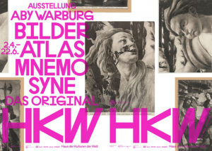
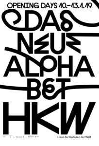
A good example is the identity we designed for Haus der Kulturen der Welt (HKW). We wanted the communication to have “disturbing” letters, something that made people doubt if it looked good or bad, because it linked well to HKW’s mission as an institution that questions the world.
Some of their initiatives include the Anthropocene project, a series of contemporary debates on humankind and the planet; and now they are developing The New Alphabet, a project about code infiltrating humanity, an investigation on the relationship of algorithms (the binary code) to the alphabets of today. We commissioned Radim Peško and Karl Nawrot the design of a custom version of Lÿno, typeface that required the elimination of some characters too strongly connected to runic letters and Nazi typography.
Even though we had initially developed a more image-base communication, with time the typography became protagonist, not only because it was visually stronger and bonded well with the content, but also because part of our work was to try to make this communication stand out in the city.
I also recall the Field Notes project.
That is a completely typography-based project. Field Notes is a Berlin guide to contemporary music and the typeface in use is Galapagos, designed by our old friend Felix Weigand and distributed by Dinamo. It’s a modular typeface built from different letters that we can break apart and rearrange as we please, something that fit perfectly our plan to create an identity that could be “played”, just like a musician plays his music. Besides, a destroyed image is easily associated with contemporary music, a concept we stretched as much as we could throughout the different print and digital communication pieces. Finally, we were also convinced by the fact that the overall language we were developing wasn’t a typical “go to” choice in projects of the same nature.
Aside from your work practice, you also do a lot of workshops and lectures around the world. You are in very close contact with new generations of designers globally. When I attended your workshop in Elisava back in 2011, I remember being very surprised over the amount of essays and articles you shared with us on the first session, subjects I still return to today, and which at the time were very helpful to inform the practical assignment you gave us. Do you prefer an “academic” or a “hands-on” approach to design education?
It’s a complex question because there are different aspects to take into consideration.
The fact that I’ve been doing this for so long, since 2004, has given me the opportunity to be in touch with many different Education systems. It’s not the same to teach in Germany, Norway or Spain, and even within the same country different schools adopt different methodologies.
I’m very committed to never present the same workshop concept twice. Firstly, I think it’s important to focus on the “now”, many concepts I explored in the past may be irrelevant or geographically misplaced; secondly, I must adapt to the school system, the cultural background of the students in the room, the curriculum and the overall level of the class; and lastly, I must keep challenging myself.
I always start my workshops with theory because I have the feeling that most students see reading as a limitation, they show some resistance to it. However, reading is something a teacher can cultivate, it all comes down to finding ways to engage younger generations with content that takes longer to assimilate. AIGA Eye on Design is doing a great job in that department, presenting texts about design that are approachable while addressing super interesting subjects, it’s amazing really. I believe its success comes from their ability to present the content in a cool way and entirely online, it’s not a book or a magazine students need to buy.
I also like to share Are.na lists before starting a workshop, but I never force anyone to read the texts. I just tell them “You don’t have to read this now, you can read it in five years, but here you have a good source of references”.
Are.na is a platform that allows you to collect articles online, store documents, etc.
It’s like an index for life.
But to answer your question, I don’t think there’s the perfect approach to design education, it’s definitely in between academia and practice, but I do think we must prepare people to enter a world where design is connected to many different disciplines and subjects. I think that a Creative Writing discipline could be fun and useful in a Design MA program, you know? There are also certain themes that are making a comeback to the general discussion, like social design, political design…
Democracy, feminism…
Exactly, and Education cannot ignore them. Even now, here in Barcelona, I went with the students to the exhibition Victor Papanek: Design for the real world, which is basically about Social design. I also usually mention the book by Ruben Pater, The Politics of Design. Everything we are doing as designers can have an impact in society.
What advice would you give a design student?
Just be aware of what’s going on, ask yourself what can be changed and make up your own mind, don’t let the way things are influence the way you think they should be.
I think this is really great advice for whoever is reading this!
The issue of influence is tricky right? I see the Swiss International Style all over instagram, a style that derives from Modernism. A lot of people are easily influenced by the things they are looking at on their screen, but I wonder what would happen if they raised the gaze to the street and let vernacular culture influence them; or if someone is from Colombia or Korea, why not take as reference their crafts culture and history? Why don’t we drink from the visual culture around us to feel inspired?
It’s curious that this theme has come up in every single interview I’ve done so far.
There are designers doing really original work. It comes to my mind Vier5 from Paris, who are doing this sort of self-made type design; or Fraser Muggeridge from London, who’s been doing printing experiments for many years and developed a very personal design style; other people are opening new paths in niche subjects, like The Rodina in Performative design, a field not many people have heard about. These are good examples on how the pursuit of an idea can take you down an interesting path.
There’s also work by designers from older generations that are now a bit forgotten, most students haven’t heard of them. I’m talking about Robin Kinross or Ken Garland… but the good thing is that anyone can read the books they wrote or find their work on the internet, they’ll continue to be relevant throughout time.
I’d like to finish this interview by asking you your opinion about the future of our profession. New fields are starting to gain real importance, like Artificial Intelligence, and even though the human being has this amazing capacity to learn and adapt, isn’t it inevitable that designers feel overwhelmed by the speed of change, as well as by the challenges these fields bring to the way we communicate?
Good question… I think it’s both a challenge and an opportunity. I’ve learned from my work with students that it’s always interesting to ask them to apply their design skills in new contexts. If a designer is interested in a certain topic, he must find out how to get to work with the people who are busy making great work in that field, or which university offers a good AI program, or an interesting Research program. Another way to approach it is by exploring the boundaries of design and finding out how other disciplines, let’s say an endeavour like Forensic Architecture, need and make use of design. Not many students are aware of this, but the role of the designer can be key on research setups, where their job is mainly to analyse content, but still, working with content at its core. Designers strive in teams of scientists, technology developers, sound engineers etc. I think the new panorama presents the opportunity for an amazing development in our discipline.
If you look at it from a commercial perspective, the Köln International School of Design (KISD) came up with the term “Service Design” and it approaches the role of the designer as a consultant in the framework of a company. The importance of a service designer in a team has to do with his/her capacity to properly organise a structure, apply design methodology and be involved in many different processes, always as a part of a team. Because, honestly, how much can we achieve on our own? This question challenges many designers to become team players. But just look at the work Rob Giampietro did at Google, where he was the Creative Lead at the Research and Machine intelligence team.
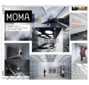
Rob Giampietro is the former principal of design studio Project Projects and former design director at MoMA. I googled him and found out that at Google he was involved in projects like the Google Design website, the Google Fonts directory, the visual update of Google’s do-it-yourself AI kits, among other innovative human-centered and strategy-driven design projects.
So this is all very interesting development. Of course the other path a designer can follow is theory, research or even fine arts. We’ve mentioned in this conversation the MIT ACT program, where artists are linking these kinds of topics to their projects.
It’s interesting to see how so many revolutionary designers throughout History come from a context similar to your description, where boundaries are crossed.
I think it’s not a coincidence, it’s through these collaborations that unexpected things happen and we evolve!
And on this note I think we can end this conversation. Thank you so much Serge!
The lockdown in Spain is now starting to relax. As I finish editing this interview I can’t avoid feeling hopeful. This is definitely one of the most challenging events for Humankind in this century, but as Serge mentioned many times, there are few things in life more powerful than people working together and learning from each other.