Events are an integral part of the master programs: from workshops with guests professors to lectures series with relevant practitioners.
past events
Wed, May 27, 2026
Masters’ Talks
7.30 pm — Event at DHub
Open to the public

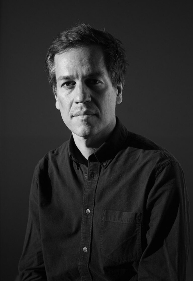
Jonas Janke, b+
Love me one time, two times … x times !
Love me one time, two times … x times !
The lecture is not a conventional showcase of selected projects from our daily practice, but rather aims to provide a broader insight into the network of actors in which b+ (bplus.xyz) operates, how we understand the contemporary way of an architectural practice and scope of work of an architect, and how we approach our projects—in short: who b+ is and how we work, what our values are, and what our understanding of our duties and responsibilities as architects is.
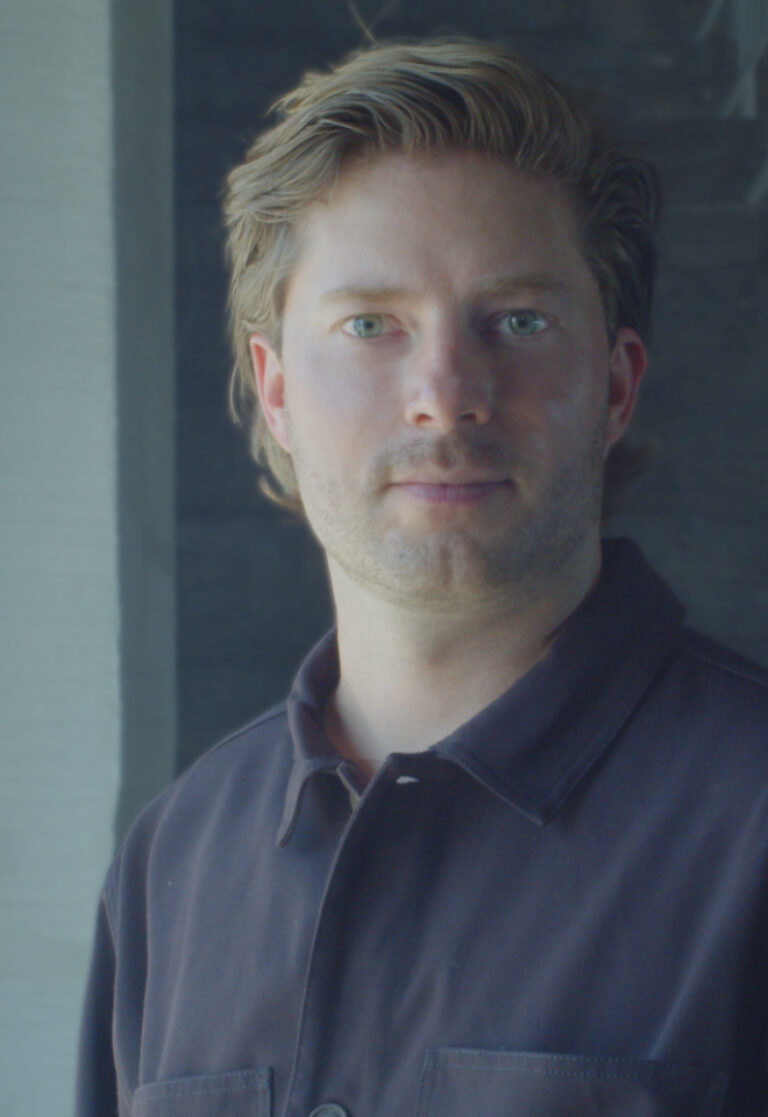
Jonas Janke (DE, 1991) is an architect and partner at bplus.xyz (Berlin). He has a diverse background in architecture, was trained as an architectural draughtsman before pursuing his studies in Hamburg, Stockholm, and Berlin. He gained valuable experience as a tutor and assistant in various departments including design & typologies, building construction, and structural design. He was part of the team 2038, the German Pavilion at 17th Venice Architecture Biennale 2021.
His early teaching experiences include guest studios at the University of Innsbruck (Austria) and Politecnico di Milano (Italy). He is regularly invited to give lectures and guest critiques at universities, cultural institutions, and public institutions. His focus is on new ecological construction materials and methods for adaptive reuse and renovation projects, seeking pragmatic and efficient technical and mechanical solutions that use material and construction thoughtfully.
bplus.xyz (b+) is a collaborative architecture practice (led by Arno Brandlhuber, Olaf Grawert, Jonas Janke and Roberta Jurčić) that operates at the intersection of theory and practice, using different media and formats. The practice seeks to engage with the contemporary challenges of our time, particularly those related to the social-ecological transformation of existing buildings, offering economically viable solutions.
b+ understands architecture as an open process, and views buildings as part of larger systems that require a systemic approach. The practice sees the given framework of existing buildings and legislation as an active design tool with the potential for transformation. Thus, b+ celebrates the potential of the existing built environment and aims to reveal and activate the latent potentials within.
b+ emphasizes working with different actors and stakeholders in project development. The practice values their knowledge and expertise and aims to create spaces for exchange and collaboration. b+ seeks to advance a new value system in architecture, one that places greater emphasis on collective responsibility, systemic thinking, and ecologically and economically viable solutions.
The current project in the field of political activism is the European citizens’ initiative HouseEurope! – HouseEurope! wants to create incentives that make renovation the new norm. This will boost the renovation market and give new value to what is already there. The goal is to preserve homes and communities, ensure a fairer and more local building industry, save energy and resources, and preserve our memories and stories.


Wed, May 20, 2026
Masterclass

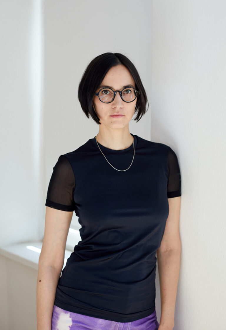
Jordi Queralt, Queralt Suau
375
Only for MVD students
375
sequence, concept, order, change, materiality, transformation, discovery, play… through projects that connect with one another and within diverse contexts, we will explore the processes that lead to materializing one idea, or many, and how everything forms part of the same whole.
Jordi Queralt Suau is an architect also trained in Fine Arts whose practice focuses on constructing narratives through space. He understands each project as an opportunity for research, a process in which an idea transforms into a story capable of taking physical form and becoming a space or device that communicates. Through his studio, Queralt Suau, his practice becomes an exercise in craftsmanship where technical rigor, material sensitivity, and conceptual strength converge, turning every project into a powerful and singular narrative experience.
Queralt Suau is a studio developing architectural projects linked to the performing arts, ephemeral installations, exhibition design, and singular play spaces within the city.
Throughout its trajectory, the studio has collaborated with institutions such as the Barcelona Centre for Contemporary Culture, the ”la Caixa” Foundation, the Natural Sciences Museum, Mercat de les Flors, and Teatre Lliure. Its work has also materialized in installations across various cities and international events, including Milan Design Week’s Fuorisalone, as well as in the creation of unique play elements integrated into different spaces in Barcelona.


May 4 — 8, 2026
Workshop

Jon Uriarte
Photobook
Only for MED students
The photobook is one of the most relevant mediums in contemporary photography practice. Photobook making is a creative process involving the sequencing and circulation of images that increases its potential when developed in collaboration between different agents, especially between photographers and editorial designers. In the photobook workshop we encourage this collaborative approach by putting both parties in direct contact. Students will have the opportunity to work with actual photographic series, develop editorial design proposals, present them to the photographers and get feedback from them.
Students are introduced to photobook world and in order to understand the role of an artistic director when it comes to producing it. They will also gain experience in the creation of visual narratives through the sequencing of images. At the end of the workshop, the students will present their proposals to the photographers, explaining the design process of their books, the format and the materials of the publication, all of which is approached as a collaborative work with their fellow master’s degree students.
Jon Uriarte studied photography at the Institut d’Estudis Fotogràfics de Catalunya and at the International Center of Photography in New York, as well as a master’s degree in Artistic Projects and Theories from PhotoEspaña and the Universidad Europea de Madrid. He has exhibited in various art centers and galleries, both in collective and individual shows, among which are La Casa Encendida in Madrid, the Koldo Mitxelena in Donostia, Studio 304 in New York, the HBC center in Berlin and the Sala d’Art Jove in Barcelona. He was the founder of Widephoto, an independent platform dedicated to curating and activities around contemporary photography. In addition, he conceptualized and coordinated for 3 years DONE, the project on reflection and visual creation promoted by Foto Colectania. He currently lives in San Sebastián, from where he combines the curatorship of The Photographers’ Gallery digital programs with the curatorship of the Getxophoto International Image Festival.


Apr 27 — 30, 2026
Workshop
Jorge León & Mikel Romero, León Romero
Logographic Systems: An exploration of the script
Only for MVD students
Cuneiform writing is one of the earliest writing systems that includes logographic elements known to us; it developed in ancient Mesopotamia with the Sumerian, Akkadian, Assyrian, and Babylonian civilizations. Since then to the present day, these writing systems have endured (Mandarin Chinese), and have coexisted with other systems such as syllabic (Japanese Kana), alphabetic (Greek alphabet), and linear (Korean Hangul). Currently, in the digital age, with globalization and the increasing use of languages with alphabetic systems (English, Spanish), languages that use logographic models have not expanded and are solely valued in their respective cultures, thus preserving historical values and cultural identity deeply rooted in society.
A logographic writing system is a type of writing system in which each symbol or logogram represents a whole word or a significant concept. In this workshop, we will create a new writing system that is directly linked to the human experience based on a series of concepts. To do this, we will appropriate the cultural, visual, historical… references from different existing ethnic tribes that will give us a starting point from which students can develop the exercise. We aim to raise awareness of the cultural value of writing itself, exploring conceptual and formal boundaries, paving the way for experimentation and research.
LEÓN ROMERO is a Barcelona-based visual communication studio founded by Jorge León and Mikel Romero. The studio takes a collaborative approach to creative direction and graphic design to produce bold, functional solutions for culture and commerce.
Driven by typographic design, LEÓN ROMERO provides an array of services including visual identity, graphic campaigns, editorial and web design, packaging, and art direction. The studio maintains a strong relationship with a vibrant network of photographers, illustrators, editors and copywriters to deliver projects both large and small.


Wed, Apr 29, 2026
Masters’ Talks
7.30 pm — Event at DHub
Open to the public

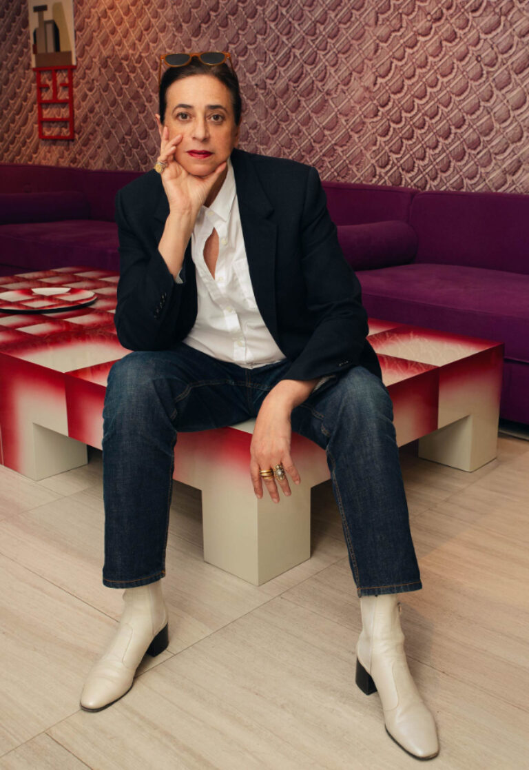
India Mahdavi
Typologies of Intuition, a conversation with Omar Sosa
Typologies of Intuition, a conversation with Omar Sosa
India Mahdavi presents a conversation exploring a practice shaped by an attentive reading of place and experience. From the vernacular minimalism of Siwa to her reinterpretation of Villa Medici, her work reflects an ongoing dialogue between past and present, where each project emerges from its context. Intuition guides this process as a flexible, human way of thinking beyond fixed rules. In Paris, this approach extends into an ecosystem of spaces that brings the studio into the street, fostering exchange, accessibility, and new forms of engagement with a wider creative community.
India Mahdavi
Color defines her work. Ornament is her language. Form is her grammar.
India Mahdavi creates environments that live, breathe, and delight —spaces in constant metamorphosis, shaped by light, mood, and memory. Based in Paris, and of Iranian and Egyptian heritage, raised across continents, she embodies a polyglot and polychrome sensibility: a synthesis of cultures and histories distilled into spaces, objects, and experiences that leave a lasting impression on the senses. Her practice spans interiors, furniture, scenography, and exhibitions, combining rigor and joy. From the Bishop stool to Sketch in London and Bar Nina in Milan, each project engages with its context and culture.
© Laura Friedli
Studio India Mahdavi is a Paris-based multidisciplinary practice working across interiors, furniture, exhibitions, and scenography. Small, nimble, and collaborative, the studio brings together architects, designers, and artisans in constant dialogue. Its ecosystem —showrooms, Project Room, and Petits Objets— acts as a laboratory for ideas and experimentation. Each project engages with its context, culture, and moment, developing environments that are sensorial, expressive, and alive. Through collaborations with leading makers, the studio extends its vision across disciplines, creating spaces and objects that spark joy and shared experience.


Tue, Apr 21, 2026
Showcase

Marc Castellví, Abuela
Getting by with little
Only for MVD students
In this showcase I will review different projects and experiences that have to do with things that make us happy at the studio. Usually related with creating and thinking with as fewer ingredients as posible. Also about rethinking why are we doing what we do and regenrating the motivation about our profession.
Marc Castellví (Barcelona, 1989) is a motion designer and director. He has co-founded projects such as No Más de Mamá (2012), Outro Studio (2014), and Abuela (2020-present). At Abuela, he specializes in visual narratives, helping clients shape their stories, define a unique visual language, and explore new production languages and formats.
Abuela is a Barcelona-based studio formed by creative directors Kevin Sabariego & Marc Castellví.
Specializing in visual narratives, we help our clients write down their story, create a unique visual language and produce it by any means.
We welcome projects with a flexible, versatile and open-minded approach.
Nobody will talk about you like your Abuela.
Wed, Apr 8, 2026
Graphic — Elisava lectures
7.30 pm — Sala Aleix Carrió
Open to the public

Bart de Baets
Paperclips
Paperclips
In his lecture, graphic designer Bart de Baets will show a large variety of works and elaborate more on the ways they find their form and are realized eventually. Although Bart’s practice is mostly spent working at the studio in Amsterdam, it is alternated by a parttime teaching position at the Royal Academy in The Hague, where he works with the first year students and the ones graduating. The way he teaches and cooks up his assignments is inspired by transforming everyday observations (at times obsessions) into educational exercises. The students are triggered to think of formal executions that evoke solutions close to Bart’s own practice visualizing abilities and editorial voice.
Although appearing less frequently today, Bart’s body of work’s been known to feature self initiated publications, such as Success and Uncertainty (together with Sandra Kassenaar), Dark and Stormy (together with Rustan Söderling), and Tabrat, a zine from 2022 in which de Baets confesses to be a tab hoarder (phone only, the browser tabs on his laptop are opened briefly and closed again efficiently) and shares them here with us in the charming A4-sized publication. His editorial assets have not been forlorn, and are frequently demonstrated more so in his collaborative works for artbook shop Page Not Found and exhibition space Nest (both are located in the city of The Hague). The talk at Elisava will prominently feature all of these works—and more—and provide insights into the developments of these designs by showing sketches, references and many inspirations.

Graphic designer Bart de Baets (1979, Knokke, BE) is based in Amsterdam. His design for the Sandberg Institute’s temporary master programme The Radical Cut Up was nominated for a Dutch Design Award. As a result, PostNL commissioned De Baets to design a series of stamps titled ‘Talk to the Hand’. With Sandra Kassenaar he designed the exhibition, campaign and catalogue for ‘Circulate’, an exhibition on photographic art acquisitions at the Stedelijk Museum Amsterdam. The two also design the graphic identity of Kunstmuseum Bochum. He designed ‘On the Necessity of Gardening: An ABC of Art, Botany and Cultivation’ (2021), which was published parallel to ‘The Botanical Revolution’, an exhibition at the Centraal Museum, Utrecht. That year, the Stiftung Buchkunst awarded the book with the highest prize in the category Best Book Design from all over the World. A second title in that series, Mothering Myths, an ABC of Art, Birth and Care was released in May of 2025, for which he collaborated once again with editors Laurie Cluitmans and Heske ten Cate. He holds a part-time teaching position at the Graphic Design department of the Royal Academy of Art in The Hague, and he has taught at the Gerrit Rietveld Academie in Amsterdam for fifteen years.
Being educated by notorious wild collaborator Will Holder, the radical typographic thinkers of Experimental Jetset and conceptual makers like Linda van Deursen, triggered Bart de Baets to think like an editor early in his graphic design studies, making zines with and for his peers, or whipping up catchy writings to go with his posters and projects. His design skills were fed ferociously when working with Maureen Mooren and Daniel van der Velden (now Metahaven) whose interest in art inspired him. For them, that always seemed to come first, then design. For the pages of Archis (an architecture magazine–now Volume), the layouts of existing periodical publications were used to give form to the magazine’s content, and Bart was taught to study their characteristics and so became an excellent copycat.
Over the years de Baets’ body of work has developed immensely mostly so by certain significant collaborations. A few early memorable ones have been those with Melanie Bonajo and Frank Koolen, two (then) Amsterdam-based artists not much older than himself and whose practice inspired an idea on which to work together, and which, in a way, kicked off de Baets’ career. The likes of Rustan Söderling and Sandra Kassenaar are of similar influence and remain crucial design partners; both are good friends to this day. Their influence on some self initiated works, such as Dark and Stormy and Success and Uncertainty is essential for de Baets’ current design approach and visual language. Kassenaar and de Baets nowadays share a studio and work together as designers regularly.
His designs are rooted heavily in a kind of conceptual thinking, and his abilities to think along editorially with commissioners has given Bart’s body of work an outspoken character. His work is distinctively playful and seemingly intuitive, giving the impression that the designs could be made quickly or hand-made. Yet, each one of the designs is a carefully put-together composition made according to a bunch of guidelines and often uses typography or visuals referencing things “found” on the street. For years Bart’s been a teacher in graphic design often working with the first year students, introducing them to the job. Surrounded by other designers, skilled coders, letter drawers and colour wizards, his teaching encourages to explore what it’s like to make art and design in today’s environments by demonstrating personal fascinations.


Apr 23 — 27, 2026
Workshop

Serge Rompza, NODE Berlin Oslo
Beyond the Canon: Alternative Histories of Graphic Design
Only for MED students
Beyond the Canon: Alternative Histories of Graphic Design
Design history is not fixed — it is shaped by visibility, selection, and repetition.
This workshop revisits the canon of graphic design from a global perspective, focusing on historically relevant yet often underrepresented designers.
Each student will research and portray one designer, situating their work within its cultural, political, and technological context. Rather than simply presenting biographical information, participants will critically interpret and visually reframe these positions through editorial and typographic design.
The resulting works should not only communicate information but also respond visually to the designer’s attitude, working methods, and conceptual approach.
After graduating from Gerrit Rietveld Academie in Amsterdam, Serge Rompza has co-founded the Berlin and Oslo based design studio NODE in 2003, together with Anders Hofgaard. The two offices collaboratively focus on identity, print, exhibition and interactive work. Clients include Haus der Kulturen der Welt Berlin, Vitra, MIT Program in Art, Culture and Technology (ACT), Lithuanian Pavilion / La Biennale di Venezia, Office for Metropolitan Architecture (OMA).
Since 2004, he has regularly been teaching at art and design academies across Europe.


Feb 23 — 27, 2026
Workshop

Piero Di Biase, Formula Type
Modular approaches in Type Design: Resource or Restriction?
Only for MVD students
Modular approaches in Type Design: Resource or Restriction?
The workshop explores the possibilities that the module offers in structuring typographic forms, questioning whether it acts as a supportive framework or a creative constraint. Through the analysis of historical and contemporary modular typefaces, as well as the investigation of the module in art, design, and architecture, students will be guided to work within a modular system to design a display typeface. The aim is to understand how predefined structures can generate coherent visual languages while still allowing room for experimentation and expressive innovation.

© Andrea Arduini
Piero Di Biase is a graphic and type designer. He trained in the graphic arts sector and then became a graphic designer. After collaborating with various design agencies, in 2011 he co–founded Think Work Observe, where he worked for national and international clients until 2022, when he launched Formula Type, an independent digital foundry that produces and distributes retail and custom fonts. Since 2017, he has been a member of the Alliance Graphique Internationale (AGI).
Formula Type is a digital type foundry started in the wettest region in Italy. Formula is a potion blended especially for those who will drink it; Formula is a chemical equation that leads to a result. This playful yet precise idea captures the dual soul of Formula Type. Its past was graphic design, and its present is type design, but there’s no real separation between the past and the present. Our fonts are crafted with a flexible designer eye and in the fifteen years since our first releases they have evolved freely through experimentation. Our approach is that of expert beginners, always welcoming new partnerships and projects.


Wed, Mar 25, 2026
Graphic — Elisava lectures
7.30 pm — Sala Aleix Carrió
Open to the public

Ann Richter, Studio Pandan
BTS: Design Twists
BTS: Design Twists
From the visual identity of the art walk Balade to Mining Photography, glitches, edited magazine covers, and typographic climate crises, we navigate Studio Pandan’s project map. We look beyond final outcomes to the many paths that lead there. Design, for us, is a collaborative practice—within the studio and in close exchange with clients from art, literature, and architecture. Sometimes the first idea holds, but more often the work unfolds through a winding, transformative journey. Together, we’ll follow the twists and turns of this process.
Ann Richter studied visual communication at the State Academy of Fine Arts in Stuttgart and graphic design at the Academy of Fine Arts Leipzig. Before co-founding Studio Pandan, she worked at international design agencies including Graphic Thought Facility in London and Project Projects in New York City. As a co-founder of the collective A.R. practice, she develops projects at the intersection of design and curatorial work. Alongside running the studio, she regularly lectures and leads workshops at art and design institutions.
© Robert Hamacher
Studio Pandan, founded by Pia Christmann and Ann Richter, is a Berlin-based design studio with a strong eye for detail and an imaginative outlook. We create visual identities across print and digital media, as well as publications and websites, shaped by careful research, playful sensitivity, and conceptual clarity. Since our beginnings in 2015, typography has been our core tool. Actively engaged in contemporary culture, we are especially interested in socially relevant and sustainable projects, seeing design as both a responsibility and a catalyst for change.


Wed, Mar 18, 2026
Masters’ Talks
7.30 pm — Event at DHub
Open to the public

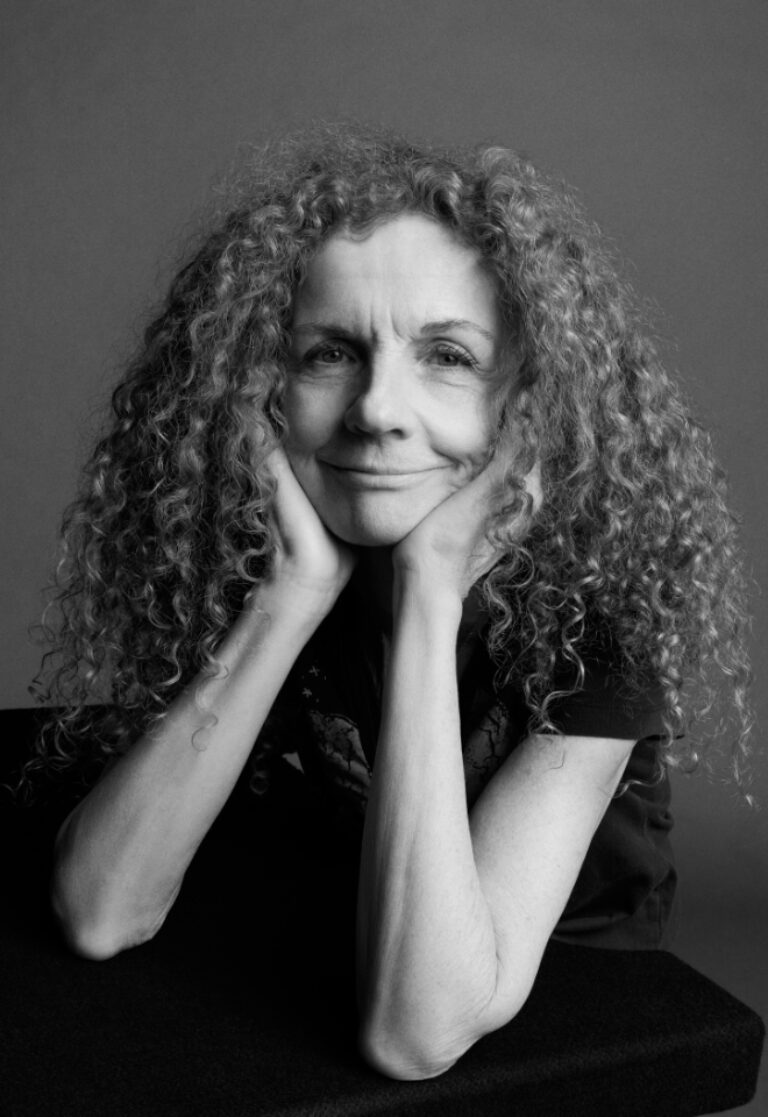
Kathy Ryan
Backstories
Backstories
Kathy Ryan will choose a handful of photographs that stand out in her mind from the pages of The New York Times Magazine during the 39 years she worked there. She will share the backstory for each picture to give insight into how that image came into being. The photographs will cover a wide range of subject matter including international news, lifestyle stories, and culture coverage.
© Inez and Vinoodh
Ryan will also show and talk about some of the photographs from her Office Romance series that she made during the last decade she worked at The NYTMAG. They are a love poem to her colleagues and a celebration of the radiant light in the Renzo Piano-designed New York Times building.
The longtime director of photography at The New York Times Magazine, Kathy Ryan has been a pioneer of combining fine art photography with photojournalism. She has worked with the world’s best photographers across all genres of photography. She regularly brought new talent into The Magazine’s pages. She left The Times after 39 years to focus on her own artwork, curating exhibitions, teaching a course at Yale, and speaking engagements.
In 2011, Ryan edited The New York Times Magazine Photographs, a landmark book published by Aperture. An accompanying exhibition, curated by Ryan and Lesley Martin opened at the Rencontres d’Arles in 2012, traveled to FOAM Museum in Amsterdam, Palau Robert in Barcelona, Universidad Católica in Santiago and ended its run at the Aperture Gallery in New York City.
Ryan has contributed essays and Q&A’s to books by photographers Lee Friedlander, Christopher Payne, Seydou Keïta, Paolo Pellegrin, Lynsey Addario, Jack Davison and Brian Finke. She was the picture editor of Feeling the Spirit by Chester Higgins.
The Magazine‘s photography and videos have been recognized with numerous awards. Ryan was awarded the Dr. Erich Salomon Prize from the German Photographic Society in September 2025. Ryan was a recipient of a lifetime achievement award from the Griffin Museum of Photography in 2007; the Royal Photographic Society’s annual award for Outstanding Service to Photography in 2012; the Vision Award at the Center for Photography at Woodstock in 2014; and the Outstanding Contribution to Photography recognition from Creative Review in 2016. Ryan has been recognized as Photo Editor of the Year by the Lucie Awards and Visa Pour l’Image. Ryan won two Emmy’s for videos she produced for The New York Times Magazine’s Great Performers series. Kathy was the International Center of Photography’s Spotlight honoree in 2024.
Office Romance, a book of Ryan’s photographs featuring her colleagues and the beauty and poetry to be found in the radiant light in the New York Times building was published by Aperture in 2014. This work has been exhibited in Europe and the U.S. All of Ryan’s photography is done with the iPhone.


Wed, Mar 18, 2026
Bookworm

Three Contemporary Magazines, 2
Only for MED students
From the perspective of contemporary editorial design, MacGuffin, Science of the Secondary, and Apartamento propose three ways of understanding the magazine as a narrative device and cultural artifact. MacGuffin constructs each issue around an everyday object, developing a constantly evolving visual identity. Similarly, Science of the Secondary explores the material universe of the things that surround us and often go unnoticed. For its part, Apartamento opts for a deliberately informal, approachable, and seemingly spontaneous aesthetic, breaking with the traditional neatness of interior design magazines. These three publications demonstrate how editorial design is capable of articulating an aesthetic and conceptual discourse around material culture.
In the Bookworm sessions we will explore iconic magazines and books that capture the spirit of the era in which they were created. The material comes from Elisava’s library collections, especially from its Reserve Fund, which contains publications that, due to their design, constitute a journey through the best of the past and present of modern graphics applied to the field of editorial design.
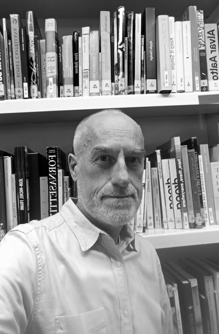
The Bookworm sessions are guided by Andreu Jansà, librarian and curator of the Enric Bricall Reserve Fund.
We will place the publications in their context and try to define what makes them relevant in the history of editorial design in the 20th and 21st centuries. The direct contact with the books and magazines that we will see in each session will allow us to experience the printed document from a material point of view: binding, paper, lay out, illustrations, typography. We will also be able to assess the adequacy between form and content.


