Events are an integral part of the master programs: from workshops with guests professors to lectures series with relevant practitioners.
Wed, Apr 8, 2026
Graphic — Elisava lectures
7.30 pm — Sala Aleix Carrió
Open to the public

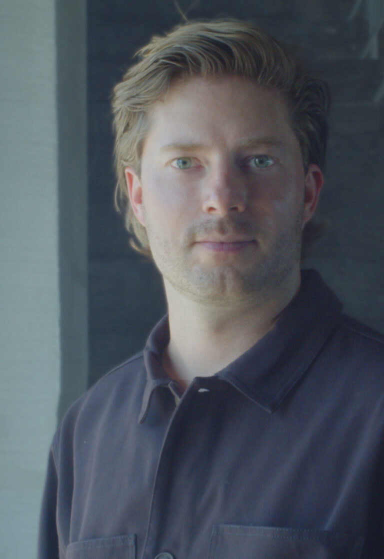
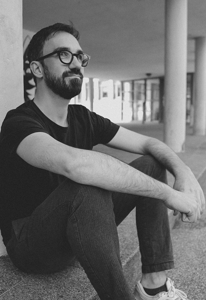
Bart de Baets
Paperclips
Paperclips
In his lecture, graphic designer Bart de Baets will show a large variety of works and elaborate more on the ways they find their form and are realized eventually. Although Bart’s practice is mostly spent working at the studio in Amsterdam, it is alternated by a parttime teaching position at the Royal Academy in The Hague, where he works with the first year students and the ones graduating. The way he teaches and cooks up his assignments is inspired by transforming everyday observations (at times obsessions) into educational exercises. The students are triggered to think of formal executions that evoke solutions close to Bart’s own practice visualizing abilities and editorial voice.
Although appearing less frequently today, Bart’s body of work’s been known to feature self initiated publications, such as Success and Uncertainty (together with Sandra Kassenaar), Dark and Stormy (together with Rustan Söderling), and Tabrat, a zine from 2022 in which de Baets confesses to be a tab hoarder (phone only, the browser tabs on his laptop are opened briefly and closed again efficiently) and shares them here with us in the charming A4-sized publication. His editorial assets have not been forlorn, and are frequently demonstrated more so in his collaborative works for artbook shop Page Not Found and exhibition space Nest (both are located in the city of The Hague). The talk at Elisava will prominently feature all of these works—and more—and provide insights into the developments of these designs by showing sketches, references and many inspirations.

Graphic designer Bart de Baets (1979, Knokke, BE) is based in Amsterdam. His design for the Sandberg Institute’s temporary master programme The Radical Cut Up was nominated for a Dutch Design Award. As a result, PostNL commissioned De Baets to design a series of stamps titled ‘Talk to the Hand’. With Sandra Kassenaar he designed the exhibition, campaign and catalogue for ‘Circulate’, an exhibition on photographic art acquisitions at the Stedelijk Museum Amsterdam. The two also design the graphic identity of Kunstmuseum Bochum. He designed ‘On the Necessity of Gardening: An ABC of Art, Botany and Cultivation’ (2021), which was published parallel to ‘The Botanical Revolution’, an exhibition at the Centraal Museum, Utrecht. That year, the Stiftung Buchkunst awarded the book with the highest prize in the category Best Book Design from all over the World. A second title in that series, Mothering Myths, an ABC of Art, Birth and Care was released in May of 2025, for which he collaborated once again with editors Laurie Cluitmans and Heske ten Cate. He holds a part-time teaching position at the Graphic Design department of the Royal Academy of Art in The Hague, and he has taught at the Gerrit Rietveld Academie in Amsterdam for fifteen years.
Being educated by notorious wild collaborator Will Holder, the radical typographic thinkers of Experimental Jetset and conceptual makers like Linda van Deursen, triggered Bart de Baets to think like an editor early in his graphic design studies, making zines with and for his peers, or whipping up catchy writings to go with his posters and projects. His design skills were fed ferociously when working with Maureen Mooren and Daniel van der Velden (now Metahaven) whose interest in art inspired him. For them, that always seemed to come first, then design. For the pages of Archis (an architecture magazine–now Volume), the layouts of existing periodical publications were used to give form to the magazine’s content, and Bart was taught to study their characteristics and so became an excellent copycat.
Over the years de Baets’ body of work has developed immensely mostly so by certain significant collaborations. A few early memorable ones have been those with Melanie Bonajo and Frank Koolen, two (then) Amsterdam-based artists not much older than himself and whose practice inspired an idea on which to work together, and which, in a way, kicked off de Baets’ career. The likes of Rustan Söderling and Sandra Kassenaar are of similar influence and remain crucial design partners; both are good friends to this day. Their influence on some self initiated works, such as Dark and Stormy and Success and Uncertainty is essential for de Baets’ current design approach and visual language. Kassenaar and de Baets nowadays share a studio and work together as designers regularly.
His designs are rooted heavily in a kind of conceptual thinking, and his abilities to think along editorially with commissioners has given Bart’s body of work an outspoken character. His work is distinctively playful and seemingly intuitive, giving the impression that the designs could be made quickly or hand-made. Yet, each one of the designs is a carefully put-together composition made according to a bunch of guidelines and often uses typography or visuals referencing things “found” on the street. For years Bart’s been a teacher in graphic design often working with the first year students, introducing them to the job. Surrounded by other designers, skilled coders, letter drawers and colour wizards, his teaching encourages to explore what it’s like to make art and design in today’s environments by demonstrating personal fascinations.


Wed, May 27, 2026
Masters’ Talks
7.30 pm — Event at DHub
Open to the public

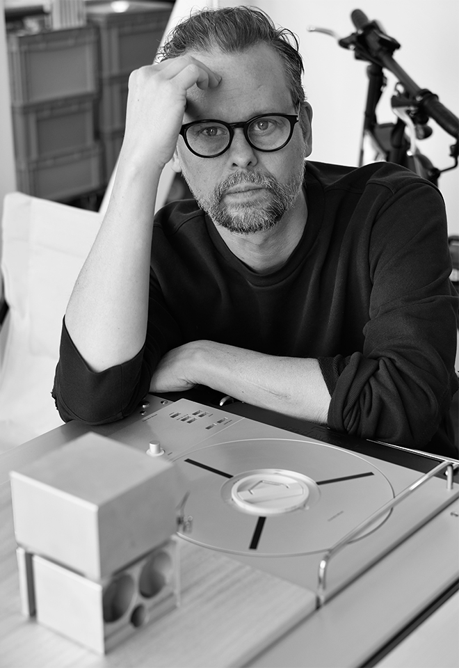
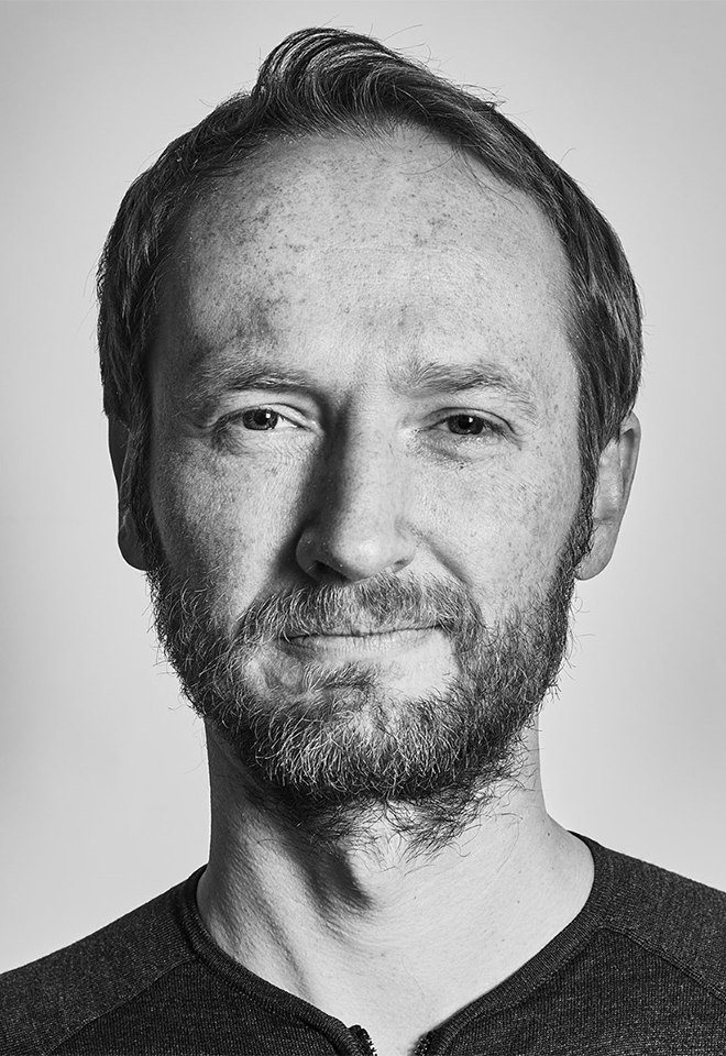
Jonas Janke, b+
Love me one time, two times … x times !
Love me one time, two times … x times !
The lecture is not a conventional showcase of selected projects from our daily practice, but rather aims to provide a broader insight into the network of actors in which b+ (bplus.xyz) operates, how we understand the contemporary way of an architectural practice and scope of work of an architect, and how we approach our projects—in short: who b+ is and how we work, what our values are, and what our understanding of our duties and responsibilities as architects is.
Jonas Janke (DE, 1991) is an architect and partner at bplus.xyz (Berlin). He has a diverse background in architecture, was trained as an architectural draughtsman before pursuing his studies in Hamburg, Stockholm, and Berlin. He gained valuable experience as a tutor and assistant in various departments including design & typologies, building construction, and structural design. He was part of the team 2038, the German Pavilion at 17th Venice Architecture Biennale 2021.
His early teaching experiences include guest studios at the University of Innsbruck (Austria) and Politecnico di Milano (Italy). He is regularly invited to give lectures and guest critiques at universities, cultural institutions, and public institutions. His focus is on new ecological construction materials and methods for adaptive reuse and renovation projects, seeking pragmatic and efficient technical and mechanical solutions that use material and construction thoughtfully.
bplus.xyz (b+) is a collaborative architecture practice (led by Arno Brandlhuber, Olaf Grawert, Jonas Janke and Roberta Jurčić) that operates at the intersection of theory and practice, using different media and formats. The practice seeks to engage with the contemporary challenges of our time, particularly those related to the social-ecological transformation of existing buildings, offering economically viable solutions.
b+ understands architecture as an open process, and views buildings as part of larger systems that require a systemic approach. The practice sees the given framework of existing buildings and legislation as an active design tool with the potential for transformation. Thus, b+ celebrates the potential of the existing built environment and aims to reveal and activate the latent potentials within.
b+ emphasizes working with different actors and stakeholders in project development. The practice values their knowledge and expertise and aims to create spaces for exchange and collaboration. b+ seeks to advance a new value system in architecture, one that places greater emphasis on collective responsibility, systemic thinking, and ecologically and economically viable solutions.
The current project in the field of political activism is the European citizens’ initiative HouseEurope! – HouseEurope! wants to create incentives that make renovation the new norm. This will boost the renovation market and give new value to what is already there. The goal is to preserve homes and communities, ensure a fairer and more local building industry, save energy and resources, and preserve our memories and stories.


past events
Tuesday,
May 16, 2023
4 pm

Guido de Boer & Ivo Brouwer, High on Type
graphic.elisava lectures
Collective Playground
High on Type is a collective of five calligraphers, artists and/or designers. Writing is the basis for everything they do. Whether they are organising a festival, doing a residency, creating an exhibition or giving a lecture. In this lecture, which Ivo and Guido will be giving, they will show why it is so important to keep playing in a making process, using mainly two major recent projects.
Guido de Boer, born 1988 is an independent visual artist with a background as designer. His work consists of images that you can read and texts that you can expe- rience visually. His work is large, monumental and handmade and therefore expressive, but also co- mes across as graphic. In addition to his artistic practice, Guido is a teacher at the Royal Academy of Art in The Hague.
Ivo Brouwer, born 1992 is a type and graphic artist based in The Hague. His work compiles of experimental type and graphic pat- terns made by translating tactile methods to digital environments and the other way around. He holds a Master‘s degree in Type Design from KABK Royal Academy of Arts The Hague. In 2022, he received a fund for Talent Development by the Creative Industries Fund NL.


Wednesday,
April 12, 2023
7.30 pm

Lev Manovich
Masters’ Talks
One billion Rembrandts?
Inside Visual AI Revolution
Event at COA, Plaça Nova 5
Book your seat (soon)
In an article about people using AI image synthesis tools, WSJ compared their arrival to another major technological revolution in art – the adoption of photography in the 19th century (8/19/22). New Yorker magazine stated: “How we work — even think — changes when we can instantly command convincing images into existence.” (9/19/22) NYT wrote that “A.I.-based image generators like DALL-E 2, Midjourney and Stable Diffusion have made it possible for anyone to create unique, hyper-realistic images just by typing a few words into a text box.” (10/21/22)
Are we indeed living through a major revolution in visual culture? Is it true that “anybody” can create “unique” images using this technology? In my talk I will critically evaluate some of the claims made about AI Image Synthesis, and suggest alternative ways of understanding it. The talk draws on the latest chapter in the book “Artificial Aesthetics: a Critical Guide to AI, Design and Media” (Manovich and Arielli, 2021-) being published online at manovich.net
Lev Manovich is a world-renown innovator and top influencer in many fields, including digital art, media theory, digital humanities, and cultural analytics. He is a Presidential Professor at The Graduate Center, CUNY, and a Director of the Cultural Analytics Lab. Manovich was included in the list of “25 People Shaping the Future of Design” and the list of “50 Most Interesting People Building the Future”. He is an author of 15 books that include The Language of New Media described as “the most suggestive and broad-ranging media history since Marshall McLuhan.”


Wednesday,
March 22, 2023

Joost Grootens' books
Bookworm 3
Joost Grootens’ books
Only for MED students
In this session we will focus on the figure of Joost Grootens, a Dutch graphic designer specialising in the design of books on architecture, urban planning and art. His work is characterised by the handling of large amounts of information in the form of statistical data, maps and diagrams. His ability to visualise data has made him a benchmark in the field of visual communication.
Taking as a starting point a retrospective book of his own work entitled “I swear I use no art at all”, we can get to know his design philosophy and some notable examples of his editorial production.
The book has been the medium and the message of the diverse movements in the arts during the last century. The book, with its emphatic material presence, takes on a special value now that we are witnessing its dematerialization, reduced to digital data in electronic format.
Over the Bookworm sessions we will explore several iconic books that capture the spirit of the era in which they were designed. We will place the books in their context and try to define what makes them relevant in the history of 20th century book design. The Bookworm sessions are guided by Andreu Jansà, librarian and curator of the Enric Bricall Reserve Fund.


Wednesday,
March 22, 2023
7.30 pm

Jesper Kouthoofd, Teenage Engineering
Masters’ Talks
Work and life at Teenage Engineering
Event at COA, Plaça Nova 5
Book your seat (soon)
teenage engineering is developing the alternative future of consumer electronics, each invention designed to last. from reimagining music-making with the iconic OP-1 portable synthesizer and growing the synth population with the affordable pocket operator series, to rethinking listening with the OD-11 ortho directional speaker and the OB–4 magic radio, they have applied their signature mindset to a new legacy of enduring technologies.
Their creations have attracted collaborations with well-known artists and brands, sharing in their vision to integrate creativity into the everyday. teenage engineering was founded in 2007 and is based in Stockholm, Sweden.
Jesper Kouthoofd is head of design, founder & CEO of teenage engineering. His work has been recognised in magazines such as New York Times, Vanity Fair, GQ, Vogue, Wall Street Journal, Wallpaper, Wired, Popular Mechanics, G3 and many more across the globe. Together with his 40 engineers at teenage engineering he has launched products such as the already legendary synthesizer OP-1, pocket operators and reengineered the classic OD-11 (by Stig Carlsson). He believes in making products for everyone, no matter where you live or what language you speak.


March 20 → 25, 2023

Cyrus Highsmith, Occupant fonts
Workshop
Thinking with your hands
Letters can be drawn in so many different ways. Cyrus Highsmith’s approach is based heavily on the importance of white space and sensitivity to shapes. It’s a method he applies to type design as well as image making of all kinds. For Highsmith, it’s a way of seeing the world. This workshop will be a messy, hands-on, and computer-free exploration of drawing, making, and thinking about letters.
The objective of this workshop is to spend a memorable week of drawing letters and making art.
Each day will be a series of demos and conversations with lots of time in between to work independently. We will experiment and play with different ways of drawing and thinking about letters. Techniques may include stencils, low tech printing, collage, and painting. Participants should be ready for new experiences, experimentation, play, and failure.
Cyrus Highsmith is a letter drawer, teacher, author, and graphic artist. He teaches type design at Rhode Island School of Design (RISD).
He wrote and illustrated the acclaimed primer Inside Paragraphs: Typographic Fundamentals.
In 2015, he received the Gerrit Noordzij Prize for extraordinary contributions to the fields of type design, typography, and type education.
In 2017, he became Creative Director for Latin Type Development at Morisawa USA.
He goes to bed very early.


Wednesday,
March 8, 2023
7.30 pm

Tim Rodenbröker, trcc
graphic.elisava lectures
Creative Coding as a School of Thought
Our world is changing at a breathtaking pace. Technological progress is continuously leading to significant transformations. It is high time that we, as designers, courageously and critically engage with the technologies that shape our everyday lives. This requires that we consequently engage with the hidden structures that are hidden behind the visible surfaces. One method that makes this possible is called Creative Coding.
Tim Rodenbröker is a designer, entrepreneur and community builder. After several years of running his own studio and teaching at various international universities, he founded his own learning platform, around 2019, which he now runs full-time. As a creative technologist, he has worked for clients such as nytimes.com, IBM, CCCB, ZKM Karlsruhe, Slate+Ash, Holo Magazine, DEMO Festival and Springer Science and Business Media.
trcc (tim rodenbröker creative coding) is an international online learning platform with an associated community for creative coding in the realms of graphic design. With about 800 active students from all over the world and a broad network of experts from universities and agencies, festivals and conferences, the Patreon-funded platform is a globally renowned institution in the current landscape of creative coding education.


Wednesday,
February 22, 2023

Contemporary books
Bookworm 2
Awarded books
Only for MED students
In this second session we will focus on contemporary books, analysing some examples that have won awards in recent years.
What is currently considered a well-designed book?
Through the verdict of the jury of the LAUS awards and the “Best Book Design From All Over The World” we will be able to take a look at recent editorial design and detect what the trends are in this field. We will be able to assess the adequacy between form and content and explore the role of the designer in the process of creating a book.
The book has been the medium and the message of the diverse movements in the arts during the last century. The book, with its emphatic material presence, takes on a special value now that we are witnessing its dematerialization, reduced to digital data in electronic format.
Over the Bookworm sessions we will explore several iconic books that capture the spirit of the era in which they were designed. We will place the books in their context and try to define what makes them relevant in the history of 20th century book design. The Bookworm sessions are guided by Andreu Jansà, librarian and curator of the Enric Bricall Reserve Fund.


Wednesday
February 22, 2023
7.30 pm

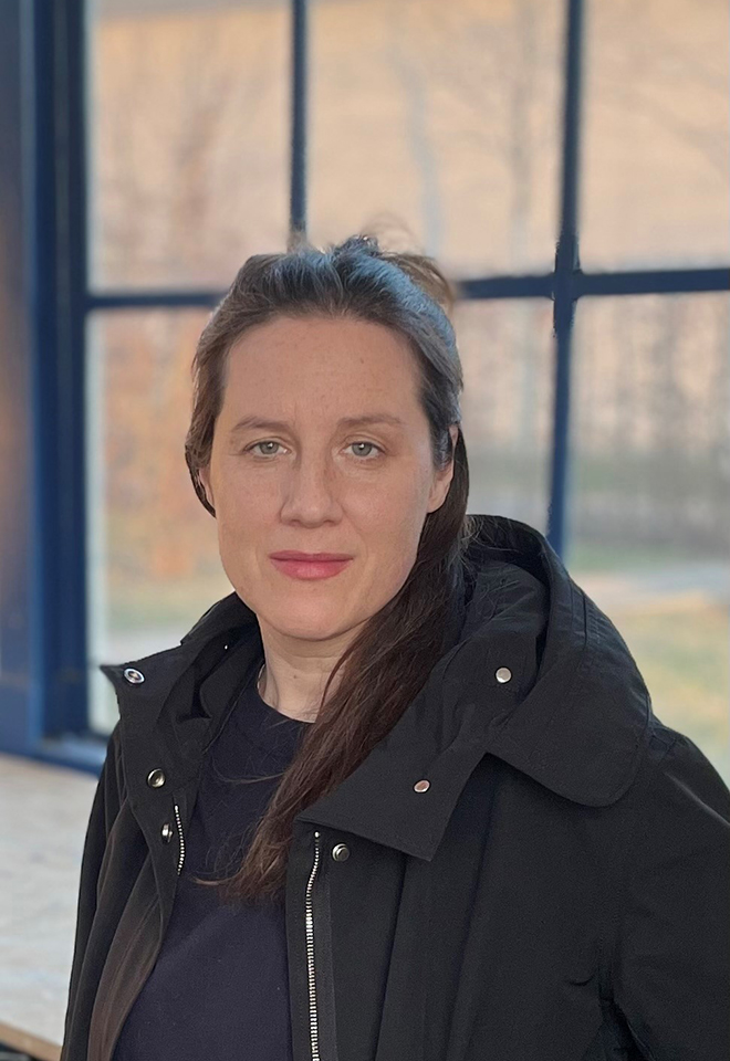
Amical Dall, Assemble
Masters’ Talks
The Work of Repair
Event at COA, Plaça Nova 5
Book your seat (soon)
The Work of Repair
Amica will reflect on how architectural and creative practices can orientate themselves away from invention and innovation towards the patient and slow work of repair, and consider work that is based on making long-term, personal or ethical commitments to sites, situations, and social contexts. She will cover some of Assemble’s early work, before discussing a set of projects that reorientated her and the studio’s attitudes towards the city and the rural, material ethics and intergenerational justice.
Amica Dall is an inter-disciplinary practitioner focused on architecture and city culture and children’s right to the city. She is a founding member of Assemble, where she delivered more than 15 major projects over ten years. Her work as a writer and filmmaker has been broadcast on the BBC, exhibited at the Venice Biennale, and published in E-Flux. She recently co-wrote a book on post-carbon future for architecture with architecture practice, Material Cultures. Amica has taught across a wide range of subjects and works with both children and post-graduates.

Assemble is a multi-disciplinary collective working across architecture, design and art. Founded in 2010 to undertake a single self-built project, Assemble has since delivered a diverse and award-winning body of work, whilst retaining a democratic and co-operative working method that enables built, social and research-based work at a variety of scales, both making things and making things happen. Turner Prize in 2016, and nominated in 2022 to the Royal Academy in recognition of their collective contribution to the culture of city making.


Wednesday,
February 8, 2023
7.30 pm

Peter Biľak, Typotheque
graphic.elisava lectures
Giving voice to People
Giving voice to People
Peter will discuss reasons for designing type today, from seeking new possibilities within the Latin script, using cognitive research to fuel design project, to designing type for minority languages.
Peter Biľak works in the field of editorial, graphic, and type design. In 1999 he started Typotheque type foundry, in 2000, together with Stuart Bailey he co-founded art & design journal Dot Dot Dot, in 2012 he started Works That Work, a magazine of unexpected creativity, in 2015 together with Andrej Krátky he co-founded Fontstand.com, a font rental platform. He collaborates with the choreographer Lukas Timulak on creation of modern dance performances.
Typotheque is a type Company giving shape to language, designing for communication in a world that is increasingly digital and multicultural.


Wednesday,
January 25, 2023
7.30 pm

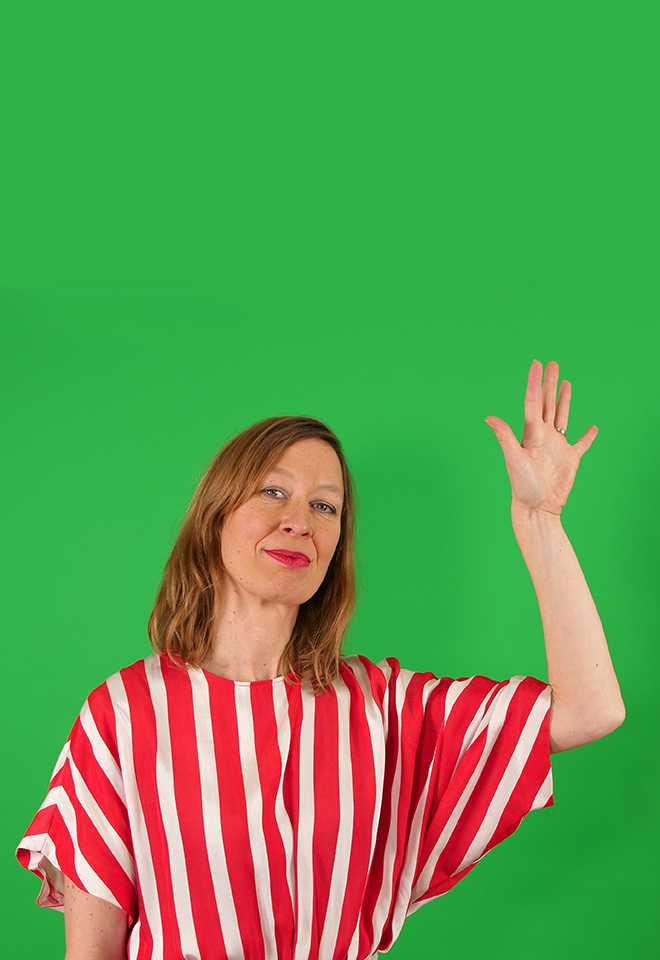
Luna Maurer, Moniker
Masters’ Talks
Rewind and fastforward
Rewind and fastforward
Luna Maurer will elaborate on Moniker’s relation with technology in the past 20 years and its impact on their practice. Moniker is currently developing a new outlook and perspective on technology, sparked by recent rapid developments in the field. The web changed from an emancipating democratizing network into an infrastructure for big capital, the screen from a desktop publishing interface to a fundamental extension of our identity. Luna will share their latest experiments.
Luna Maurer is an interaction and media design artist. Originally from Stuttgart (Germany), she completed her studies at the Gerrit Rietveld Academy and the Sandberg Institute in Amsterdam.
With Roel Wouters she heads the Amsterdam based studio Moniker. Moniker is well known for authoring the Conditional Design Manifesto (together with Edo Paulus and Jonathan Puckey). Luna Maurer has been teaching media courses at the Gerrit Rietveld Academy, the Sandberg Institute, Royal Academy of Art, The Hague, HfG Karlsruhe and at Yale University School of Art.
Moniker explores the characteristics of technology and its influence on our daily lives. They have designed many participatory projects (online and offline), as well as other web projects, films and performances. Their clients range from cultural institutions like Stedelijk Museum, Amsterdam and Fondation Beyeler, Basel to more technology oriented clients like the Mozilla Foundation, Unity 3D and Google.
Moniker has won many awards, including a British Music Video Award, a Webby, several Dutch Design Awards and the Amsterdam Prijs voor de Kunst.


Wednesday,
January 11, 2023
7.30 pm

Dahyun Hwang, HHHA
graphic.elisava lectures
Between Digital and Analog
dahyunhwang.com
hhha.online
@da_hyonni
@hejhellohalloannyeong
Open to the public
Dahyun will talk about how we can convert analog into digital things and explore the possibilities of the web. Furthermore, how can we create exciting websites in unexpected ways? And how can we use online tools for better communication nowadays?

Dahyun Hwang is a graphic designer. She studied visual communication at University of Seoul in Korea and finished her master’s at Bauhaus University in Weimar, Germany. She thinks about how we can connect analog and digital. She is also a co-initiator of HHHA, a creative coding collective. She has participated in ‘Post Modern Child’ Exhibition in MoCA Busan and ‘POST IT!’ Exhibition in Tokyo. Her works have been featured in Monthly Design, It’s Nice That, CA Magazine, and so on.
HHHA (Hej Hello Hallo Annyeong) is a creative coding collective in which female creators gather to share and explore web-based works. Dahyun Hwang co-initiated HHHA with Naree Shin, and they gathered other teammates living in various places such as Germany, Denmark, and Korea.


Wednesday
November 30, 2022
7.30 pm

Viviane Stappmanns, Vitra Design Museum
Masters’ Talks
Curating for the Common Good
To curate means to care. Literally. In the case of design, these objects – and the exhibitions they are featured in – talk about the human drive for progress, about creative leadership, about material economies and technological innovations. But what does it mean to curate within the field of design in the 21st century? How can exhibitions and books make a contribution to fostering more just, socially and ecologically sustainable societies? In her lecture, she will provide insights into the hands-on practice of curating, and into the broader issues that may inform how we present, discuss and practice design in the future.
Viviane Stappmanns is a curator at the Vitra Design Museum in Weil am Rhein. She is interested in exploring the contribution curators can make to rethinking design as a practice concerned with ecological and social sustainability. In her exhibition and teaching work, she experiments with new, collaborative approaches to curating and exhibiting. She has taught at different schools and universities, among them the School of Architecture and Urban Design at RMIT University in Melbourne, Australia and, most recently the University of Arts and Design in Karlsruhe.
Prior to working at the Vitra Design Museum, Viviane has worked as an editor and curator within architecture and design contexts in Australia and Germany, and holds degrees in Interior Design and Journalism.
The exhibition “Here We Are! Women in Design 1900 – Today!” (2021) will open at the Barcelona Design Museum in October 2023. Currently, she is working on the international travelling exhibition “Garden Futures”, due to open at the Vitra Design Museum in Spring 2023.


1 & 2 — Exhibition «Typology. An ongoing study of everyday items», 2020 / 3 — Exhibition «Beyond the Surface», 2018 / 4 — Installation of the exhibition «Better Nature», 2019 / 5 & 6 — Exhibition «Here We Are! Women in Design», 2021 / 7 — Preparing the exhibition « Here We Are! Women in Design », 2021