Events are an integral part of the master programs: from workshops with guests professors to lectures series with relevant practitioners.
Wed, Apr 8, 2026
Graphic — Elisava lectures
7.30 pm — Sala Aleix Carrió
Open to the public

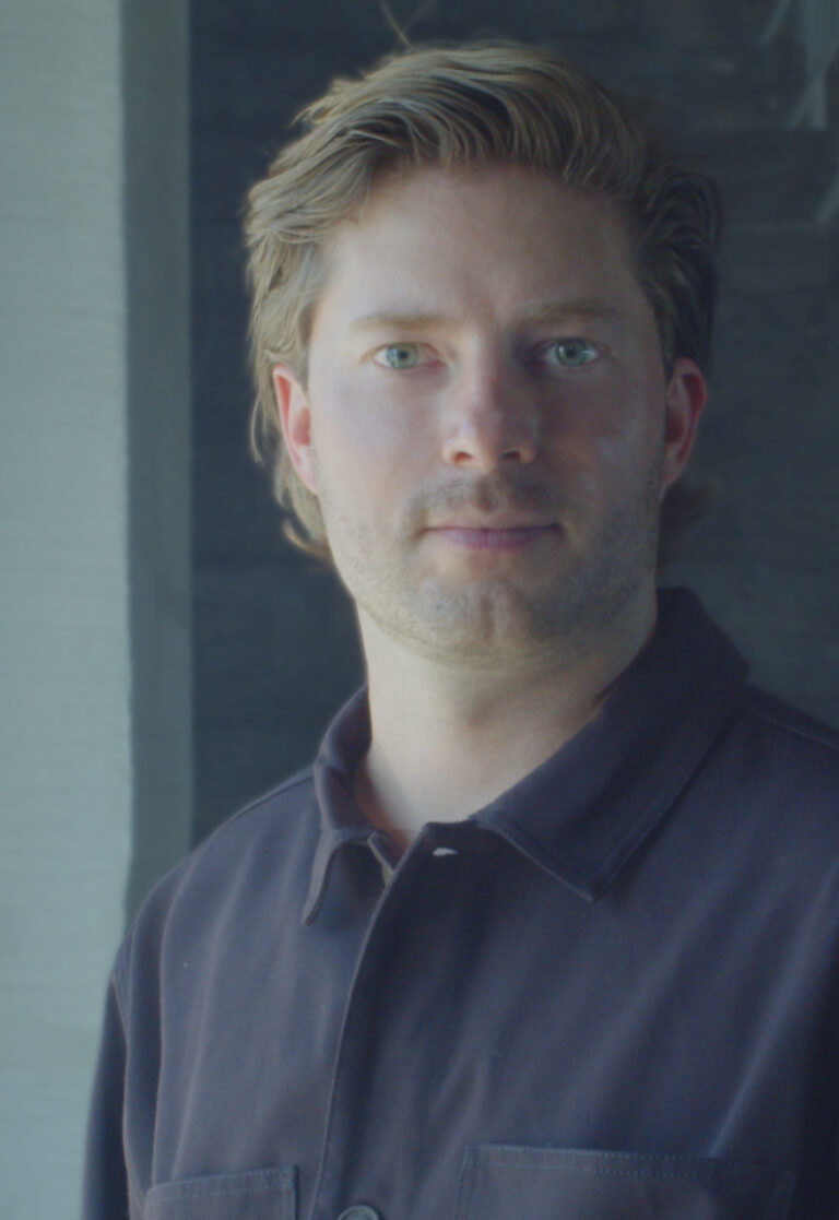
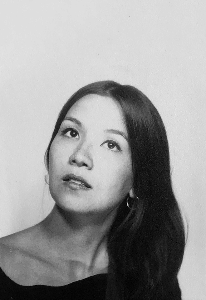
Bart de Baets
Paperclips
Paperclips
In his lecture, graphic designer Bart de Baets will show a large variety of works and elaborate more on the ways they find their form and are realized eventually. Although Bart’s practice is mostly spent working at the studio in Amsterdam, it is alternated by a parttime teaching position at the Royal Academy in The Hague, where he works with the first year students and the ones graduating. The way he teaches and cooks up his assignments is inspired by transforming everyday observations (at times obsessions) into educational exercises. The students are triggered to think of formal executions that evoke solutions close to Bart’s own practice visualizing abilities and editorial voice.
Although appearing less frequently today, Bart’s body of work’s been known to feature self initiated publications, such as Success and Uncertainty (together with Sandra Kassenaar), Dark and Stormy (together with Rustan Söderling), and Tabrat, a zine from 2022 in which de Baets confesses to be a tab hoarder (phone only, the browser tabs on his laptop are opened briefly and closed again efficiently) and shares them here with us in the charming A4-sized publication. His editorial assets have not been forlorn, and are frequently demonstrated more so in his collaborative works for artbook shop Page Not Found and exhibition space Nest (both are located in the city of The Hague). The talk at Elisava will prominently feature all of these works—and more—and provide insights into the developments of these designs by showing sketches, references and many inspirations.

Graphic designer Bart de Baets (1979, Knokke, BE) is based in Amsterdam. His design for the Sandberg Institute’s temporary master programme The Radical Cut Up was nominated for a Dutch Design Award. As a result, PostNL commissioned De Baets to design a series of stamps titled ‘Talk to the Hand’. With Sandra Kassenaar he designed the exhibition, campaign and catalogue for ‘Circulate’, an exhibition on photographic art acquisitions at the Stedelijk Museum Amsterdam. The two also design the graphic identity of Kunstmuseum Bochum. He designed ‘On the Necessity of Gardening: An ABC of Art, Botany and Cultivation’ (2021), which was published parallel to ‘The Botanical Revolution’, an exhibition at the Centraal Museum, Utrecht. That year, the Stiftung Buchkunst awarded the book with the highest prize in the category Best Book Design from all over the World. A second title in that series, Mothering Myths, an ABC of Art, Birth and Care was released in May of 2025, for which he collaborated once again with editors Laurie Cluitmans and Heske ten Cate. He holds a part-time teaching position at the Graphic Design department of the Royal Academy of Art in The Hague, and he has taught at the Gerrit Rietveld Academie in Amsterdam for fifteen years.
Being educated by notorious wild collaborator Will Holder, the radical typographic thinkers of Experimental Jetset and conceptual makers like Linda van Deursen, triggered Bart de Baets to think like an editor early in his graphic design studies, making zines with and for his peers, or whipping up catchy writings to go with his posters and projects. His design skills were fed ferociously when working with Maureen Mooren and Daniel van der Velden (now Metahaven) whose interest in art inspired him. For them, that always seemed to come first, then design. For the pages of Archis (an architecture magazine–now Volume), the layouts of existing periodical publications were used to give form to the magazine’s content, and Bart was taught to study their characteristics and so became an excellent copycat.
Over the years de Baets’ body of work has developed immensely mostly so by certain significant collaborations. A few early memorable ones have been those with Melanie Bonajo and Frank Koolen, two (then) Amsterdam-based artists not much older than himself and whose practice inspired an idea on which to work together, and which, in a way, kicked off de Baets’ career. The likes of Rustan Söderling and Sandra Kassenaar are of similar influence and remain crucial design partners; both are good friends to this day. Their influence on some self initiated works, such as Dark and Stormy and Success and Uncertainty is essential for de Baets’ current design approach and visual language. Kassenaar and de Baets nowadays share a studio and work together as designers regularly.
His designs are rooted heavily in a kind of conceptual thinking, and his abilities to think along editorially with commissioners has given Bart’s body of work an outspoken character. His work is distinctively playful and seemingly intuitive, giving the impression that the designs could be made quickly or hand-made. Yet, each one of the designs is a carefully put-together composition made according to a bunch of guidelines and often uses typography or visuals referencing things “found” on the street. For years Bart’s been a teacher in graphic design often working with the first year students, introducing them to the job. Surrounded by other designers, skilled coders, letter drawers and colour wizards, his teaching encourages to explore what it’s like to make art and design in today’s environments by demonstrating personal fascinations.


Wed, May 27, 2026
Masters’ Talks
7.30 pm — Event at DHub
Open to the public

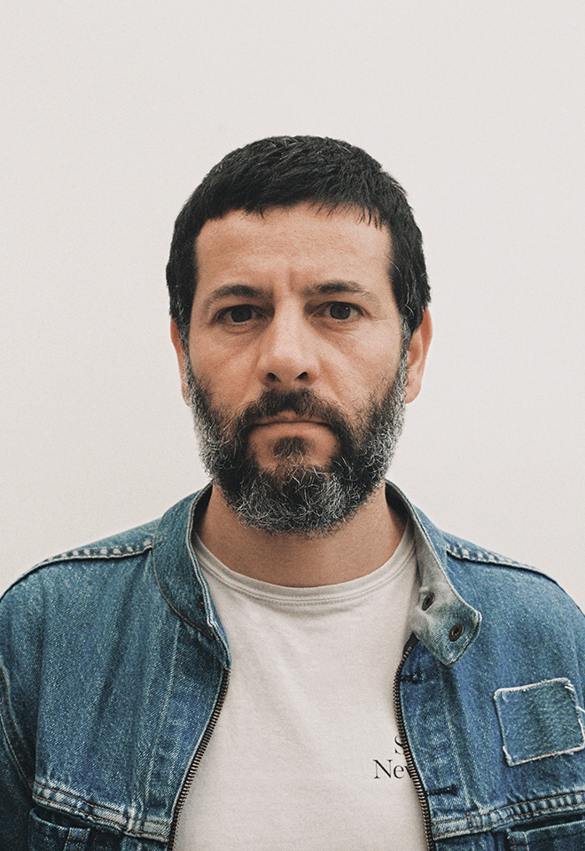
Jonas Janke, b+
Love me one time, two times … x times !
Love me one time, two times … x times !
The lecture is not a conventional showcase of selected projects from our daily practice, but rather aims to provide a broader insight into the network of actors in which b+ (bplus.xyz) operates, how we understand the contemporary way of an architectural practice and scope of work of an architect, and how we approach our projects—in short: who b+ is and how we work, what our values are, and what our understanding of our duties and responsibilities as architects is.
Jonas Janke (DE, 1991) is an architect and partner at bplus.xyz (Berlin). He has a diverse background in architecture, was trained as an architectural draughtsman before pursuing his studies in Hamburg, Stockholm, and Berlin. He gained valuable experience as a tutor and assistant in various departments including design & typologies, building construction, and structural design. He was part of the team 2038, the German Pavilion at 17th Venice Architecture Biennale 2021.
His early teaching experiences include guest studios at the University of Innsbruck (Austria) and Politecnico di Milano (Italy). He is regularly invited to give lectures and guest critiques at universities, cultural institutions, and public institutions. His focus is on new ecological construction materials and methods for adaptive reuse and renovation projects, seeking pragmatic and efficient technical and mechanical solutions that use material and construction thoughtfully.
bplus.xyz (b+) is a collaborative architecture practice (led by Arno Brandlhuber, Olaf Grawert, Jonas Janke and Roberta Jurčić) that operates at the intersection of theory and practice, using different media and formats. The practice seeks to engage with the contemporary challenges of our time, particularly those related to the social-ecological transformation of existing buildings, offering economically viable solutions.
b+ understands architecture as an open process, and views buildings as part of larger systems that require a systemic approach. The practice sees the given framework of existing buildings and legislation as an active design tool with the potential for transformation. Thus, b+ celebrates the potential of the existing built environment and aims to reveal and activate the latent potentials within.
b+ emphasizes working with different actors and stakeholders in project development. The practice values their knowledge and expertise and aims to create spaces for exchange and collaboration. b+ seeks to advance a new value system in architecture, one that places greater emphasis on collective responsibility, systemic thinking, and ecologically and economically viable solutions.
The current project in the field of political activism is the European citizens’ initiative HouseEurope! – HouseEurope! wants to create incentives that make renovation the new norm. This will boost the renovation market and give new value to what is already there. The goal is to preserve homes and communities, ensure a fairer and more local building industry, save energy and resources, and preserve our memories and stories.


past events
Wednesday,
November 16, 2022
Albert Folch & Rafa Martínez, Folch
Case Studies
Latests projects
Only for MDV students
Latest projects
In an accelerated world, every aspect of our lives is in constant change. At Folch we bring together different disciplines to respond to every brief, always seeking to have an atypical vision. Each project is an opportunity to design concepts, brands, narratives and digital events, reaching and involving audiences to this new liquid paradigm.
Folch Creative-driven brand ecosystem. Acid House (creative and business innovation hub in Barcelona and Madrid), White Horse (creative production), Avanti Studio (city branding & way finding ), NOW (digital innovation and transformation), Creative Services (fashion and e-commerce), PILLS (digital education), Gallery Studio (New music formats), G.Records (Record label), Gallery (Music Innovation), Eldorado Agency (outdoor creative agency), J.Franc (3D visualization and AR/VR solutions), FFF (Digital type foundry) and Self (talent management).


Wednesday,
November 9, 2022

From 1900 to Postmodernism
Bookworm 1
Enric Bricall Special Collection
Only for MED students
Introduction to the Enric Bricall Special Collection, a collection of books whose design and typography represent excellence in 20th century editorial design. We will offer a historical review from 1900 to Postmodernism, passing through the interwar avant-garde, the New Typography and Swiss graphics.
We will look at some representative books from each period and analyse their characteristics. We will try to understand where their importance lies and why they have gone down in the history of graphic design as canonical examples of editorial design in the last century.
The book has been the medium and the message of the diverse movements in the arts during the last century. The book, with its emphatic material presence, takes on a special value now that we are witnessing its dematerialization, reduced to digital data in electronic format.
Over the Bookworm sessions we will explore several iconic books that capture the spirit of the era in which they were designed. We will place the books in their context and try to define what makes them relevant in the history of 20th century book design. The Bookworm sessions are guided by Andreu Jansà, librarian and curator of the Enric Bricall Reserve Fund.


Wednesday,
November 9, 2022

Pablo Juncadella, Mucho
Case studies
Degrow or grow in another way?
Only for MVD students
Degrow or grow in another way?
The value of a project cannot be measured only in monetary terms. And we are clear about that.
It is important for us to develop ideas and concepts that contribute to society, that help to fulfill an objective and that lead us to think beyond the limits. We call these projects ‘pro-bono’ and they are part of the commitment we have with others and with society, but especially with our community of designers.
How do we organize pro-bono projects? How do we limit collaboration so that it is sustainable for both parties? How do we maintain the client relationship over time?
Pablo Juncadella
Co-founder and creative director at Mucho. Thanks to his constant search for new challenges, Pablo was promoted to the position of Creative Director of the English newspaper The Observer after working as a graphic designer for grafica and Pentagram. His global vision and his great interest in visual knowledge have been fundamental contributions to the growth of the studio. Today, together with his team at Mucho, he works with the purpose of finding solutions that fit in the positioning of the brands by contributing with original ideas.


Wednesday,
November 9, 2022

Robbie Whitehead, Apartamento Magazine
Case studies
Title
Title
Description of the session
Robbie Whitehead (London, 1988) is the editorial director of the magazine Apartment. In 2010, after finishing his graphic design studies in Sydney, Australia, he came to Barcelona to work on the publication. In it, together with its founders Nacho Alegre, Omar Sosa and Marco Velardi, is responsible for the editorial direction of the magazine and the rest of the brand’s editorial projects, directing in a close manner a network of photographers, writers and illustrators of recognition international.
Apartamento is widely recognised as today’s most influential, inspiring, and honest interiors magazine. International, well designed, simply written, and tastefully curated since 2008, it is an indispensable resource for individuals who are passionate about the way they live. The publication is published biannually from its headquarters in Barcelona. It also has offices in New York, Milan and Berlin.


Tuesday,
November 8, 2022

Clara Layti, LLOS&
Showcase
Design-focused website development
After more than 10 years collaborating with designers for the creation of digital projects, we will analyze relevant works of our trajectory, share experiences and give examples of how to prepare the ideal hand off for the development of a website, making life easier for the developer and minimizing feedback and unforeseen events.

Clara Layti is a web programmer at LLOS& since 2020. She has led the development of web projects produced by studios such as Folch, Hey, Affaire or Proxi, among others. Working with the latest web development technologies, she seeks to adapt to the needs of each project to offer the best user experience. He studied Creation and Development of Digital Activities, specializing in UX design and web programming.
LLOS& is a web development studio in Barcelona specialized in pixel-perfect front-end finishing.
Our projects are programmed from scratch with emphasis on aesthetics, animations and interactions, almost always executed by the hand of art direction and design professionals.

Wednesday,
October 26, 2022

Pau Garcia, Domestic Data Streamers
Case studies
Designing for the unknown
We, humans, struggle to build empathy towards large amounts of information. ¿How do we solve these challenges when the problems we face today are so inherently big, interconnected, wicked, and globalized? In this talk, we will explore some humble experiments done to overcome this lack of empathy through art, technology, and participatory experiences.
Pau Garcia is a media designer and the co-founder of Domestic Data Streamers, a 25 people studio that since 2013 has been focused on creating info-experiences. He also leads de Master in Data Design at Elisava. He is a guest lecturer at The New School (NYC), Hong Kong Design Institute, the Royal College of Arts (London), Politecnico di Milano and the Barcelona School of Economics. He built and permanently lives in the Residence for Artists HeyHuman! and is part of the Posttraumatic Collective. Usually, he doesn’t speak in the third person.
Domestic Data Streamers is an award-winning studio exploring how to express data through film, robotics, code, theater, or architecture in schools, prisons, cinemas, the streets of many cities, and even the United Nations Headquarters. They work for commercial brands and all kinds of old-school and new-kinky institutions. They truly believe data can be a real trigger of change and build bridges in a polarized society.


Wednesday,
October 19, 2022

Anna Berbiela, Pràctica
Case studies
Pràctica: Graphic Hunting
Pràctica: Graphic Hunting
Exploring our reality allows us to understand the creative potential that lies behind everything that surrounds us; In this session we will analyse, through visualising the latest Pràctica case studies, how our environment and surroundings can become an inexhaustible source of inspiration if we really pay attention.
Anna Berbiela
Graphic designer, creative director, and illustrator based in Barcelona. Anna Berbiela is co-founder, together with Javier Arizu, Carlos Bermúdez, and Albert Porta, of the design studio Pràctica. With offices in Barcelona and New York, Pràctica believes that design it’s a process involving researching, thinking, sharing, challenging… then giving all this a definitive shape.
Pràctica is a design and identity studio based in Barcelona and New York that seeks to reveal the particular truth of each brand. By simplifying complexity and shaping concepts, creates work that makes sense.


Wednesday,
October 19, 2022

Mela Dávila Freire, Artfile
Showcase
“The servants, the artisans, the workers, the others”:
Visible and Invisible Hands in Publishing
Making a book means undertaking a complex task which is eminently collective. In addition to those who create content, design it and print the resulting book, other roles and knowledge must be involved whose participation is not always visible from the outside. This session will review all of the agents involved in editorial publishing, as well as some of the types of balance that can be established between such roles throughout the work process.
In her professional career, Mela Dávila Freire has combined institutional work – at Museu d’Art Contemporani de Barcelona and Museo Reina Sofía, among others– with research,writing, editing and curating. Her work focuses in particular on artist publications and art archives, spanning topics such as the theoretical and practical overlaps between archives and art collections, the ideological biases in archival structures,and the feminist revision of the genre of artists’ publications.
Her most recent book, Mission and Commission: documenta and the Art Market, 1955 – 1968, deals with the relationship between the early documenta exhibitions and the incipient art market through the publication of multiples and graphic works.


1 — Damián Ucieda, Camiño negro, 2022. Design by Luis Llorens Pendás, A Coruña / Hamburg. / 2 — Essay 2: We Want to Know, 2022. Design by Todojunto, Barcelona. / 3 — Mission and Commission: documenta and the Art Market 1955 – 1968, 2022. Design by Cosmic, Barcelona. / 4 — The publication My Holy Nacho (2015) in Jamie Allen and Bernhard Garnicnic’s installation Sectioning: My Holy Nacho, Nikolaj Kunsthal, Copenhagen, 2016. Design by Cosmic, Barcelona. / 5 — Poster for a presentation at the University of Fine Arts Hamburg (HfbK), 2019. Design by Luis Lloréns Pendás, A Coruña / Hamburg.
Wednesday,
June 8, 2022
7.30 pm

Thierry Brunfaut, Base
Open Lecture
Blanding, The Branding Paradox
Blanding, The Branding Paradox
I’ve come to believe one thing: Brands are like people. Some are understated. Some are loud. Some funny. Some communicate by exclaiming! Some have terrible grammar. Brands aren’t created in a vacuum; they’re products of the world around them. Formed around the strengths and weaknesses of the competition, a brand is as much about what it isn’t as what it is. The point is differentiation; that’s what branding is. That’s why I’m so baffled by the current epidemic of what I call blanding—branding not to stand out at all, but to blend in. With results that are, in a word, bland.
Thierry Brunfaut is a creative director and one of the founding partners of Base Design, the international network of branding studios based in Brussels, New York, Geneva, and Melbourne. He is the author of the renowned 5–Minute poster series, a professor, and a regular speaker at design and branding conferences around the world. Thierry bears a striking and seemingly contradictory resemblance both to Moby and Kermit the frog.
Base Design creates brands with cultural impact. Our team of creatives, strategists, and digital experts design and develop simple yet powerful brands, and build unique personalities. Base knows that branding is first and foremost about people, so specializes in helping companies – whether new or established; large or small – to become human-centric brands with vision, clarity, and empathy. Founded in the early ‘90s, the company has evolved continuously over the years and is now steered by partners across all four studios.


Wednesday,
May 11, 2022
7.30 pm
Vrints-Kolsteren, Off track
Open Lecture
Off track
Off track
In this lecture Vrints-Kolsteren will take you into their creative process. From their sources of inspiration to the way they build visual systems.
Like a game, a visual identity is build up from a set of rules. How to apply these rules will determine the end result. The trick is to navigate freely within the game, like a traveler that goes off track but has a map to feel safe.
Vrints-Kolsteren is an Antwerp based design studio founded by Vincent Vrints and Naomi Kolsteren in 2015, working both locally and internationally. The bureau’s forte is developing visual identities with a clear and strong focus on typography. When working on an identity, they create a system, a set of rules, which can evolve over time.
Additionally, dealing with the organic opposed to rudimentary shapes and straight lines is a recurring narrative within their practice.
Vrints-Kolsteren puts an emphasis on collaboration and likes to work closely with their clients. They don’t want to view the client as a client, in the strict sense of the word, rather they consider all parties to be equal.
Vrints-Kolsteren is influenced by the modernist period, with clear references to that time, its designers and artists, which can be soon in their attention for form, linework, and most importantly, the use of grids and rulesets.


Wednesday,
April 27, 2022
Muriel Cooper + Irma Boom
Bookworm 4
Learning from Las Vegas, 1972
+
The architecture of the book, 2013
Only for MED students
The work of the designers Muriel Cooper and Irma Boom serves to reflect on the phenomenon of the designer as author. Learning from Las Vegas was one of the seminal texts of postmodern architecture, but the design of the book was the cause of confrontation between its authors and Muriel Cooper due to the lack of adequacy between substance and form. A similar case is that of Irma Boom, who claims her creative autonomy in the process of creating the book. Two very strong personalities that refute the image of the “invisible designer”.
Modernism and Postmodernism are the driving forces that have shaped 20th century architecture, art and design.
The Modern Movement began at the end of the 19th century, ran vigorously through the century and began to be questioned at the beginning of the 1960s, before finally fading away in the 1990s with the advent of the Internet and the paradigm shift it brought with it.
The book has been the medium and the message of the diverse movements in the arts during the last century. The book, with its emphatic material presence, takes on a special value now that we are witnessing its dematerialization, reduced to digital data in electronic format.
Over the Bookworm sessions we will explore several iconic books that capture the spirit of the era in which they were designed. We will place the books in their context and try to define what makes them relevant in the history of 20th century book design. The Bookworm sessions are guided by Andreu Jansà, librarian and curator of the Enric Bricall Reserve Fund. The books that make up the collection are documented in the main accounts of the history of 20th century graphic design.


Wednesday,
March 2, 2022
7.30 pm

Sarah Boris, Multi-practice
Open Lecture
Multi-practice
In this talk, artist and designer, Sarah Boris will talk about her shifting practice from being an in house designer and art director for some of the leading art institutions in the UK, to setting up her own studio in 2015. She will present some of her personal and non commercial projects that have shaped her practice and are informing new directions including self-published projects such as ‘Global Warming Anyone?’, or her artist book ‘Le Théâtre Graphique’ and her latest sculptural heart shaped bench design.
Sarah Boris is an artist and graphic designer based in London. After working for over ten years for organisations such as Phaidon, the Barbican Centre and the Institute of Contemporary Arts, she set up on her own in 2015, with a focus on visual identities, editorial design and developing her personal art practice. Her clients include The Photographers’ Gallery, Tate, The National Gallery and Christie’s to name a few.
In parallel to commissioned projects Sarah creates screenprinted artworks during artist residencies. Her work was acquired by the Stedelijk Museum, Amsterdam and was exhibited at the Design Museum in London and at Une Saison Graphique, Le Havre, France. She was judge president for D&AD book design in 2016 and is on the graphic design jury for the Latin American Design Awards 2022.


