Events are an integral part of the master programs: from workshops with guests professors to lectures series with relevant practitioners.
past events
Wednesday,
October 26, 2022

Pau Garcia, Domestic Data Streamers
Case studies
Designing for the unknown
We, humans, struggle to build empathy towards large amounts of information. ¿How do we solve these challenges when the problems we face today are so inherently big, interconnected, wicked, and globalized? In this talk, we will explore some humble experiments done to overcome this lack of empathy through art, technology, and participatory experiences.

Pau Garcia is a media designer and the co-founder of Domestic Data Streamers, a 25 people studio that since 2013 has been focused on creating info-experiences. He also leads de Master in Data Design at Elisava. He is a guest lecturer at The New School (NYC), Hong Kong Design Institute, the Royal College of Arts (London), Politecnico di Milano and the Barcelona School of Economics. He built and permanently lives in the Residence for Artists HeyHuman! and is part of the Posttraumatic Collective. Usually, he doesn’t speak in the third person.
Domestic Data Streamers is an award-winning studio exploring how to express data through film, robotics, code, theater, or architecture in schools, prisons, cinemas, the streets of many cities, and even the United Nations Headquarters. They work for commercial brands and all kinds of old-school and new-kinky institutions. They truly believe data can be a real trigger of change and build bridges in a polarized society.


Wednesday,
October 19, 2022

Anna Berbiela, Pràctica
Case studies
Pràctica: Graphic Hunting
Pràctica: Graphic Hunting
Exploring our reality allows us to understand the creative potential that lies behind everything that surrounds us; In this session we will analyse, through visualising the latest Pràctica case studies, how our environment and surroundings can become an inexhaustible source of inspiration if we really pay attention.
Anna Berbiela
Graphic designer, creative director, and illustrator based in Barcelona. Anna Berbiela is co-founder, together with Javier Arizu, Carlos Bermúdez, and Albert Porta, of the design studio Pràctica. With offices in Barcelona and New York, Pràctica believes that design it’s a process involving researching, thinking, sharing, challenging… then giving all this a definitive shape.
Pràctica is a design and identity studio based in Barcelona and New York that seeks to reveal the particular truth of each brand. By simplifying complexity and shaping concepts, creates work that makes sense.


Wednesday,
October 19, 2022

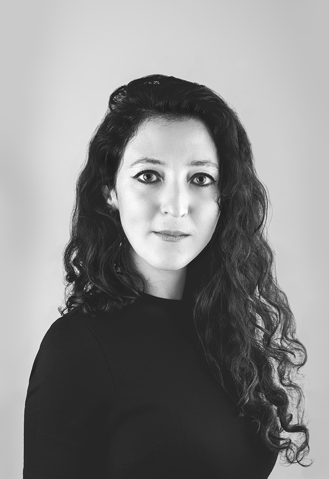
Mela Dávila Freire, Artfile
Showcase
“The servants, the artisans, the workers, the others”:
Visible and Invisible Hands in Publishing
Making a book means undertaking a complex task which is eminently collective. In addition to those who create content, design it and print the resulting book, other roles and knowledge must be involved whose participation is not always visible from the outside. This session will review all of the agents involved in editorial publishing, as well as some of the types of balance that can be established between such roles throughout the work process.

In her professional career, Mela Dávila Freire has combined institutional work – at Museu d’Art Contemporani de Barcelona and Museo Reina Sofía, among others– with research,writing, editing and curating. Her work focuses in particular on artist publications and art archives, spanning topics such as the theoretical and practical overlaps between archives and art collections, the ideological biases in archival structures,and the feminist revision of the genre of artists’ publications.
Her most recent book, Mission and Commission: documenta and the Art Market, 1955 – 1968, deals with the relationship between the early documenta exhibitions and the incipient art market through the publication of multiples and graphic works.


1 — Damián Ucieda, Camiño negro, 2022. Design by Luis Llorens Pendás, A Coruña / Hamburg. / 2 — Essay 2: We Want to Know, 2022. Design by Todojunto, Barcelona. / 3 — Mission and Commission: documenta and the Art Market 1955 – 1968, 2022. Design by Cosmic, Barcelona. / 4 — The publication My Holy Nacho (2015) in Jamie Allen and Bernhard Garnicnic’s installation Sectioning: My Holy Nacho, Nikolaj Kunsthal, Copenhagen, 2016. Design by Cosmic, Barcelona. / 5 — Poster for a presentation at the University of Fine Arts Hamburg (HfbK), 2019. Design by Luis Lloréns Pendás, A Coruña / Hamburg.
Wednesday,
June 8, 2022
7.30 pm

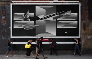
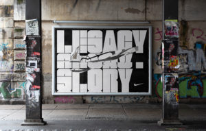
Thierry Brunfaut, Base
Open Lecture
Blanding, The Branding Paradox
Blanding, The Branding Paradox
I’ve come to believe one thing: Brands are like people. Some are understated. Some are loud. Some funny. Some communicate by exclaiming! Some have terrible grammar. Brands aren’t created in a vacuum; they’re products of the world around them. Formed around the strengths and weaknesses of the competition, a brand is as much about what it isn’t as what it is. The point is differentiation; that’s what branding is. That’s why I’m so baffled by the current epidemic of what I call blanding—branding not to stand out at all, but to blend in. With results that are, in a word, bland.
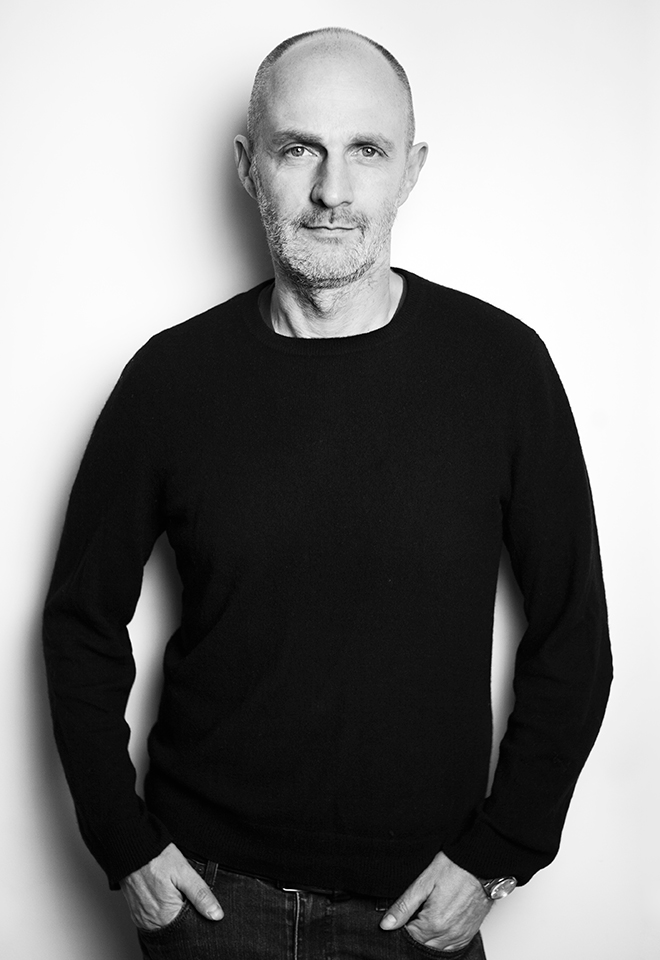
Thierry Brunfaut is a creative director and one of the founding partners of Base Design, the international network of branding studios based in Brussels, New York, Geneva, and Melbourne. He is the author of the renowned 5–Minute poster series, a professor, and a regular speaker at design and branding conferences around the world. Thierry bears a striking and seemingly contradictory resemblance both to Moby and Kermit the frog.
Base Design creates brands with cultural impact. Our team of creatives, strategists, and digital experts design and develop simple yet powerful brands, and build unique personalities. Base knows that branding is first and foremost about people, so specializes in helping companies – whether new or established; large or small – to become human-centric brands with vision, clarity, and empathy. Founded in the early ‘90s, the company has evolved continuously over the years and is now steered by partners across all four studios.


Wednesday,
May 11, 2022
7.30 pm
Vrints-Kolsteren, Off track
Open Lecture
Off track
Off track
In this lecture Vrints-Kolsteren will take you into their creative process. From their sources of inspiration to the way they build visual systems.
Like a game, a visual identity is build up from a set of rules. How to apply these rules will determine the end result. The trick is to navigate freely within the game, like a traveler that goes off track but has a map to feel safe.
Vrints-Kolsteren is an Antwerp based design studio founded by Vincent Vrints and Naomi Kolsteren in 2015, working both locally and internationally. The bureau’s forte is developing visual identities with a clear and strong focus on typography. When working on an identity, they create a system, a set of rules, which can evolve over time.
Additionally, dealing with the organic opposed to rudimentary shapes and straight lines is a recurring narrative within their practice.
Vrints-Kolsteren puts an emphasis on collaboration and likes to work closely with their clients. They don’t want to view the client as a client, in the strict sense of the word, rather they consider all parties to be equal.
Vrints-Kolsteren is influenced by the modernist period, with clear references to that time, its designers and artists, which can be soon in their attention for form, linework, and most importantly, the use of grids and rulesets.


Wednesday,
April 27, 2022
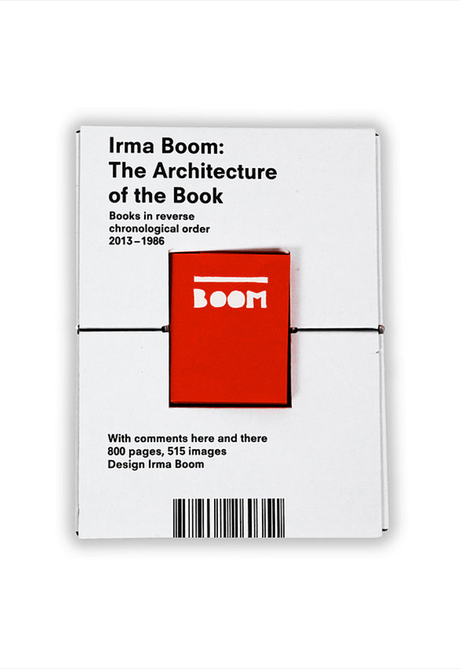
Muriel Cooper + Irma Boom
Bookworm 4
Learning from Las Vegas, 1972
+
The architecture of the book, 2013
Only for MED students
The work of the designers Muriel Cooper and Irma Boom serves to reflect on the phenomenon of the designer as author. Learning from Las Vegas was one of the seminal texts of postmodern architecture, but the design of the book was the cause of confrontation between its authors and Muriel Cooper due to the lack of adequacy between substance and form. A similar case is that of Irma Boom, who claims her creative autonomy in the process of creating the book. Two very strong personalities that refute the image of the “invisible designer”.
Modernism and Postmodernism are the driving forces that have shaped 20th century architecture, art and design.
The Modern Movement began at the end of the 19th century, ran vigorously through the century and began to be questioned at the beginning of the 1960s, before finally fading away in the 1990s with the advent of the Internet and the paradigm shift it brought with it.
The book has been the medium and the message of the diverse movements in the arts during the last century. The book, with its emphatic material presence, takes on a special value now that we are witnessing its dematerialization, reduced to digital data in electronic format.
Over the Bookworm sessions we will explore several iconic books that capture the spirit of the era in which they were designed. We will place the books in their context and try to define what makes them relevant in the history of 20th century book design. The Bookworm sessions are guided by Andreu Jansà, librarian and curator of the Enric Bricall Reserve Fund. The books that make up the collection are documented in the main accounts of the history of 20th century graphic design.


Wednesday,
March 2, 2022
7.30 pm

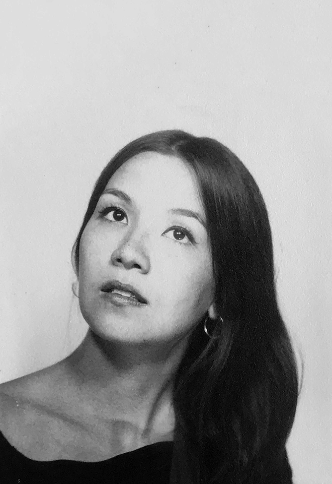
Sarah Boris, Multi-practice
Open Lecture
Multi-practice
In this talk, artist and designer, Sarah Boris will talk about her shifting practice from being an in house designer and art director for some of the leading art institutions in the UK, to setting up her own studio in 2015. She will present some of her personal and non commercial projects that have shaped her practice and are informing new directions including self-published projects such as ‘Global Warming Anyone?’, or her artist book ‘Le Théâtre Graphique’ and her latest sculptural heart shaped bench design.
Sarah Boris is an artist and graphic designer based in London. After working for over ten years for organisations such as Phaidon, the Barbican Centre and the Institute of Contemporary Arts, she set up on her own in 2015, with a focus on visual identities, editorial design and developing her personal art practice. Her clients include The Photographers’ Gallery, Tate, The National Gallery and Christie’s to name a few.
In parallel to commissioned projects Sarah creates screenprinted artworks during artist residencies. Her work was acquired by the Stedelijk Museum, Amsterdam and was exhibited at the Design Museum in London and at Une Saison Graphique, Le Havre, France. She was judge president for D&AD book design in 2016 and is on the graphic design jury for the Latin American Design Awards 2022.


Wednesday,
February 16, 2022
Massin + Sister Corita
Bookworm 3
La cantatrice chauve, 1964
+
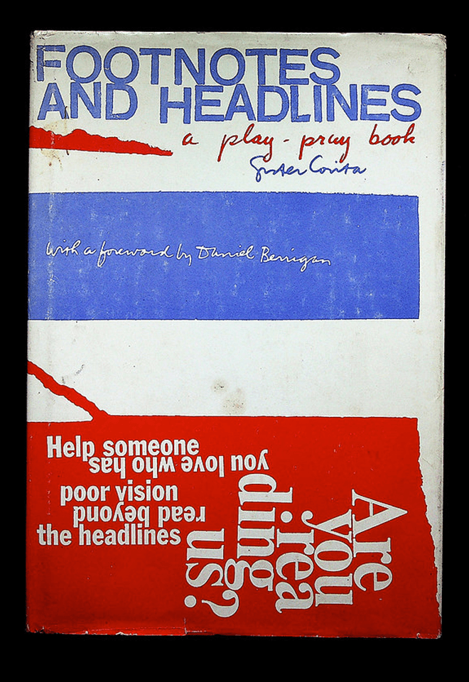
Footnotes and headlines: a play-pray book, 1967
Only for MED students
In the 1960s the modern canon began to be questioned. Social unrest and countercultural movements found their way into graphic design. A new aesthetic far removed from the Swiss grid gave way to playful typographical compositions that connected with the “words in freedom” of the artistic avant-gardes of the early 20th century, especially Futurism and Dadaism. Robert Massin in France and Corita Kent in the USA mastered the use of the printed word in their creations.
Modernism and Postmodernism are the driving forces that have shaped 20th century architecture, art and design.
The Modern Movement began at the end of the 19th century, ran vigorously through the century and began to be questioned at the beginning of the 1960s, before finally fading away in the 1990s with the advent of the Internet and the paradigm shift it brought with it.
The book has been the medium and the message of the diverse movements in the arts during the last century. The book, with its emphatic material presence, takes on a special value now that we are witnessing its dematerialization, reduced to digital data in electronic format.
Over the Bookworm sessions we will explore several iconic books that capture the spirit of the era in which they were designed. We will place the books in their context and try to define what makes them relevant in the history of 20th century book design. The Bookworm sessions are guided by Andreu Jansà, librarian and curator of the Enric Bricall Reserve Fund. The books that make up the collection are documented in the main accounts of the history of 20th century graphic design.


Wednesday,
February 2, 2022
7.30pm

Lucienne Roberts, Is it still ok to be a graphic designer?
Open Lecture
Is it still ok to be a graphic designer?
Influenced as much by feminism as Swiss typography, Lucienne will share her graphic design journey from utopian zeal to dystopian dilemma. She has always considered graphic design to be a political act. In the early days this message was greeted with incredulity but when her book Good: An Introduction to Ethics in Graphic Design hit the streets the subject was inching onto the agenda. Since then, she and colleagues have curated / designed exhibitions about graphic design in health and politics:
(Can Graphic Design Save Your Life? and Hope to Nope: Graphic Design and Politics 2008–18), worked on multiple NGO campaigns; helped spread the word about climate change; and most recently developed the installation Perhaps it’s not you, it’s me. in which Lucienne contemplates ‘leaving’ her long-standing partner Graphic Design. Here she explains why divorce was an option, argues for the value of graphic design and ponders on what we all need to do next.

Lucienne Roberts is founder of design studio LR+ and co-founder of advocacy initiative GD&. A graduate of Central Saint Martins, Lucienne’s practice is characterised by her abiding interest in ethical design. LR+ work spans exhibition design, books and corporate identity. GD& creates vivid books and exhibitions that explore how graphic design connects with all other things. Projects include the originating and co-curation of two critically-acclaimed London exhibitions: Can Graphic Design Save Your Life? and Hope to Nope: Graphics and Politics 2008–18.


January 24 → 28, 2022

Serge Rompza, NODE Berlin Oslo
Workshop
Lost in Translation
Only for MED students
Lost in Translation
On your way to becoming an editorial designer, you are confronted with exploring and producing common formats such as books, magazines or websites. For some time now, the discipline’s range of work has been steadily expanding; demands are changing. Collaboration with other disciplines, working with new formats is more necessary and exciting today than ever.
How can new things emerge in exchange with other specialists? How do we approach unknown formats and what are their characteristics? This workshop week will give us time to challenge ourselves and explore our skills as authors and producers of unconventional or even unknown formats.
Serge Rompza
After graduating from Gerrit Rietveld Academie in Amsterdam, Serge Rompza has co-founded the Berlin and Oslo based design studio NODE in 2003, together with Anders Hofgaard.
The two offices collaboratively focus on identity, print, exhibition and interactive work. Clients include Haus der Kulturen der Welt Berlin, Vitra, MIT Program in Art, Culture and Technology (ACT), Lithuanian Pavilion / La Biennale di Venezia, Office for Metropolitan Architecture (OMA). Since 2004, he has regularly been teaching at art and design academies across Europe.


Wednesday,
January 19, 2022
Max Bill + Karl Gerstner
Bookworm 2
Form, 1952
+
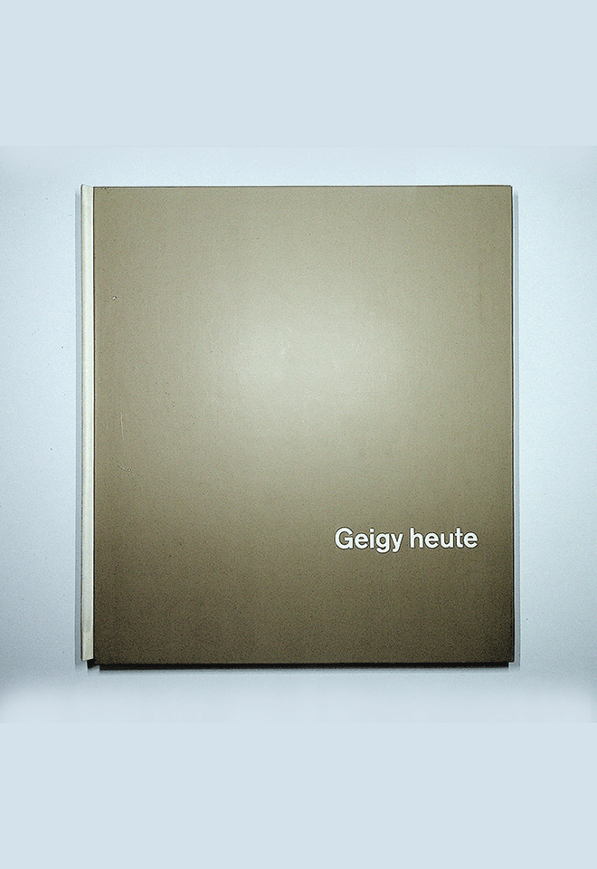
Geigy heute, 1958
Only for MED students
Swiss graphics led the international scene after the Second World War. In the 1950s and 1960s the Swiss style, a refined version of the New Typography, had become the universal solution to any visual communication need from book design to poster design to advertising and corporate image. Max Bill and Karl Gerstner, among many others, created a sophisticated language rooted in the avant-garde to communicate with the consumer society.
Modernism and Postmodernism are the driving forces that have shaped 20th century architecture, art and design.
The Modern Movement began at the end of the 19th century, ran vigorously through the century and began to be questioned at the beginning of the 1960s, before finally fading away in the 1990s with the advent of the Internet and the paradigm shift it brought with it.
The book has been the medium and the message of the diverse movements in the arts during the last century. The book, with its emphatic material presence, takes on a special value now that we are witnessing its dematerialization, reduced to digital data in electronic format.
Over the Bookworm sessions we will explore several iconic books that capture the spirit of the era in which they were designed. We will place the books in their context and try to define what makes them relevant in the history of 20th century book design. The Bookworm sessions are guided by Andreu Jansà, librarian and curator of the Enric Bricall Reserve Fund. The books that make up the collection are documented in the main accounts of the history of 20th century graphic design.


Novembre 29
↳ December 3, 2021

Martin Lorenz, TwoPoints.Net
Workshop
Systemic Type Design
Only for MVD students
Systemic Type Design
We live in a (new) golden age of systemic type design. New technologies and easy to use programmes leveled the playfield for emerging designers and gave them the chance to experiment with new ideas. The world of display fonts has witnessed a lot of new impulses in the last years. Type has become more flexible, variable and kinetic as ever, adjusting efficiently and effectively to new communication channels.
Systemic Type Design is more than designing fonts. A type system is an efficient design tool that helps designers to design. If done well, the act of writing is the act of designing without the need to further layout the text. In this course we will develop an experimental type system that almost automatically generates fantastic design applications.
Martin Lorenz
might as well have become a cook, a comic artist or an architect, were it not for an internship at Müller+Volkmann. Lorenz studied Graphic Design at the University of Applied Sciences in Darmstadt and the Royal Academy of Arts (KABK) in The Hague. After working four years at the design agency Hort, he moved to Barcelona to found TwoPoints.Net with Lupi Asensio and do his MA and PhD in Design Research at the UB. Lorenz has taught since 2006 for Elisava and still likes to cook.