Events are an integral part of the master programs: from workshops with guests professors to lectures series with relevant practitioners.
Wed, Oct 21, 2026
Graphic — Elisava lectures
7.30 pm — Sala Aleix Carrió
Open to the public

Luisa Milani, La Tigre
An illustrated alphabet of vibrant matters
An illustrated alphabet of vibrant matters
La Tigre looks at graphic design as a living material: shapes that breathe, colours that vibrate, signs that shift between the abstract and the figurative. The talk composes an illustrated alphabet of the qualities that guide the studio’s work, from synthesis to colour, from research to play. A journey through forms and words, where visual language becomes a playground and every element, however small, has something to say.
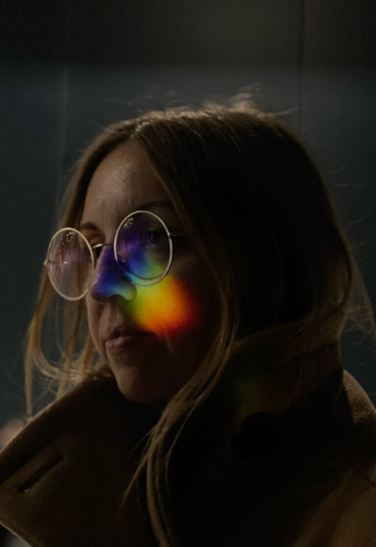
Luisa Milani is the art director and co-founder of the independent graphic design studio LaTigre. She studied at Politecnico di Milano and, a few years later, in 2009, founded the studio. Alongside her practice, she has spent several years teaching. Always in search of the sublime in color and form, her design approach is solid and concrete, yet spontaneous—free from constraints or creative limits. She draws inspiration from everything around her, making intuition a core aspect of her practice. A long-time yoga practitioner, she brings the same balance and awareness to her creative work, leaving room for serendipity, her motto.
La Tigre is a graphic design studio founded and directed by Luisa Milani and Walter Molteni, members of AGI (Alliance Graphique Internationale). Since 2009, the studio has been developing multiform visual languages in which formal research is driven by synthesis and a vibrant use of color, where the boundary between the abstract and the figurative at times becomes blurred. It collaborates with international entities such as Apple, Bitossi Home, Living and Abitare – Corriere della Sera, Max Mara, The New York Times, Phaidon, and Wired USA. Alongside commissioned projects, the studio conducts experimental research across various media.


Wed, Nov 4, 2026
Masters’ Talks
7.30 pm — Event at DHub
Open to the public

Izaskun Chinchilla
Los barrios del buen vivir: A Perspective from Tentative Design
Los barrios del buen vivir: A Perspective from Tentative Design
What if designers made fewer mistakes if they stopped trying to get it right the first time? Neighborhoods of Good Living explore a city understood not as a finished object, but as a living laboratory: spaces that are tested, inhabited, evaluated, and transformed. The lecture will explore the work of Izaskun Chinchilla Architects and the book Neighborhoods of Good Living to ask what happens when design abandons certainty and embraces hypothesis, experimentation, and adaptation. A perspective from tentative design to conceive of well-being as something experienced collectively.

Izaskun Chinchilla, a professor at the Bartlett School of Architecture, University College London (UCL), and an honorary fellow of the Royal Institute of British Architects (RIBA), integrates ecology, care, and participation into her practice, research, and teaching. Her work promotes more equitable and sustainable cities. She combines design, critical thinking, and cultural knowledge to promote an architecture that is educational, cooperative, and oriented toward the common good. She is the author of La ciudad de los cuidados (Catarata, 2021) and Los barrios del buen vivir (Catarata, 2026).
Izaskun Chinchilla Architects is a group of architects led by Izaskun Chinchilla that brings together interdisciplinary teams for each project. Their work focuses on optimizing the environmental performance of architecture, public space, facilities, art, and cultural products through innovation. Public engagement and social participation are pillars of their practice, which promotes collaboration in the construction of shared spaces and community-based decision-making regarding the use, location, and characteristics of the facilities they design.


past events
Wednesday,
November 24, 2021
7.30 pm

Yehwan Song, Experimental Websites
Open Lecture
Experimental Websites
This lecture talks about the diverse trials faced when attempting to expand the range of our capacity within web environments by questioning standard web design templates. The talk features Anti-User-Friendly, an ongoing project that challenges the concept of user-friendliness by creating a content-focused website.
Web tools work as a bridge connecting the user and the device-website to narrow the world wide web down to a ‘village wide web’ and transform the web into an extended space.
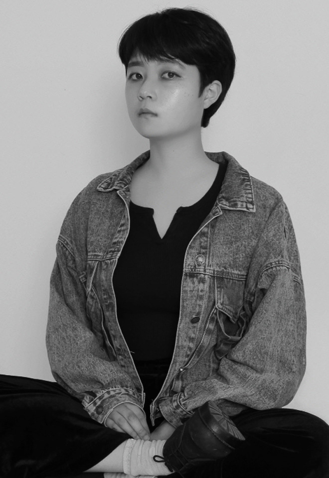
Yehwan Song is a graphic web designer. She runs her own independent design studio focusing on the strategic use of technologies. Her work involves projects with multiple cultural organizations, including ifa, LIMA Media Art, Rhizome, Typojanchi, and Seoul Museum of Art.
She has participated in a number of exhibitions—Venice Biennale (Korean pavilion), Seoul Biennale(SBAU), and others; and her works have been featured in such magazines as Étapes, Monthly DESIGN, It’s Nice That, among others.
Yehwan Song Studio is a web design and a web development studio questioning standardized design and interface conventions that frame users’ behavior and the templates that make them lose their content awareness and become accustomed to oversimplification. We construct outside-the-frame devices and interfaces in order to challenge the notion of user-friendliness. We pursue diversity and variety in the web environment above efficiency.


Wednesday,
November 17, 2021

Esteve Padilla, 131
Showcase
Typography and collective memory
We will reflect from some projects elaborated in 131 during the last years, in which starting from typography we work to recover the local and collective memory.
Esteve Padilla.
Barcelona, 1983
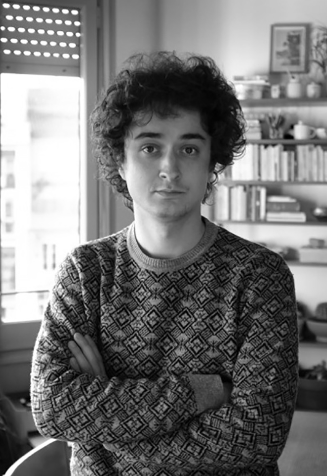
Graphic designer, half of the 131 studio and occasional teacher at various universities. Graduated in graphic design at Eina (UAB).
131
(Pau Llop, Esteve Padilla) is a graphic design office based in Barcelona and Lleida. Typography understood as image, form or letter is a substantial element in all the projects we do. Our work includes art direction, identities, editorial projects, websites and typography.


Wednesday,
November 10, 2021

Anna Berbiela, Pràctica
Case studies
Pràctica: Process
Pràctica: Process
Pràctica does not have a style, but it follows a process; In this session, we will analyze, through the case studies of the latest studio projects, the process that Pràctica follows to develop its work.
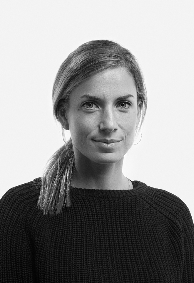
Anna Berbiela
Graphic designer based in Barcelona. Anna founded the studio Pràctica together with Javier Arizu, Carlos Bermúdez and Albert Porta in 2018. With offices in Barcelona and New York, Pràctica is a studio that works for institutional, cultural, and commercial clients, developing communication projects in printed, digital, and environmental matters.
Pràctica is a full-service design studio based in Barcelona and New York. Working for institutional, cultural, and commercial clients, always seeks powerful concepts, bold visual codes, and customized solutions for each project. This is translated into a very eclectic job; Their style is the lack of one, it’s finding the best solution for each project.


Wednesday,
November 3, 2021

Miquel Hervás, Book Bindery Rietveld Academy
Showcase
The act of making something public
The act of making something public
This session addresses the methods, tools and implications of publishing activities.
— What does the publication does/mean? And how is it going to exist/circulate?
— How does it achieve its aspirations through form?
— How do content, editorial concept and design come together?
— How to think publishing as complement and supplement to working practices?
— In which terms can ‘making public’ act as a tool for bringing common shared interests and concerns?
Book Bindery
The BB allows the production of books and publications in small editions and specific manipulations of paper and cardboard. All processes are always done entirely by hand and pushing the limits of what is possible.
Next to being a technical workshop, the BB functions as a cross-departmental point in our institution. We believe the publishing practice is an emancipatory process. We support project such as: PUB.sandberg.nl, Radio Rietveld and Rietveld Journal.
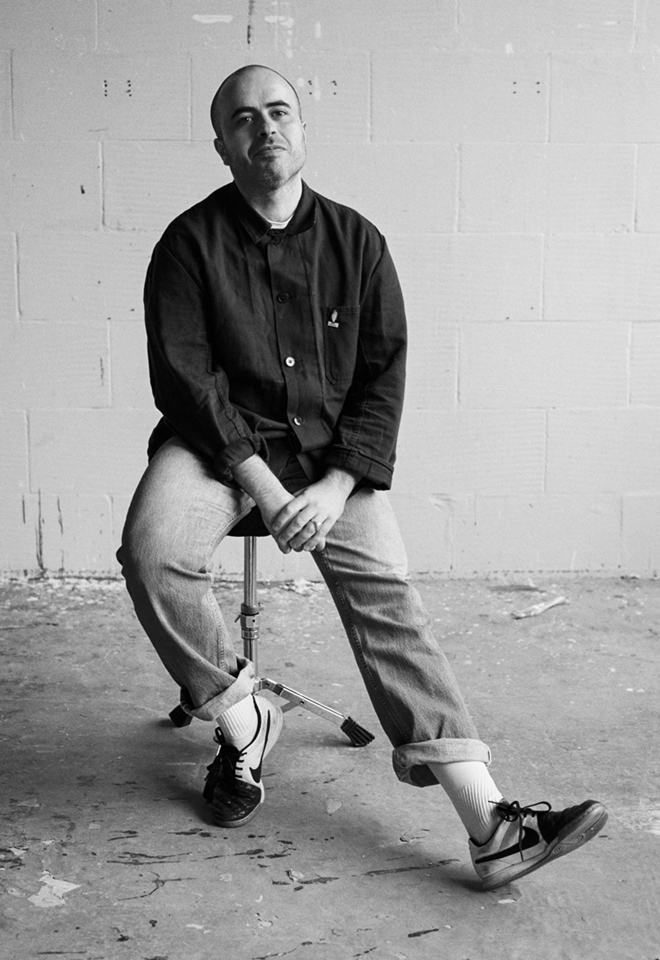
Miquel Hervás Gómez
(Terrassa, 19 April 1985). Handy graphic design freelancer based in the www. Running as a workshop manager at the BB. Tutor for Disarming Design at the Sandberg Instituut and Preparatory Course at the Gerrit Rietveld Academie, while being member of fanfare and Carne Kids.


Wednesday,
November 3, 2021

Miquel Hervás, fanfare
Case studies
Spatial publishing
fanfare was established in the observation of a context, a network, within which design and art interactions resulted in projects not suiting within the existing platforms for presentation. fanfare creates a framework to connect already existing structures. What organically happened in this context was the creation of new structures, new networks, new initiatives. We allow ourselves in the context of today to speak about fanfare as framework for (non)physical publishing.
fanfare is a platform and design studio for cross-disciplinary collaboration and visual communication. Through an active programme, fanfare generates, explores, and curates environments for visual interactions.
Since the start in 2014, fanfare has created a unique space for experiments, explorations and collaborations in the realm of graphic design and related disciplines. Through their research and design practice, fanfare sharpens and challenges the notion of visual communication.
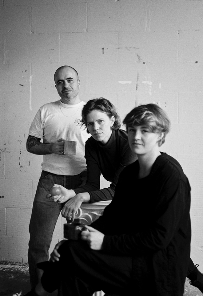
Miquel Hervás Gómez
(Terrassa, 19 de abril de 1985). Diseñador gráfico autónomo afincado en la www. Funcionando como jefe de taller en la BB. Tutor de Disarming Design en el Sandberg Instituut y del Curso Preparatorio en la Gerrit Rietveld Academie, a la vez que miembro de fanfare y Carne Kids.


Wednesday,
October 27, 2021
7.30 pm

Ruben Pater, CAPS LOCK
Open Lecture
CAPS LOCK
How capitalism took hold of graphic design,
and how to escape from it.
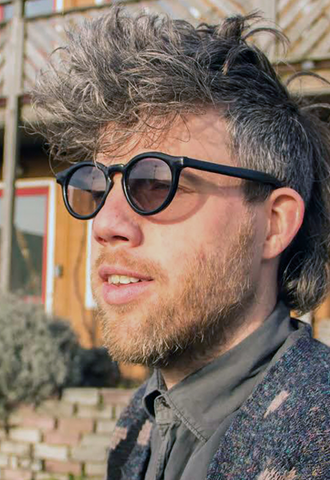
Ruben Pater (1977, NL) (he/him) works between journalism and graphic design. Under the name Untold Stories, Pater creates visual narratives that support solidarity, justice, and equality. Pater finds himself being a designer at a time when design is last thing the world needs. Until more ethical approaches present themselves, he designs, writes, and teaches. He is a tutor at the BA Graphic Design, and the MA Non Linear Narrative at KABK. The Politics of Design, is his first book about cultural bias in graphic design. His second book CAPS LOCK looks at the role of graphic design in capitalism.
CAPS LOCK
Capitalism could not exist without the coins, notes, documents, graphics, interfaces, branding and advertisements; artefacts that have been (partly) created by graphic designers. Even anti-consumerist strategies such as social design and speculative design are being appropriated within capitalist societies to serve economic growth. It seems that design is locked in a system of exploitation and profit, a cycle that fosters inequality and the depletion of natural resources.
CAPS LOCK uses clear language and striking visual examples to show how graphic design and capitalism are inextricably linked. The book contains many case studies of designed objects related to capitalist societies and cultures, and also examines how the education and professional practice of (graphic) designers supports the market economy and how design practice is caught within that very system.
CAPS LOCK is an inspirational book full of sources for design students, educators and visual communicators all over the world, just like Ruben’s first book The Politics of Design.


Wednesday,
October 27, 2021
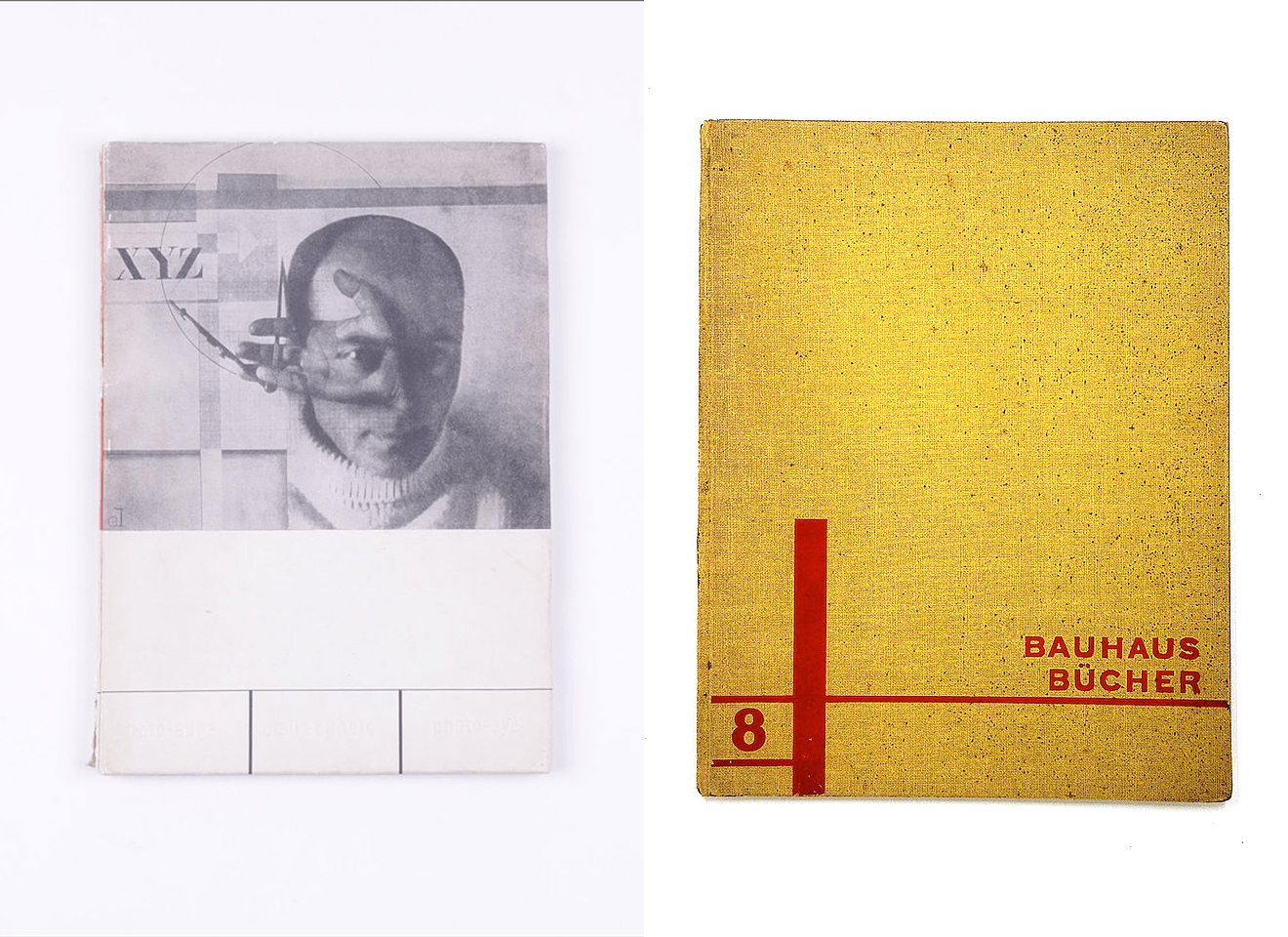
László Moholy-Nagy + Jan Tschichold
Bookworm 1
Malerei, Fotografie, Film, 1925
+
Foto-Auge, 1929
Only for MED students
Two crucial works of New Typography, the avant-garde movement that revolutionised graphic design in the interwar period. The increasing availability of the photographic image played a fundamental role in this new approach to editorial design. Moholy-Nagy, a member of the legendary Bauhaus, and Jan Tschichold, author of the landmark work Die neue Typographie, radically changed the face of the printed page, producing a lasting impact whose effects continue to this day.
Modernism and Postmodernism are the driving forces that have shaped 20th century architecture, art and design.
The Modern Movement began at the end of the 19th century, ran vigorously through the century and began to be questioned at the beginning of the 1960s, before finally fading away in the 1990s with the advent of the Internet and the paradigm shift it brought with it.
The book has been the medium and the message of the diverse movements in the arts during the last century. The book, with its emphatic material presence, takes on a special value now that we are witnessing its dematerialization, reduced to digital data in electronic format.
Over the Bookworm sessions we will explore several iconic books that capture the spirit of the era in which they were designed. We will place the books in their context and try to define what makes them relevant in the history of 20th century book design. The Bookworm sessions are guided by Andreu Jansà, librarian and curator of the Enric Bricall Reserve Fund. The books that make up the collection are documented in the main accounts of the history of 20th century graphic design.


Wednesday,
October 20, 2021

Santi Fuster, Bendita Gloria
Showcase
“La langue est fasciste”
Two hours filled with semantics, politics and graphic design, appropriately illustrated with works by Bendita Gloria.
Santi Fuster
Graphic designer.
50% of Bendita Gloria.
Bendita Gloria is a design studio founded by Alba Rosell and Santi Fuster. Focusing on identity and editorial projects, their work has won certain attention because of its particular conceptual approach. Since 2007, Bendita Gloria strives to turn their projects into interesting reading matter.


June 18 → 24, 2021

MADDhouse #3, Behind the fear
Exhibition
Maria Moreso
MUTUO
Méndez Núñez, 7
08003 Barcelona
Throughout our lives, women, or people with vaginas, will visit the gynecologist multiple times. The Public Health recommendation is to do it every 1-3 years, depending on individual circumstances, however, more than 50% of women will not follow this recommendation. It is not news that almost no woman likes going to the gynecologist. Unfortunately, feeling anxiety, fear, vulnerability, shame, and discomfort are part of the common experience of many women when visiting this specialist. But, why do we experience it this way?
The lack of sensitivity and empathy towards a patient in an extremely vulnerable position, the judgment, infantilization, paternalism, the lack of scientific advancement, misinformation, the taboo or normalization of female pain are some of the subtle forms of patriarchal violence that women suffer in relation to our intimate health. A violence that occurs in a medical context where, apparently, the values of care and attention prevail, and where precisely the opposite of violence is expected.
Gynecological violence affects half the population, it is a complex and systemic problem in which a multitude of factors intervene and in which we all participate more or less consciously. This exhibition seeks to detect and denormalize these situations as an indispensable first step for change.


June 11 → 18, 2021

MADDhouse #2, Body Builders
Exhibition
Carla de la Torre
MUTUO
Méndez Núñez, 7
08003 Barcelona
We live in a “fit” society, where gyms are temples of transformation towards a globalized stereotype. The cult of the body plans and controls our daily routines and ends up shaping our identity, fueling the fitness industry, which is only growing.
At the same time we are in the age of information, of data; it is said that having information is power, and we can apply it to this fitness paradigm as well. We design our body in gyms by entering data (15 repetitions of squats for 3 sets, 100 grams of rice…) para construir el cuerpo ideal and at the same time gain individual power. The beauty acaba siendo algo measured, weighed, equated, and compared.
The bodies that visualize this in the most extreme way are body-builders. Mass body, corporal and data body, representing a bodily ideal of power. We all see this social group as far from our reality, but the body-builders of the past are the fitness followers of the present.
Sport today has become a complex commercial, political and social activity, where the healthy body is confused with the aesthetic body, moulding the canons of beauty and our self-esteem at will. And the way we get entangled is by following these data rituals.


April 20 → June 11, 2021
Àgora Elisava

Óscar Germade, Job Title: Art Director
Exhibition
Job Title: Art Director.
About Vogue Spain 2017/2021.
Design, Typography & Photography.
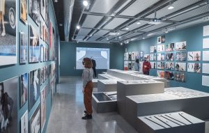
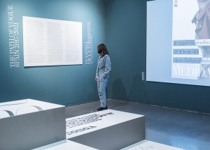
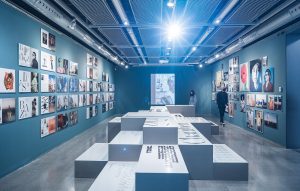
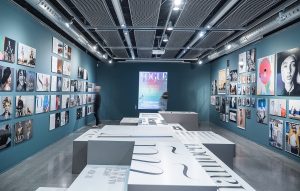
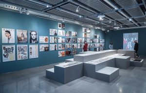
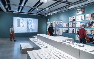
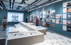
The exhibition traces the work as art director of Vogue Spain of Óscar Germade, between 2017 and 2021. The space is divided into four parts: Art Direction, linked to the visual part and design direction of the magazine. Covers, with a review of the work on covers of the last four years. “Making of”, where the design process of each part of the magazine is shown, from a technical and specific point of view.
Typography, with a purely visual retrospective of the design of Chamberí, ad-hoc typography designed by Íñigo Jerez for the magazine, which Eugenia de la Torriente, director of the magazine between January 2017 and December 2020, describes “Chamberí is a seemingly irreconcilable combination of rationality and exuberance. It starts from a very Cartesian skeleton, but has a final visual part of a more folkloric spirit, if it can be called that, thanks to a series of details that refer to Spanish tradition such as accents, crossbars and ascending curves. As it grows, it is playful, joyful and warm, and so far removed from its rational base that it is hard to recognize it.”
The sum of these spaces is a complete immersion in the work involved in the art direction of a fashion magazine today, with the complexity of inheriting the history of a masthead like Vogue, linked to figures of enormous transcendence such as Alexander Liberman: “art director of Vogue in the US and editorial director of Condé Nast, and who in his more than 50 years at the company laid the foundations of this masthead and many others. Liberman’s layouts were very simple because he made a very direct use of layout, with few flourishes in the text. In recent decades, the trend in fashion magazines has been precisely the opposite: many elements per page, shaped boxes…” (Eugenia de la Torriente).
This work of design and art direction is not only aware of the historical part but also of the complex moment in which the big publishing houses are living, adapted to a digital reality where they coexist with new visual proposals.
The tour ends with an extensive review of the Vogue covers of the last four years that, in an organic way, shows a definite evolution and a clear direction of the commitment to iconic covers, based on the image and memorable for the audience.






June 2 → 10, 2021

MADDhouse #1, Nationalities
Exhibition
Pedro Vallejo
MUTUO
Méndez Núñez, 7
08003 Barcelona
Nationalities are universal, they affect and surround every person in the world, they are really a vital factor in your personal development, and it’s something you don’t initially get to choose. While It may appear in the western world that we live in a globalized and free world, freedom and mobility can turn into a really individual process depending on what nationality you have.
By exploring the concept of nationalities as something imposed by globalized standards, this project seeks to reveal a critical perspective and explore in different ways the global inequalities we already think we know. As well as reveal the way the world is gonna process you and treat you in some cases –addressing it through a symbolic form of how we represent nationalities.
This exploration seeks to give a new perspective and spark a conversation regarding our identity and how we relate with one’s own nation and the world in general. As a society, the nationalities’ principles are forced and untouchable and there’s no space to question them, and can’t help but wonder if the world as we know it could exist if we revise flags, borders, international law and passports.


