Events are an integral part of the master programs: from workshops with guests professors to lectures series with relevant practitioners.
Wed, Oct 21, 2026
Graphic — Elisava lectures
7.30 pm — Sala Aleix Carrió
Open to the public

Luisa Milani, La Tigre
An illustrated alphabet of vibrant matters
An illustrated alphabet of vibrant matters
La Tigre looks at graphic design as a living material: shapes that breathe, colours that vibrate, signs that shift between the abstract and the figurative. The talk composes an illustrated alphabet of the qualities that guide the studio’s work, from synthesis to colour, from research to play. A journey through forms and words, where visual language becomes a playground and every element, however small, has something to say.
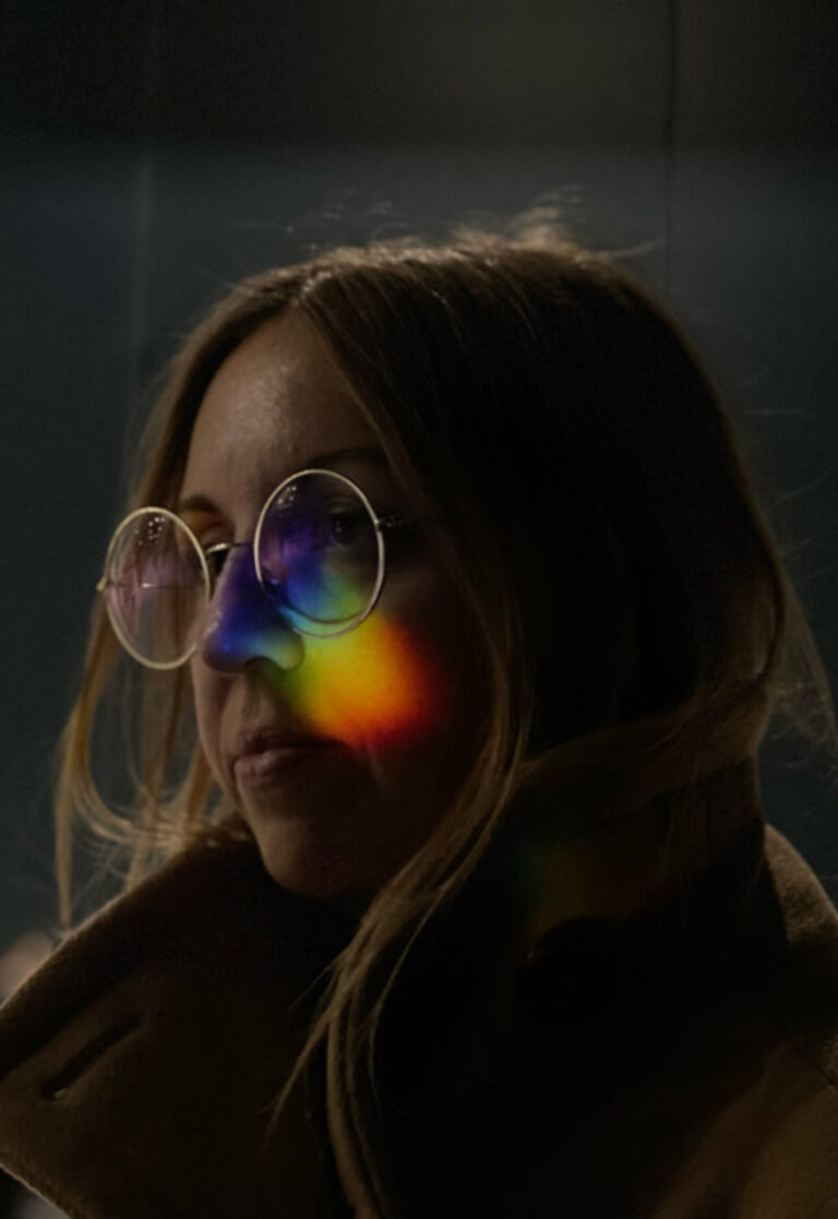
Luisa Milani is the art director and co-founder of the independent graphic design studio LaTigre. She studied at Politecnico di Milano and, a few years later, in 2009, founded the studio. Alongside her practice, she has spent several years teaching. Always in search of the sublime in color and form, her design approach is solid and concrete, yet spontaneous—free from constraints or creative limits. She draws inspiration from everything around her, making intuition a core aspect of her practice. A long-time yoga practitioner, she brings the same balance and awareness to her creative work, leaving room for serendipity, her motto.
La Tigre is a graphic design studio founded and directed by Luisa Milani and Walter Molteni, members of AGI (Alliance Graphique Internationale). Since 2009, the studio has been developing multiform visual languages in which formal research is driven by synthesis and a vibrant use of color, where the boundary between the abstract and the figurative at times becomes blurred. It collaborates with international entities such as Apple, Bitossi Home, Living and Abitare – Corriere della Sera, Max Mara, The New York Times, Phaidon, and Wired USA. Alongside commissioned projects, the studio conducts experimental research across various media.


Wed, Nov 4, 2026
Masters’ Talks
7.30 pm — Event at DHub
Open to the public

Izaskun Chinchilla
Los barrios del buen vivir: A Perspective from Tentative Design
Los barrios del buen vivir: A Perspective from Tentative Design
What if designers made fewer mistakes if they stopped trying to get it right the first time? Neighborhoods of Good Living explore a city understood not as a finished object, but as a living laboratory: spaces that are tested, inhabited, evaluated, and transformed. The lecture will explore the work of Izaskun Chinchilla Architects and the book Neighborhoods of Good Living to ask what happens when design abandons certainty and embraces hypothesis, experimentation, and adaptation. A perspective from tentative design to conceive of well-being as something experienced collectively.

Izaskun Chinchilla, a professor at the Bartlett School of Architecture, University College London (UCL), and an honorary fellow of the Royal Institute of British Architects (RIBA), integrates ecology, care, and participation into her practice, research, and teaching. Her work promotes more equitable and sustainable cities. She combines design, critical thinking, and cultural knowledge to promote an architecture that is educational, cooperative, and oriented toward the common good. She is the author of La ciudad de los cuidados (Catarata, 2021) and Los barrios del buen vivir (Catarata, 2026).
Izaskun Chinchilla Architects is a group of architects led by Izaskun Chinchilla that brings together interdisciplinary teams for each project. Their work focuses on optimizing the environmental performance of architecture, public space, facilities, art, and cultural products through innovation. Public engagement and social participation are pillars of their practice, which promotes collaboration in the construction of shared spaces and community-based decision-making regarding the use, location, and characteristics of the facilities they design.


past events
Apr 15 — 19, 2024
workshop
Serge Rompza, NODE Berlin
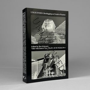
Bootleg Week
Only for MED students
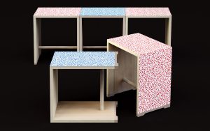
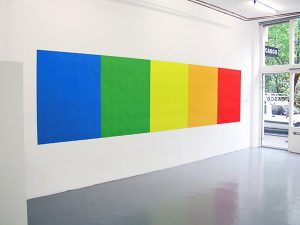
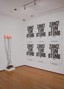
In this workshop, we will turn bootlegging into a method and examine the phenomenon that originally developed from smuggling and pirating into a common practice in the music and fashion sector, but today also in the world of graphic design and branding. Your task will be to develop your own bootleg and explore the boundaries between piracy, homage and re-creation. The choice of media is expected to be free.
How do you want to position yourself and your way of working in a world in which your work is influenced by countless impressions, especially from the Internet and social media. Today you have access to many sources of information and influences. To what extent do you allow your work to be influenced by other styles and methods, and how can you claim authorship for your work? Who owns an idea? We will try to approach this topic in the workshop and discuss it. Have fun!
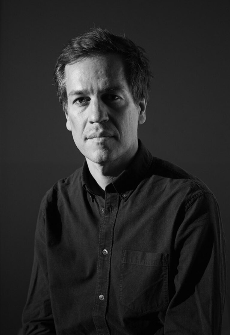
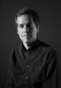
After graduating from Gerrit Rietveld Academie in Amsterdam, Serge Rompza has co-founded the Berlin and Oslo based design studio NODE in 2003, together with Anders Hofgaard. The two offices collaboratively focus on identity, print, exhibition and interactive work. Clients include Haus der Kulturen der Welt Berlin, Vitra, MIT Program in Art, Culture and Technology (ACT), Lithuanian Pavilion / La Biennale di Venezia, Office for Metropolitan Architecture (OMA).
Since 2004, he has regularly been teaching at art and design academies across Europe.
Wed, Apr 10, 2024
masters’ talks
7.30 pm — Event at DHub
Open to the public
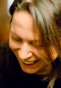
Irma Boom
Boom & Book
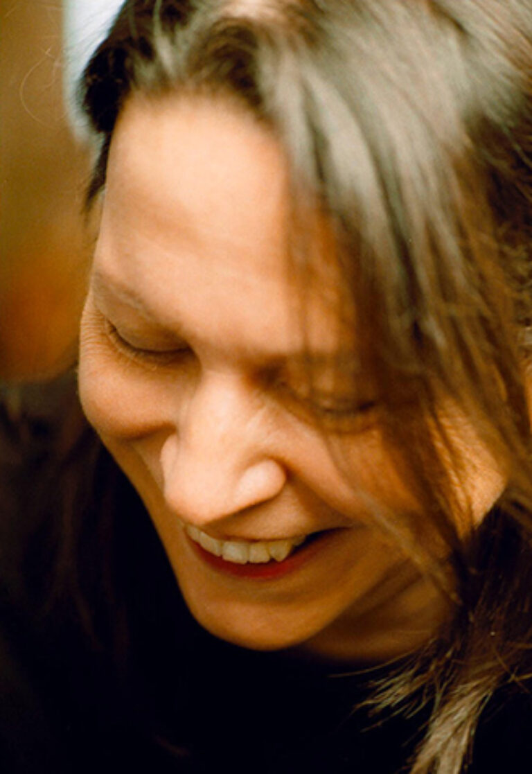
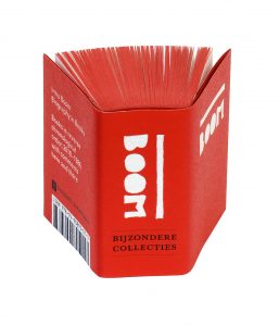
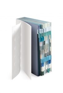
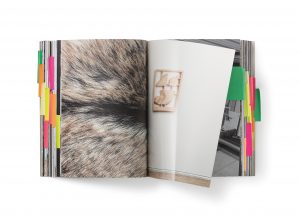
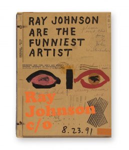
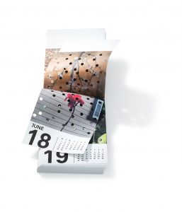
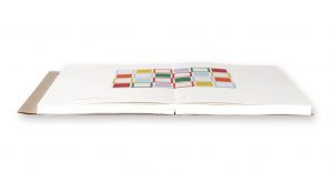
Irma Boom is a bookmaker based in Amsterdam. She has created over five hundred books. Her experimental approach often challenges the conventions of traditional books in both physical design and printed content. Since 1992, Boom has been senior critic at Yale University, New Haven, Connecticut, and she gives lectures and workshops worldwide. She has received many awards for her book designs and, in 2001, was the youngest person ever to receive the Gutenberg Prize.
Boom’s books are in the permanent collections of the Museum of Modern Art, New York; Art Institute of Chicago; Vatican Library; and Centre Pompidou, Paris, among other institutions. The Special Collections of the University of Amsterdam collect her complete oeuvre. In 2014, Boom received the Johannes Vermeer Award, the Dutch state prize for the arts. In 2019, she received an honorary doctorate from the Royal College of Art, London.
The Survival of the Book or The Renaissance of the Book!
The distribution of information has always been dependent on its changing form. The classic book can’t escape that and is now feeling it acutely. The digital book is decidedly on the rise. But its appearance in the form of flat, digital images need not threaten the three-dimensional book. The new competition even encourages us to explore the intrinsic characteristics of the printed book more intensely.
I think we stand on the verge of a new flourishing of the classic book. Perhaps it has even begun already: the Renaissance of the book. For the printed book, preconceived layouts are a thing of the past. The book designer must first become thoroughly familiar with the content before beginning the actual task at hand: conceiving a structure and a form. One can compare designing a book to performing a piece of music: a conductor explores the music and interprets it. The book designer is an editor and director of texts and images.
The result of this effort is the freezing of time and information, which is a means of reflection; compare it to a photograph or a painting. An image at a given moment serving as a reference of time and place. The flux inherent in the internet doesn’t allow you that kind of time. The printed book is final and thus unchangeable. Moreover, the extra use of base materials and man-hours (with printing and binding) forces you, to some degree, to make conscious choices.
I make books where content and form are closely connected. The content of the material very much determines the design. This makes each book unique: never the result of routine treatment. My books have a physical presence through their dimensions, scale and weight. Their form may be emphatic, but it is always determined by the content. The need for the book’s intimacy – the paper, the smell of ink – is certainly not nostalgia or false sentiment.
The printed book is a fundamental and integral part of our tradition and culture, of published and public knowledge and wisdom. The book is dead. Long live the book!
Wed, Apr 3, 2024
graphic.elisava lectures
7.30 pm — Sala Aleix Carrió
Open to the public
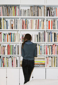
Julie Peeters
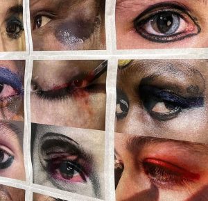
EYES
Open to the public
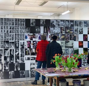
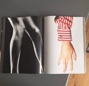
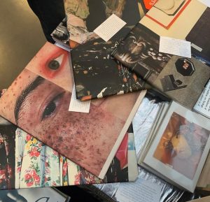
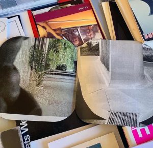
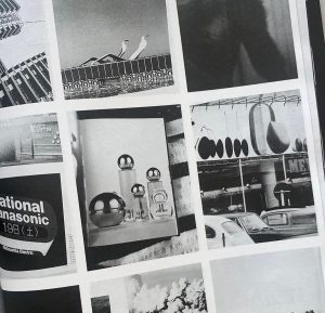
In my work as an independent graphic designer I’ve always been very focussed on images and how the printed image can communicate ideas and be read. For my lecture I would like to focus more on this, and explain how I’ve explored this throughout different projects. Starting from a few commissions to my self initiated work with BILL magazine and related publications, as well as MMDC a series of publications portraying libraries.
I will discuss my role as a graphic designer in commissioned projects, how these projects feed into editing BILL, the importance of paper and exploring the offset printing process and how I distribute my own publishing through curated events and gatherings.
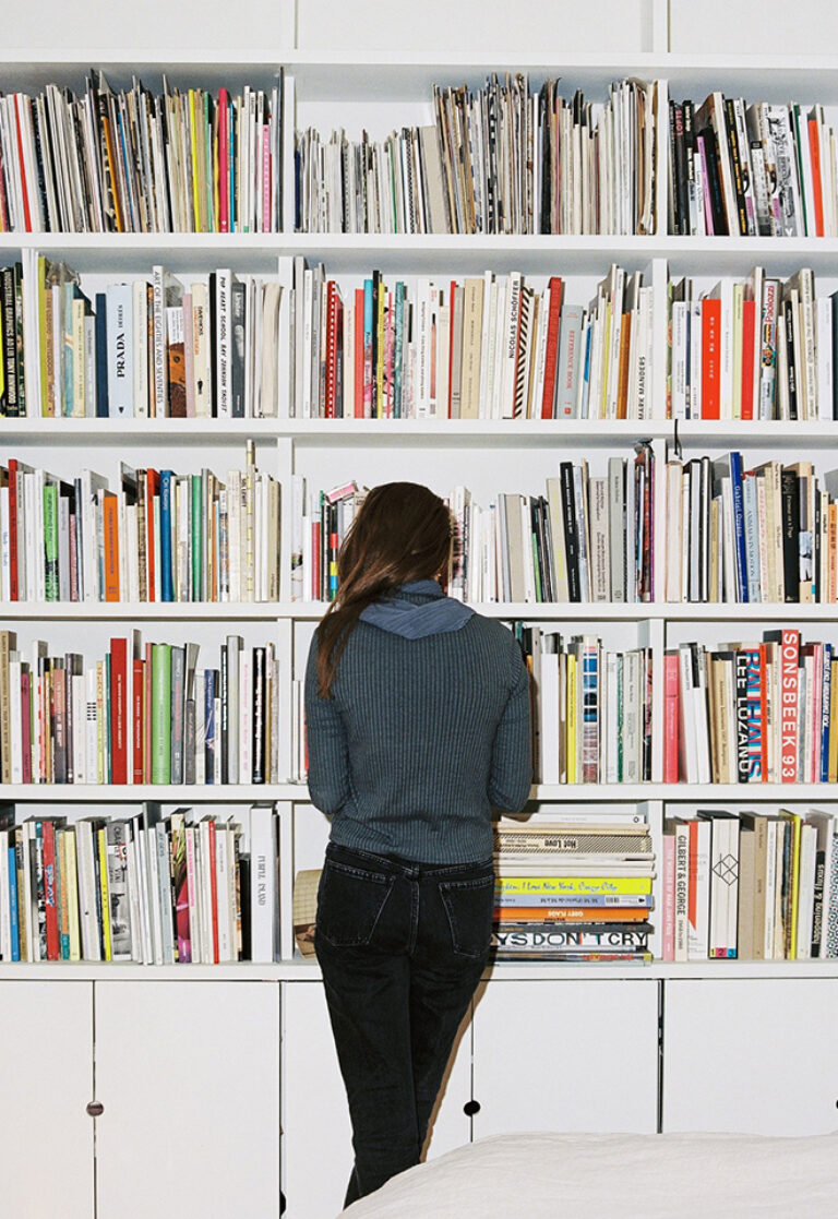
Julie Peeters (Hasselt, BE) is a designer and editor based in Brussels. She studied graphic design at Sint Lukas in Ghent, was a researcher at the Jan Van Eyck Academy (Maastricht) and graduated from the Werkplaats Typografie in 2009. Working closely with artists, photographers and curators around print is the core of her practice. In 2021, she presented her first solo exhibition, Daybed, at MACRO in Rome. Julie has worked on artist books with Linder Sterling, Silke Otto Knapp, Rosalind Nashashibi, Yuji Agematsu, Thomas Demand among many others.
Julie is the founder and creative director of BILL, an annual magazine of photographic stories and a publisher of slow visual material. Peeters has taught at the Gerrit Rietveld Academy, Amsterdam, and currently teaches at KASK School of Arts, Ghent.
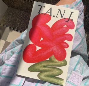
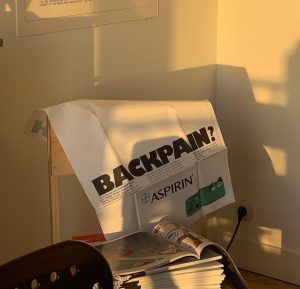
Overlapping design and visual arts with an editing, publishing and educational practice, my work explores the possibilities of printed matter as a medium and what it means to edit through design. In 2017 I founded BILL, an annual periodical that takes the form of a glossy magazine without words, presenting a collection of visual essays by invited contributors that explore the potential of printed images in a digital age.
My practice both questions and celebrates the power of print. By combining the roles of editor-in-chief and art director I use BILL as a tool to investigate ways to both create and present content, as well as a vehicle to investigate the possibilities of printing.
Once printed, BILL becomes a prompt for discussions on image distribution and consumption, how images are read on a page and what it means to publish a printed object in a time of climate collapse and digital communication
Mar 18 — 22, 2024
workshop
Jorge León & Mikel Romero, León Romero
Logographic Systems
Only for MVD students
A logographic writing system is a type of writing system in which each symbol or logogram represents a whole word or a significant concept. In this workshop, we will create a new writing system that is directly linked to the human experience based on a series of concepts. To do this, we will appropriate the cultural, visual, historical… references from different existing ethnic tribes that will give us a starting point from which students can develop the exercise.
The student will refine both their conceptual ability and their synthesis capacity for the ideation of a graphic system and will develop sensitivity towards form/counterform from a visual perspective. We aim to raise awareness of the cultural value of writing itself, exploring conceptual and formal boundaries, paving the way for experimentation and research.
LEÓN ROMERO is a Barcelona-based visual communication studio founded by Jorge León and Mikel Romero. The studio takes a collaborative approach to creative direction and graphic design to produce bold, functional solutions for culture and commerce.
Driven by typographic design, LEÓN ROMERO provides an array of services including visual identity, graphic campaigns, editorial and web design, packaging, and art direction. The studio maintains a strong relationship with a vibrant network of photographers, illustrators, editors and copywriters to deliver projects both large and small.
Wed, Mar 20, 2024
bookworm
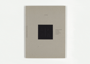
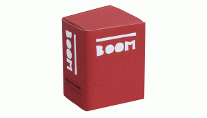
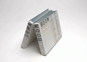
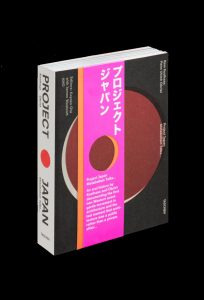
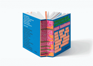
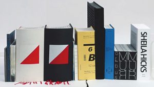
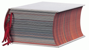
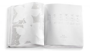
Irma Boom's books
Only for MED students
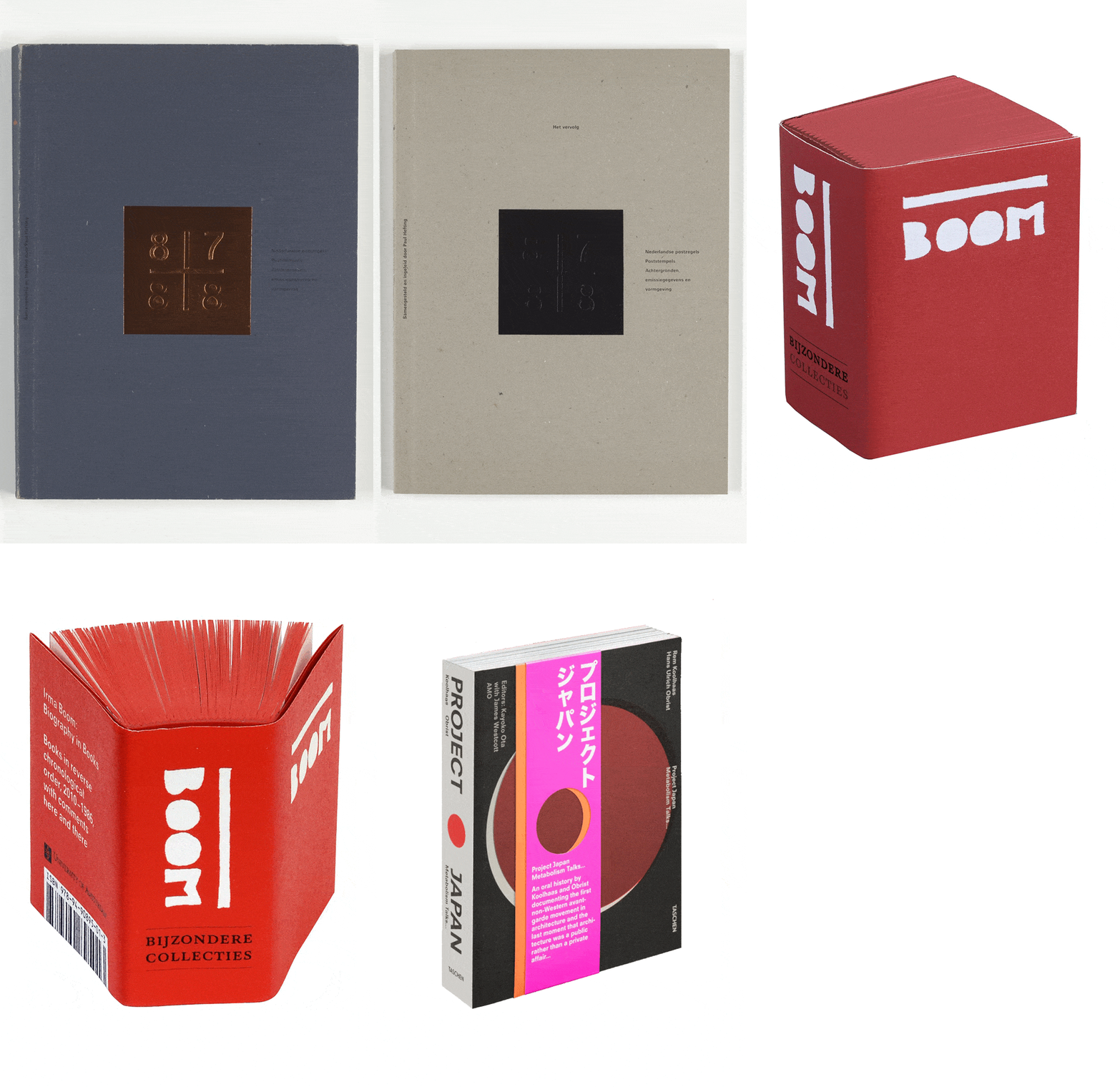
Irma Boom’s books
The Dutch designer is one of the leading figures in contemporary editorial design. Since the beginning of her career in the mid-1980s, Irma Boom has contributed to the revaluation of the book as an object, questioning the primacy of the electronic format that some predicted. Her books have a material quality that goes beyond the content.
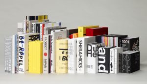
Over the Bookworm sessions we will explore several iconic books that capture the spirit of the era in which they were designed. We will place the books in their context and try to define what makes them relevant in the history of 20th century editorial design. The Bookworm sessions are guided by Andreu Jansà, librarian and curator of the Enric Bricall Reserve Fund.
Wed, Mar 13, 2024
graphic.elisava lectures
7.30 pm — Sala Aleix Carrió
Open to the public
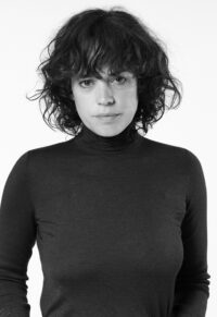
Julia Born
Title of the Talk
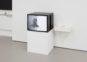
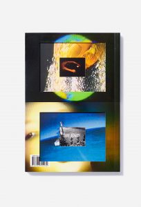
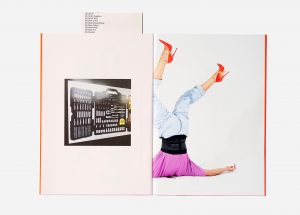
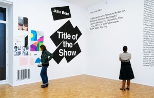
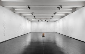
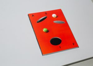
The design of a book and of an exhibition are two distinct yet interrelated practices. While both are spatial concepts through which narratives are articulated and displayed, they manifest under different physical and disciplinary conditions. Julia Born’s practice encapsulates an inquiry into these formats, challenging them and expanding the notion of design across media and disciplines. Language and its ambiguous qualities are at the center of her project, which she explores through commissioned and independent work—for instance her recent solo show All Capitals at MACRO in Rome, or various collaborations with choreographer Alexandra Bachzetsis.
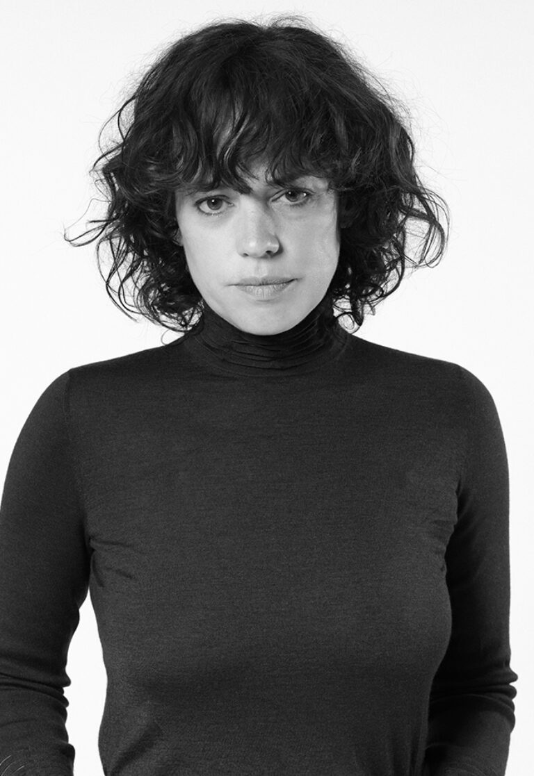
© Diana Pfammatter
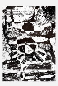
Julia Born is a designer and educator based in Zurich. Her work focuses on editorial design, exhibition design, and graphic identities for a variety of cultural institutions, including Stedelijk Museum and Rijksakademie van beeldende kunsten in Amsterdam; Kunsthalle and Kunstmuseum Basel; Guggenheim Museum in New York; HKW and Brücke-Museum in Berlin; and documenta 14 in Athens/Kassel.
She has designed monographs for artists such as Michel Auder, Miriam Cahn, Vivian Suter, and Elisabeth Wild. Born teaches editorial design at Master Type Design at ECAL, École cantonale d’art de Lausanne, and is a visiting lecturer at international art and design institutes. Solo exhibitions include All Capitals (MACRO—Museo d’Arte Contemporanea di Roma, 2022) and Title of the Show (Galerie für Zeitgenössische Kunst Leipzig, 2009). Born is the recipient of the Swiss Grand Award for Design, awarded by the Swiss Federal Office of Culture in 2021.
Wed, Mar 6, 2024
bookworm
Emigre magazine
Only for MED students
Emigre magazine
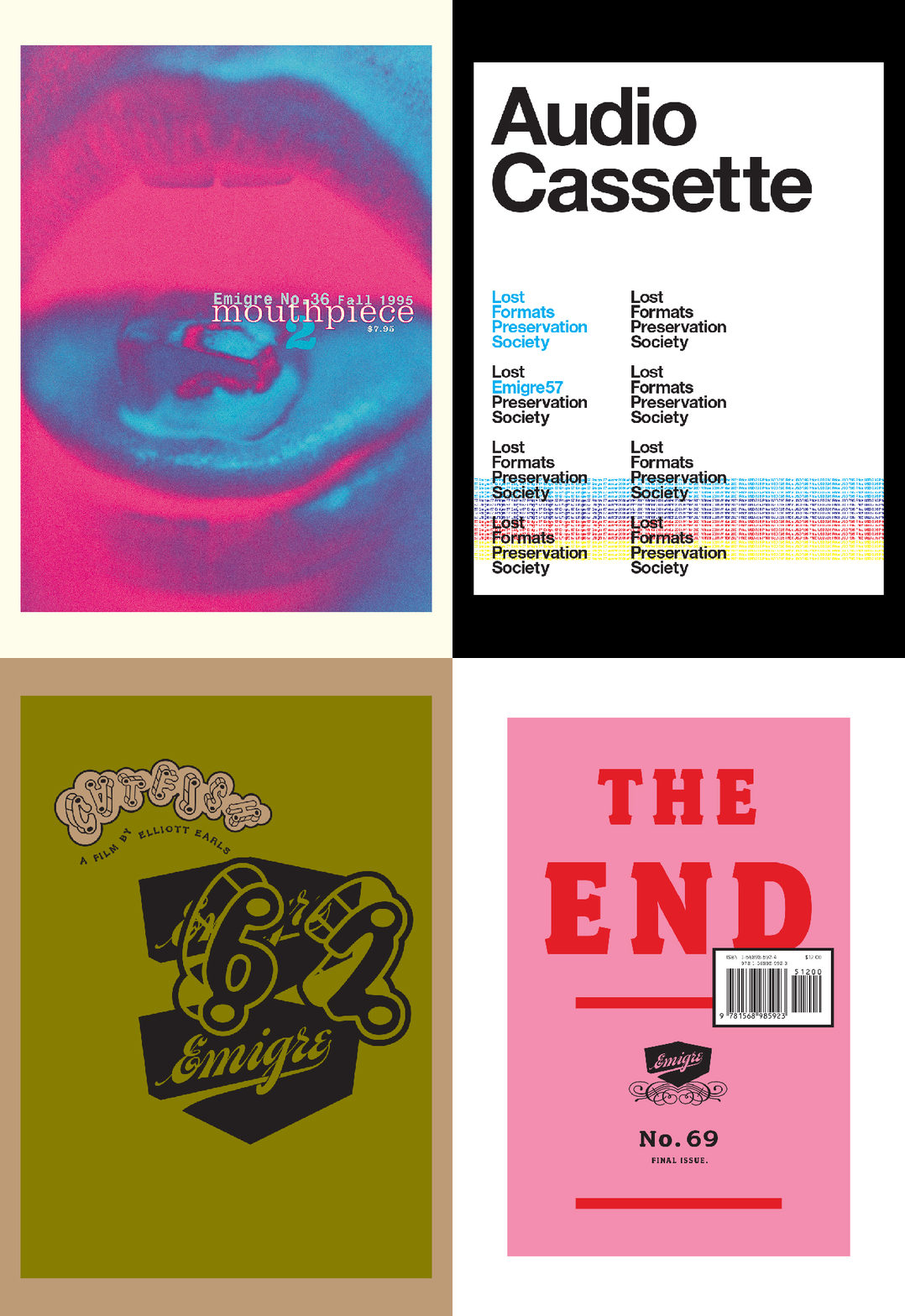
Emigre was a typography magazine that had considerable significance at the end of the last century as it questioned the modern canon in terms of grid, composition and legibility. Its editors and designers, Rudy Vanderlans and Zuzana Licko, initiated a debate that popularized typography through advertising and graphic design.
Over the Bookworm sessions we will explore several iconic magazines that capture the spirit of the era in which they were designed. We will place the magazines in their context and try to define what makes them relevant in the history of 20th century editorial design. The Bookworm sessions are guided by Andreu Jansà, librarian and curator of the Enric Bricall Reserve Fund.


Wed, Feb 28, 2024
graphic.elisava lectures
7.30 pm — Sala Aleix Carrió
Open to the public

Samar Maakaroun, Pentagram
Artist, Imposter or somewhere in between?
Aristotle first explored the idea of becoming by doing, he says ‘we become just by doing just things, moderate by doing moderate things, brave by doing brave things.’
That same idea translates today in the saying ‘Fake it till you make it’.
But when do we make it? How do we make it? Is making it an external or internal feeling?
Does anyone ever tell us: ‘You made it. Well done. You’ve arrived’?
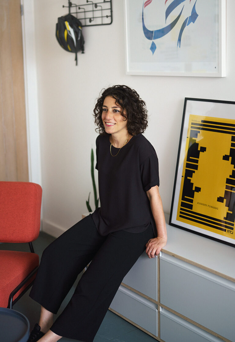
In this talk, Samar Maakaroun will share stories, projects, moments from her career that fall somehow between the faking and the making, and what it all comes down to.
Arab and British in equal measure, Samar Maakaroun is a designer and creative director renowned for her creatively multilingual approach to design.
Growing up in Beirut before moving to London in 2005, Samar is fluent in three languages and two cultures. Spanning 20+ years across branding, digital storytelling, scenography and typography, her career has focused on balancing aesthetics, context and heritage with brand voice and purpose.
In a globalized world with burgeoning diasporic communities in every city, Samar believes in embracing the fluidity and nuances of identity, seeing complexity as a source of creative inspiration and narrative power. Her work explores the space in-between – where cultures and languages intersect, integrate, align or diverge.
Samar founded Right to Left in 2021, a design agency that straddles cultures and typographic traditions. Specialising in designing for hybrid brands, the multidisciplinary team speaks seven languages and crosses three generations, working to fluidly integrate worlds, cultures and languages across naming, brand strategy, brands systems and identities.
An example of their language-hopping, culture-crossing approach manifested in the typographic project, 29 Words for 29 Letters, which explores language, translation, and the fluidity of meaning through design.
In 2023, Samar brought her Right to Left team to Pentagram‘s London office, where she joined as one of the eleven partners.


Feb 19 — 23, 2024
interdisciplinary workshops

Christoph Brach, Raw Color
Wind Things
Only for masters students
The aim of the workshop is to create a graphic object that interacts with wind and will be able to generate energy. During the workshop the participants will develop their own Wind Thing. These objects should unite the artistic appearance of a kinetic object with the function of a small scale wind turbine.
We will start to make simple test with colour, pattern, shapes and rotation. They should influence each other to create a unity. From there you will chose the design that works best. Together we will develop a working prototype that is able to rotate and generate electricity.
The world is looking for solutions in the energy transitions. Big scale wind turbines are often unwanted due to their size and appearance. Beautifully designed small scale wind turbines could become an addition of wind energy for private context.

The work of Raw Color reflects a sophisticated treatment of material and colour by mixing the fields of graphic design and photography. This is embodied through research and experiments, building their visual language. Daniera ter Haar & Christoph Brach work on self initiated and commissioned projects in their Eindhoven based studio.


Feb 19 — 23, 2024
interdisciplinary workshops

Stummerer & Hablesreiter, Honey and Bunny
Eat temperature: design transformation
Only for master students
The Viennese duo honey & bunny discuss future design goals and methods by the help of edible objects and eating activities. Honey & bunny will present an overview of food design, eat design and resilient design. Together with participating students, they will design edible objects, discuss them and do a presentation of these design processes.
30 percent of climate emissions come from food production and at southern areas of the EU work more than 150 000 slaves on the fields to feed Europe – any more questions?

Sonja Stummerer and Martin Hablesreiter founded the interdisciplinary studio honey & bunny in Vienna in 2003. They developed and built several loft conversions, stores and apartments, directed “food design – the film”, created the exhibitions “food design” for the Designforum MQ in Vienna, “food | design | humanity” in Lodz and “eat | body | design” in Zurich, among others. Their installation “EAT DESIGN” is part of the permanent collection of the Vienna Museum of Applied Arts.
Honey & bunny have taken part in numerous international solo and group exhibitions as designers and Eat Art artists. Most recently, they created the installations “room 333” for the Museum of the Image in Breda/ NL, “food design objects” for the Palazzo Triennale in Milan, “table manners” for the Gwangju Biennale and “eat VALUE design” for the Victoria and Albert Museum in London. Honey & bunny developed and presented design and eat art performances at Paris Design Week 2015, Expo Milan 2015 and Republic in Salzburg, among others.


Feb 19 — 23, 2024
interdisciplinary workshops

Victor Guerithault, KiteLab
‘Infinite reach, zero weight’
Only for master students
Continuing the construction game, the aim of the workshop is to imagine a simple system for constructing cellular kites. To add a very specific constraint to kite flyers, these kites will need to be foldable and relatively large when built.
At the end of the workshop all the kites must be hung in the school entrance hall. These kites must be aesthetic and poetic but also well thought in their construction system. The aim of the workshop is to explore repetitive geometric shapes with specific kite materials such as the spinnaker or structures. It is also important to think about kites that tell a story and create a coherent volume common to all participants.

Victor Guerithault (born in 1993, Paris, FR) is a designer specialized in kites and aerials structures graduated in EESAB Rennes (European School of Arts) in 2018. Passionate about lightweight structures, architectures and kites he found a way to dust off the aerodynes systems in a fun way. Kites are thousand-year-old objects that have the power to create interactions, social links, dreams and memories. The goal is not simply to fly your kites but to build it from A to Z and also to be able to transform it in a few minutes. This game based on 3d parts specially created for these kites, allows the construction of more than 300 different shapes.
Guided by basic but equally complex geometries, these aerodynes are 100% customizable, making them it’s first quality. Indeed, all the projects, collaborations or requests on which I worked saw the light of day thanks to this system. I already worked for Louis Vuitton, Hermès, Le Coq Sportif and Burberry.
This building game allow me to work with different structures like schools, brands and festivals.
Kites are serious children’s objects, several recognized designers or architects have become passionate about these age-old objects, such as the couple Charles and Ray Eames.


Feb 19 — 23, 2024
workshop

Veronika Gryshchuk & Thinh Truong
AI Hack-A-Week
Only for MADD students
Join us for an immersive one-week course tailored for designers, where we’ll explore the integration of AI into the creative process. This professional program offers a hands-on experience with the latest AI tools, empowering you to innovate and elevate your design work. Perfect for those looking to stay ahead in the ever-evolving world of design, our course is a blend of practical skills and cutting-edge knowledge. Because everybody is afraid of losing their jobs to AI.

Meet a dynamic duo Thinh Truong (Artificial) and Vero Gryshchuk (Intelligence) in the world of design and AI education. Vero, a graphic design grad from Elisava and speculative design aficionado. Thinh Truong, a playful yet insightful multidisciplinary designer, a motion graphic grad from IED Barcelona. Together their fates twisted at Domestic Data Streamers where they began the AI journey diving deep into AI research and its application in creative industry.
They’re not just teachers but fun-seekers, blending design expertise with generative AI. Their classes? A creative journey at the exciting crossroads of design and experimental prompting.


