events are an integral part of the master programs: from workshops with guests professors to lectures series with relevant practitioners.
Thu, May 9, 2024
masters’ talks
7.30 pm — Event at DHub
Open to the public
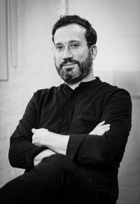
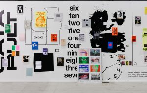
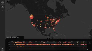
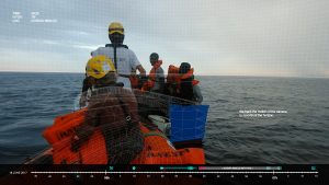
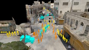
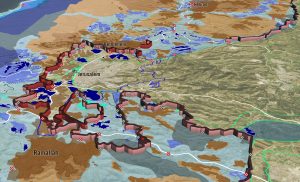
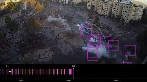
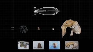
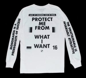
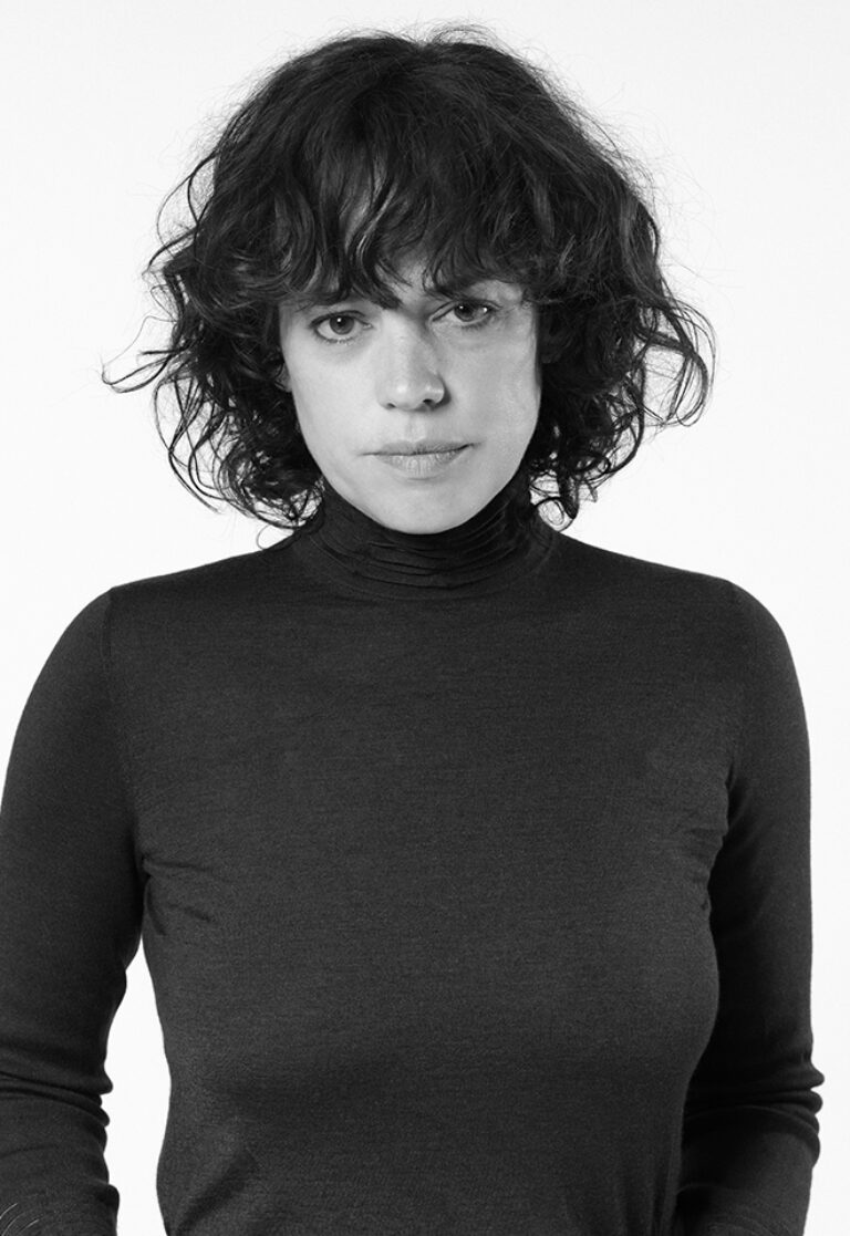
Eyal Weizman, Forensic Architecture
Ungrounding
Eyal Weizman is the founder and director of Forensic Architecture and professor of Spatial and Visual Cultures at Goldsmiths, University of London, where in 2005 the founded the Centre for Research Architecture. In 2007 he set up, with Sandi Hilal and Alessandro Petti, the architectural collective DAAR in Beit Sahour/Palestine. He is the author of many books, including Hollow Land, The Least of all Possible Evils, Investigative Aesthetics, The Roundabout Revolutions, The Conflict Shoreline and Forensic Architecture. Eyal held positions in many universities worldwide including Princeton, ETH Zurich and the Academy of Fine Arts in Vienna.
He is a member of the Technology Advisory Board of the International Criminal Court and of the Centre for Investigative Journalism.
In 2019 he was elected life fellow of the British Academy. In 2020 he received an MBE for ‘services to architecture’ and in 2021 the London Design Award. Forensic Architecture is the recipient of a Peabody Award for interactive media and the European Cultural Foundation Award for Culture.
Eyal studied architecture at the Architectural Association, graduating in 1998. He received his PhD in 2006 from the London Consortium at Birkbeck, University of London.

© David Ausserhofer / Robert Bosch Academy
Forensic Architecture is a research agency based at Goldsmiths, University of London. Our mandate is to develop, employ, and disseminate new techniques, methods, and concepts for investigating state and corporate violence. Our team includes architects, software developers, filmmakers, investigative journalists, scientists, and lawyers.
We are an interdisciplinary agency operating across human rights, journalism, architecture, art and aesthetics, academia and the law; in 2022, the Peabody Awards programme wrote that we had co-created ‘an entire new academic field and emergent media practice’.


past events
apr 15 — 19, 2024
workshop

Serge Rompza, NODE Berlin
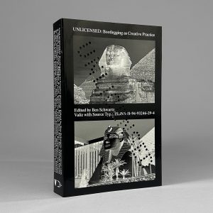
Bootleg Week
Only for MED students
In this workshop, we will turn bootlegging into a method and examine the phenomenon that originally developed from smuggling and pirating into a common practice in the music and fashion sector, but today also in the world of graphic design and branding. Your task will be to develop your own bootleg and explore the boundaries between piracy, homage and re-creation. The choice of media is expected to be free.
How do you want to position yourself and your way of working in a world in which your work is influenced by countless impressions, especially from the Internet and social media. Today you have access to many sources of information and influences. To what extent do you allow your work to be influenced by other styles and methods, and how can you claim authorship for your work? Who owns an idea? We will try to approach this topic in the workshop and discuss it. Have fun!
After graduating from Gerrit Rietveld Academie in Amsterdam, Serge Rompza has co-founded the Berlin and Oslo based design studio NODE in 2003, together with Anders Hofgaard. The two offices collaboratively focus on identity, print, exhibition and interactive work. Clients include Haus der Kulturen der Welt Berlin, Vitra, MIT Program in Art, Culture and Technology (ACT), Lithuanian Pavilion / La Biennale di Venezia, Office for Metropolitan Architecture (OMA).
Since 2004, he has regularly been teaching at art and design academies across Europe.

Wed, Apr 10, 2024
masters’ talks
7.30 pm — Event at DHub
Open to the public

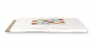
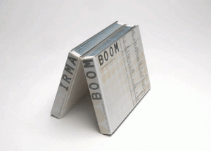
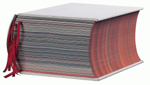
Irma Boom
Boom & Book
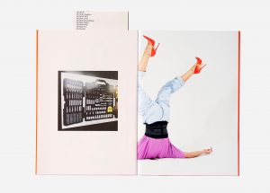
Irma Boom is a bookmaker based in Amsterdam. She has created over five hundred books. Her experimental approach often challenges the conventions of traditional books in both physical design and printed content. Since 1992, Boom has been senior critic at Yale University, New Haven, Connecticut, and she gives lectures and workshops worldwide. She has received many awards for her book designs and, in 2001, was the youngest person ever to receive the Gutenberg Prize.
Boom’s books are in the permanent collections of the Museum of Modern Art, New York; Art Institute of Chicago; Vatican Library; and Centre Pompidou, Paris, among other institutions. The Special Collections of the University of Amsterdam collect her complete oeuvre. In 2014, Boom received the Johannes Vermeer Award, the Dutch state prize for the arts. In 2019, she received an honorary doctorate from the Royal College of Art, London.
The Survival of the Book or The Renaissance of the Book!
The distribution of information has always been dependent on its changing form. The classic book can’t escape that and is now feeling it acutely. The digital book is decidedly on the rise. But its appearance in the form of flat, digital images need not threaten the three-dimensional book. The new competition even encourages us to explore the intrinsic characteristics of the printed book more intensely.
I think we stand on the verge of a new flourishing of the classic book. Perhaps it has even begun already: the Renaissance of the book. For the printed book, preconceived layouts are a thing of the past. The book designer must first become thoroughly familiar with the content before beginning the actual task at hand: conceiving a structure and a form. One can compare designing a book to performing a piece of music: a conductor explores the music and interprets it. The book designer is an editor and director of texts and images.
The result of this effort is the freezing of time and information, which is a means of reflection; compare it to a photograph or a painting. An image at a given moment serving as a reference of time and place. The flux inherent in the internet doesn’t allow you that kind of time. The printed book is final and thus unchangeable. Moreover, the extra use of base materials and man-hours (with printing and binding) forces you, to some degree, to make conscious choices.
I make books where content and form are closely connected. The content of the material very much determines the design. This makes each book unique: never the result of routine treatment. My books have a physical presence through their dimensions, scale and weight. Their form may be emphatic, but it is always determined by the content. The need for the book’s intimacy – the paper, the smell of ink – is certainly not nostalgia or false sentiment.
The printed book is a fundamental and integral part of our tradition and culture, of published and public knowledge and wisdom. The book is dead. Long live the book!
Wed, April 3, 2024
graphic.elisava lectures
7.30 pm — Sala Aleix Carrió
Open to the public
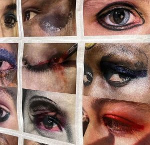
Julie Peeters
EYES
Open to the public
In my work as an independent graphic designer I’ve always been very focussed on images and how the printed image can communicate ideas and be read. For my lecture I would like to focus more on this, and explain how I’ve explored this throughout different projects. Starting from a few commissions to my self initiated work with BILL magazine and related publications, as well as MMDC a series of publications portraying libraries.
I will discuss my role as a graphic designer in commissioned projects, how these projects feed into editing BILL, the importance of paper and exploring the offset printing process and how I distribute my own publishing through curated events and gatherings.

Julie Peeters (Hasselt, BE) is a designer and editor based in Brussels. She studied graphic design at Sint Lukas in Ghent, was a researcher at the Jan Van Eyck Academy (Maastricht) and graduated from the Werkplaats Typografie in 2009. Working closely with artists, photographers and curators around print is the core of her practice. In 2021, she presented her first solo exhibition, Daybed, at MACRO in Rome. Julie has worked on artist books with Linder Sterling, Silke Otto Knapp, Rosalind Nashashibi, Yuji Agematsu, Thomas Demand among many others.
Julie is the founder and creative director of BILL, an annual magazine of photographic stories and a publisher of slow visual material. Peeters has taught at the Gerrit Rietveld Academy, Amsterdam, and currently teaches at KASK School of Arts, Ghent.
Overlapping design and visual arts with an editing, publishing and educational practice, my work explores the possibilities of printed matter as a medium and what it means to edit through design. In 2017 I founded BILL, an annual periodical that takes the form of a glossy magazine without words, presenting a collection of visual essays by invited contributors that explore the potential of printed images in a digital age.
My practice both questions and celebrates the power of print. By combining the roles of editor-in-chief and art director I use BILL as a tool to investigate ways to both create and present content, as well as a vehicle to investigate the possibilities of printing.
Once printed, BILL becomes a prompt for discussions on image distribution and consumption, how images are read on a page and what it means to publish a printed object in a time of climate collapse and digital communication
mar 18 — 22, 2024
workshop
Jorge León & Mikel Romero, León Romero
Logographic Systems
Only for MVD students
A logographic writing system is a type of writing system in which each symbol or logogram represents a whole word or a significant concept. In this workshop, we will create a new writing system that is directly linked to the human experience based on a series of concepts. To do this, we will appropriate the cultural, visual, historical… references from different existing ethnic tribes that will give us a starting point from which students can develop the exercise.
The student will refine both their conceptual ability and their synthesis capacity for the ideation of a graphic system and will develop sensitivity towards form/counterform from a visual perspective. We aim to raise awareness of the cultural value of writing itself, exploring conceptual and formal boundaries, paving the way for experimentation and research.
LEÓN ROMERO is a Barcelona-based visual communication studio founded by Jorge León and Mikel Romero. The studio takes a collaborative approach to creative direction and graphic design to produce bold, functional solutions for culture and commerce.
Driven by typographic design, LEÓN ROMERO provides an array of services including visual identity, graphic campaigns, editorial and web design, packaging, and art direction. The studio maintains a strong relationship with a vibrant network of photographers, illustrators, editors and copywriters to deliver projects both large and small.
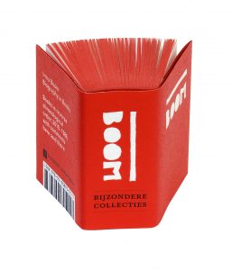
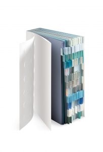
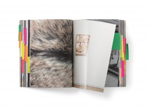
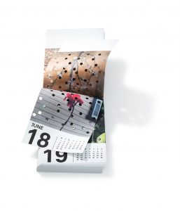
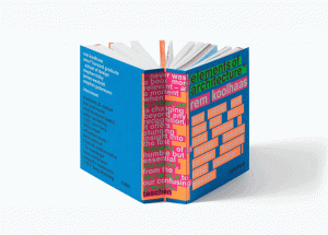
Wed, Mar 20, 2024
bookworm
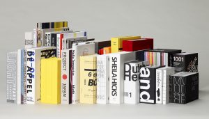
Irma Boom's books
Only for MED students
Irma Boom’s books
The Dutch designer is one of the leading figures in contemporary editorial design. Since the beginning of her career in the mid-1980s, Irma Boom has contributed to the revaluation of the book as an object, questioning the primacy of the electronic format that some predicted. Her books have a material quality that goes beyond the content.

Over the Bookworm sessions we will explore several iconic books that capture the spirit of the era in which they were designed. We will place the books in their context and try to define what makes them relevant in the history of 20th century editorial design. The Bookworm sessions are guided by Andreu Jansà, librarian and curator of the Enric Bricall Reserve Fund.
Wed, Mar 13, 2024
graphic.elisava lectures
7.30 pm — Sala Aleix Carrió
Open to the public

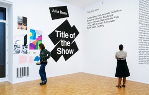
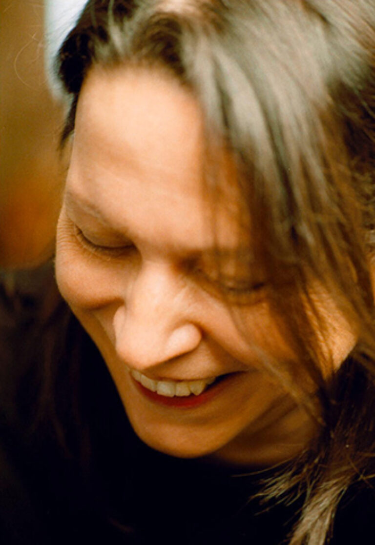
Julia Born
Title of the Talk
The design of a book and of an exhibition are two distinct yet interrelated practices. While both are spatial concepts through which narratives are articulated and displayed, they manifest under different physical and disciplinary conditions. Julia Born’s practice encapsulates an inquiry into these formats, challenging them and expanding the notion of design across media and disciplines. Language and its ambiguous qualities are at the center of her project, which she explores through commissioned and independent work—for instance her recent solo show All Capitals at MACRO in Rome, or various collaborations with choreographer Alexandra Bachzetsis.
© Diana Pfammatter
Julia Born is a designer and educator based in Zurich. Her work focuses on editorial design, exhibition design, and graphic identities for a variety of cultural institutions, including Stedelijk Museum and Rijksakademie van beeldende kunsten in Amsterdam; Kunsthalle and Kunstmuseum Basel; Guggenheim Museum in New York; HKW and Brücke-Museum in Berlin; and documenta 14 in Athens/Kassel.
She has designed monographs for artists such as Michel Auder, Miriam Cahn, Vivian Suter, and Elisabeth Wild. Born teaches editorial design at Master Type Design at ECAL, École cantonale d’art de Lausanne, and is a visiting lecturer at international art and design institutes. Solo exhibitions include All Capitals (MACRO—Museo d’Arte Contemporanea di Roma, 2022) and Title of the Show (Galerie für Zeitgenössische Kunst Leipzig, 2009). Born is the recipient of the Swiss Grand Award for Design, awarded by the Swiss Federal Office of Culture in 2021.