Events are an integral part of the master programs: from workshops with guests professors to lectures series with relevant practitioners.
Wed, Apr 8, 2026
Graphic — Elisava lectures
7.30 pm — Sala Aleix Carrió
Open to the public

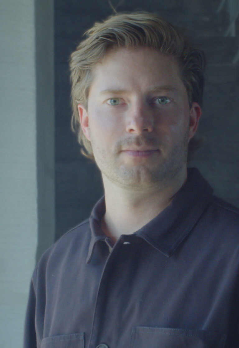
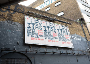
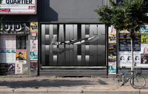
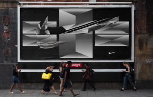
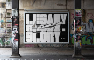
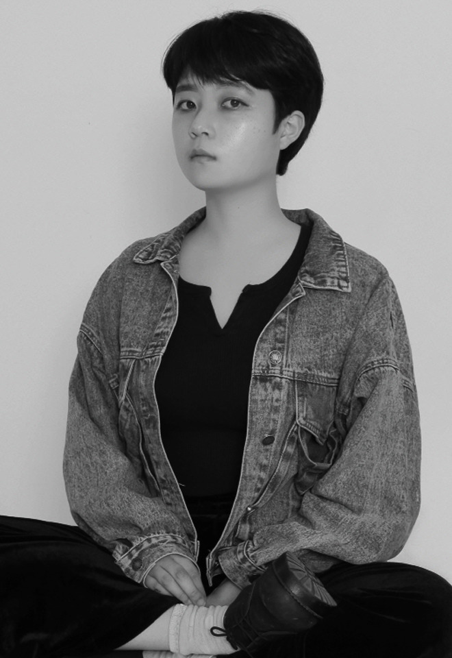
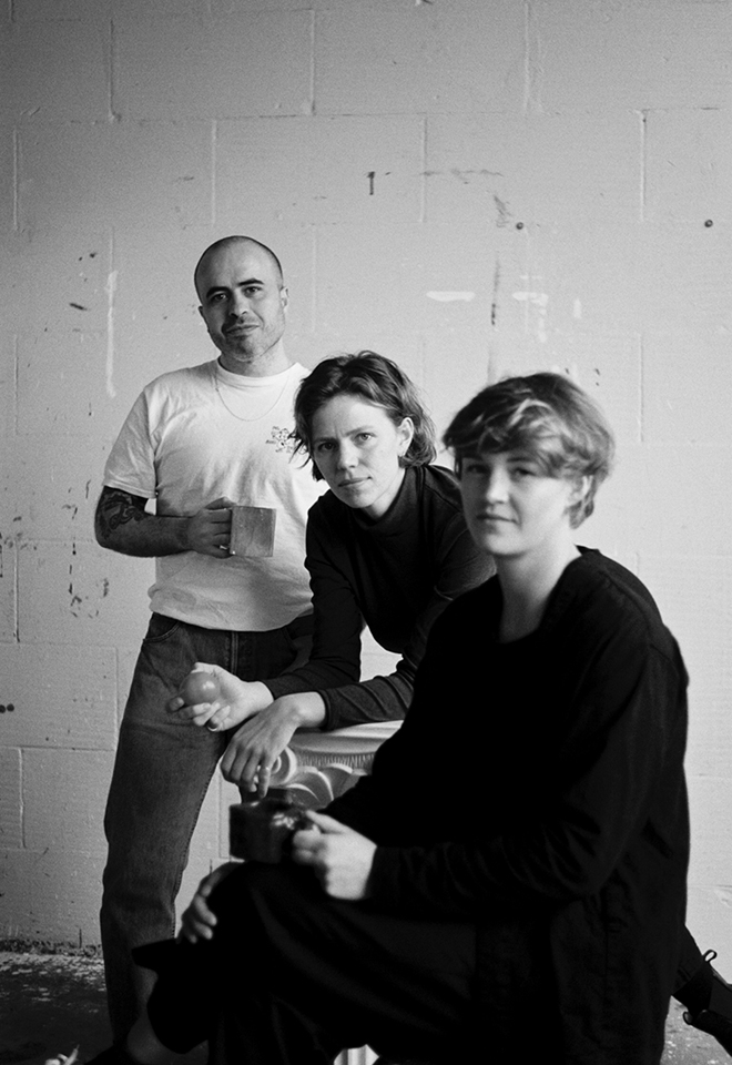
Bart de Baets
Paperclips
Paperclips
In his lecture, graphic designer Bart de Baets will show a large variety of works and elaborate more on the ways they find their form and are realized eventually. Although Bart’s practice is mostly spent working at the studio in Amsterdam, it is alternated by a parttime teaching position at the Royal Academy in The Hague, where he works with the first year students and the ones graduating. The way he teaches and cooks up his assignments is inspired by transforming everyday observations (at times obsessions) into educational exercises. The students are triggered to think of formal executions that evoke solutions close to Bart’s own practice visualizing abilities and editorial voice.
Although appearing less frequently today, Bart’s body of work’s been known to feature self initiated publications, such as Success and Uncertainty (together with Sandra Kassenaar), Dark and Stormy (together with Rustan Söderling), and Tabrat, a zine from 2022 in which de Baets confesses to be a tab hoarder (phone only, the browser tabs on his laptop are opened briefly and closed again efficiently) and shares them here with us in the charming A4-sized publication. His editorial assets have not been forlorn, and are frequently demonstrated more so in his collaborative works for artbook shop Page Not Found and exhibition space Nest (both are located in the city of The Hague). The talk at Elisava will prominently feature all of these works—and more—and provide insights into the developments of these designs by showing sketches, references and many inspirations.

Graphic designer Bart de Baets (1979, Knokke, BE) is based in Amsterdam. His design for the Sandberg Institute’s temporary master programme The Radical Cut Up was nominated for a Dutch Design Award. As a result, PostNL commissioned De Baets to design a series of stamps titled ‘Talk to the Hand’. With Sandra Kassenaar he designed the exhibition, campaign and catalogue for ‘Circulate’, an exhibition on photographic art acquisitions at the Stedelijk Museum Amsterdam. The two also design the graphic identity of Kunstmuseum Bochum. He designed ‘On the Necessity of Gardening: An ABC of Art, Botany and Cultivation’ (2021), which was published parallel to ‘The Botanical Revolution’, an exhibition at the Centraal Museum, Utrecht. That year, the Stiftung Buchkunst awarded the book with the highest prize in the category Best Book Design from all over the World. A second title in that series, Mothering Myths, an ABC of Art, Birth and Care was released in May of 2025, for which he collaborated once again with editors Laurie Cluitmans and Heske ten Cate. He holds a part-time teaching position at the Graphic Design department of the Royal Academy of Art in The Hague, and he has taught at the Gerrit Rietveld Academie in Amsterdam for fifteen years.
Being educated by notorious wild collaborator Will Holder, the radical typographic thinkers of Experimental Jetset and conceptual makers like Linda van Deursen, triggered Bart de Baets to think like an editor early in his graphic design studies, making zines with and for his peers, or whipping up catchy writings to go with his posters and projects. His design skills were fed ferociously when working with Maureen Mooren and Daniel van der Velden (now Metahaven) whose interest in art inspired him. For them, that always seemed to come first, then design. For the pages of Archis (an architecture magazine–now Volume), the layouts of existing periodical publications were used to give form to the magazine’s content, and Bart was taught to study their characteristics and so became an excellent copycat.
Over the years de Baets’ body of work has developed immensely mostly so by certain significant collaborations. A few early memorable ones have been those with Melanie Bonajo and Frank Koolen, two (then) Amsterdam-based artists not much older than himself and whose practice inspired an idea on which to work together, and which, in a way, kicked off de Baets’ career. The likes of Rustan Söderling and Sandra Kassenaar are of similar influence and remain crucial design partners; both are good friends to this day. Their influence on some self initiated works, such as Dark and Stormy and Success and Uncertainty is essential for de Baets’ current design approach and visual language. Kassenaar and de Baets nowadays share a studio and work together as designers regularly.
His designs are rooted heavily in a kind of conceptual thinking, and his abilities to think along editorially with commissioners has given Bart’s body of work an outspoken character. His work is distinctively playful and seemingly intuitive, giving the impression that the designs could be made quickly or hand-made. Yet, each one of the designs is a carefully put-together composition made according to a bunch of guidelines and often uses typography or visuals referencing things “found” on the street. For years Bart’s been a teacher in graphic design often working with the first year students, introducing them to the job. Surrounded by other designers, skilled coders, letter drawers and colour wizards, his teaching encourages to explore what it’s like to make art and design in today’s environments by demonstrating personal fascinations.


Wed, May 27, 2026
Masters’ Talks
7.30 pm — Event at DHub
Open to the public

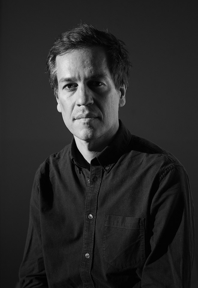
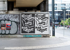
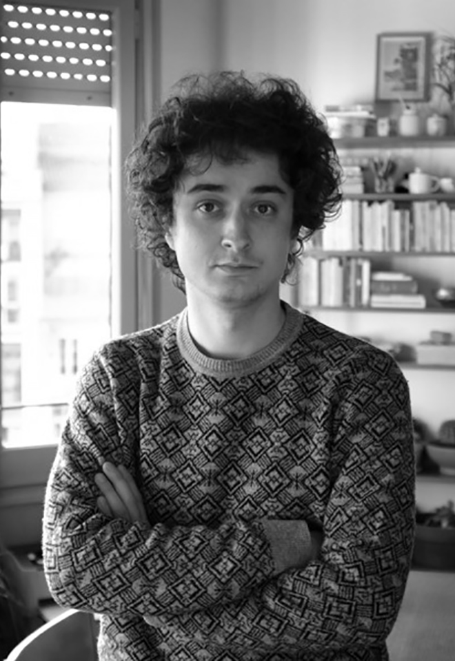
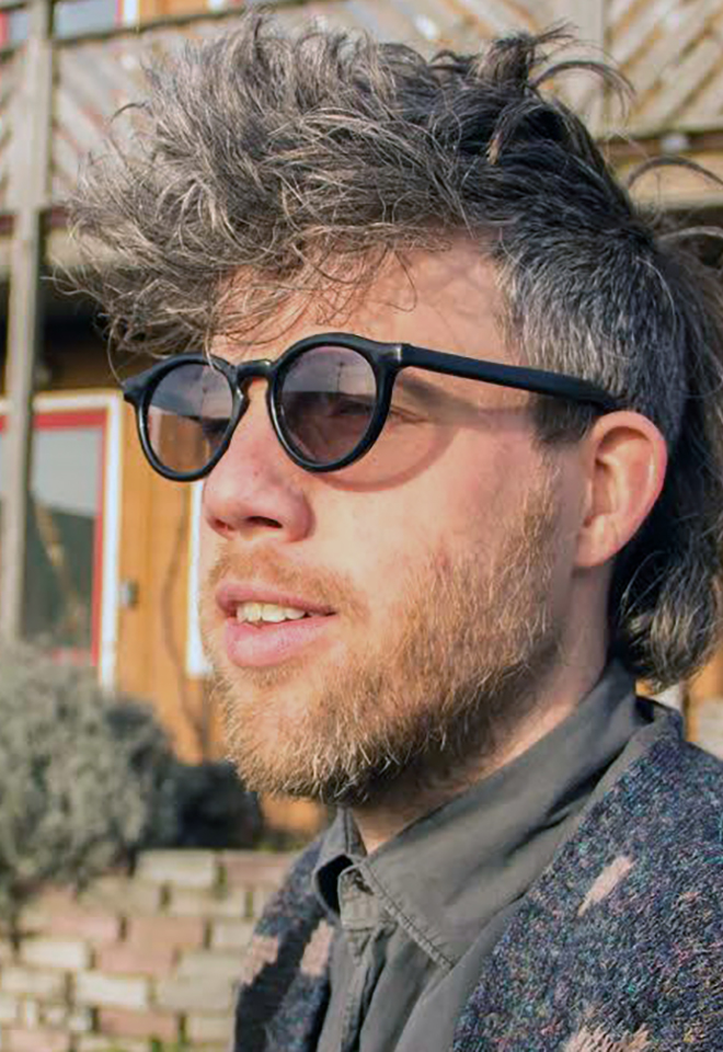
Jonas Janke, b+
Love me one time, two times … x times !
Love me one time, two times … x times !
The lecture is not a conventional showcase of selected projects from our daily practice, but rather aims to provide a broader insight into the network of actors in which b+ (bplus.xyz) operates, how we understand the contemporary way of an architectural practice and scope of work of an architect, and how we approach our projects—in short: who b+ is and how we work, what our values are, and what our understanding of our duties and responsibilities as architects is.
Jonas Janke (DE, 1991) is an architect and partner at bplus.xyz (Berlin). He has a diverse background in architecture, was trained as an architectural draughtsman before pursuing his studies in Hamburg, Stockholm, and Berlin. He gained valuable experience as a tutor and assistant in various departments including design & typologies, building construction, and structural design. He was part of the team 2038, the German Pavilion at 17th Venice Architecture Biennale 2021.
His early teaching experiences include guest studios at the University of Innsbruck (Austria) and Politecnico di Milano (Italy). He is regularly invited to give lectures and guest critiques at universities, cultural institutions, and public institutions. His focus is on new ecological construction materials and methods for adaptive reuse and renovation projects, seeking pragmatic and efficient technical and mechanical solutions that use material and construction thoughtfully.
bplus.xyz (b+) is a collaborative architecture practice (led by Arno Brandlhuber, Olaf Grawert, Jonas Janke and Roberta Jurčić) that operates at the intersection of theory and practice, using different media and formats. The practice seeks to engage with the contemporary challenges of our time, particularly those related to the social-ecological transformation of existing buildings, offering economically viable solutions.
b+ understands architecture as an open process, and views buildings as part of larger systems that require a systemic approach. The practice sees the given framework of existing buildings and legislation as an active design tool with the potential for transformation. Thus, b+ celebrates the potential of the existing built environment and aims to reveal and activate the latent potentials within.
b+ emphasizes working with different actors and stakeholders in project development. The practice values their knowledge and expertise and aims to create spaces for exchange and collaboration. b+ seeks to advance a new value system in architecture, one that places greater emphasis on collective responsibility, systemic thinking, and ecologically and economically viable solutions.
The current project in the field of political activism is the European citizens’ initiative HouseEurope! – HouseEurope! wants to create incentives that make renovation the new norm. This will boost the renovation market and give new value to what is already there. The goal is to preserve homes and communities, ensure a fairer and more local building industry, save energy and resources, and preserve our memories and stories.


past events
Wednesday,
February 16, 2022
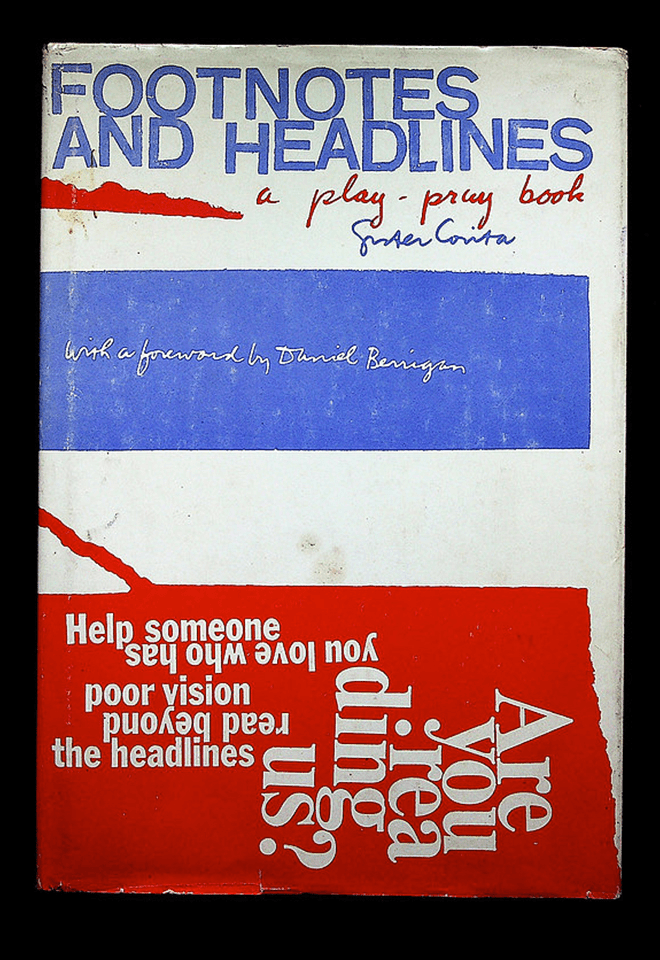
Massin + Sister Corita
Bookworm 3
La cantatrice chauve, 1964
+
Footnotes and headlines: a play-pray book, 1967
Only for MED students
In the 1960s the modern canon began to be questioned. Social unrest and countercultural movements found their way into graphic design. A new aesthetic far removed from the Swiss grid gave way to playful typographical compositions that connected with the “words in freedom” of the artistic avant-gardes of the early 20th century, especially Futurism and Dadaism. Robert Massin in France and Corita Kent in the USA mastered the use of the printed word in their creations.
Modernism and Postmodernism are the driving forces that have shaped 20th century architecture, art and design.
The Modern Movement began at the end of the 19th century, ran vigorously through the century and began to be questioned at the beginning of the 1960s, before finally fading away in the 1990s with the advent of the Internet and the paradigm shift it brought with it.
The book has been the medium and the message of the diverse movements in the arts during the last century. The book, with its emphatic material presence, takes on a special value now that we are witnessing its dematerialization, reduced to digital data in electronic format.
Over the Bookworm sessions we will explore several iconic books that capture the spirit of the era in which they were designed. We will place the books in their context and try to define what makes them relevant in the history of 20th century book design. The Bookworm sessions are guided by Andreu Jansà, librarian and curator of the Enric Bricall Reserve Fund. The books that make up the collection are documented in the main accounts of the history of 20th century graphic design.


Wednesday,
February 2, 2022
7.30pm

Lucienne Roberts, Is it still ok to be a graphic designer?
Open Lecture
Is it still ok to be a graphic designer?
Influenced as much by feminism as Swiss typography, Lucienne will share her graphic design journey from utopian zeal to dystopian dilemma. She has always considered graphic design to be a political act. In the early days this message was greeted with incredulity but when her book Good: An Introduction to Ethics in Graphic Design hit the streets the subject was inching onto the agenda. Since then, she and colleagues have curated / designed exhibitions about graphic design in health and politics:
(Can Graphic Design Save Your Life? and Hope to Nope: Graphic Design and Politics 2008–18), worked on multiple NGO campaigns; helped spread the word about climate change; and most recently developed the installation Perhaps it’s not you, it’s me. in which Lucienne contemplates ‘leaving’ her long-standing partner Graphic Design. Here she explains why divorce was an option, argues for the value of graphic design and ponders on what we all need to do next.

Lucienne Roberts is founder of design studio LR+ and co-founder of advocacy initiative GD&. A graduate of Central Saint Martins, Lucienne’s practice is characterised by her abiding interest in ethical design. LR+ work spans exhibition design, books and corporate identity. GD& creates vivid books and exhibitions that explore how graphic design connects with all other things. Projects include the originating and co-curation of two critically-acclaimed London exhibitions: Can Graphic Design Save Your Life? and Hope to Nope: Graphics and Politics 2008–18.


January 24 → 28, 2022

Serge Rompza, NODE Berlin Oslo
Workshop
Lost in Translation
Only for MED students
Lost in Translation
On your way to becoming an editorial designer, you are confronted with exploring and producing common formats such as books, magazines or websites. For some time now, the discipline’s range of work has been steadily expanding; demands are changing. Collaboration with other disciplines, working with new formats is more necessary and exciting today than ever.
How can new things emerge in exchange with other specialists? How do we approach unknown formats and what are their characteristics? This workshop week will give us time to challenge ourselves and explore our skills as authors and producers of unconventional or even unknown formats.
Serge Rompza
After graduating from Gerrit Rietveld Academie in Amsterdam, Serge Rompza has co-founded the Berlin and Oslo based design studio NODE in 2003, together with Anders Hofgaard.
The two offices collaboratively focus on identity, print, exhibition and interactive work. Clients include Haus der Kulturen der Welt Berlin, Vitra, MIT Program in Art, Culture and Technology (ACT), Lithuanian Pavilion / La Biennale di Venezia, Office for Metropolitan Architecture (OMA). Since 2004, he has regularly been teaching at art and design academies across Europe.


Wednesday,
January 19, 2022
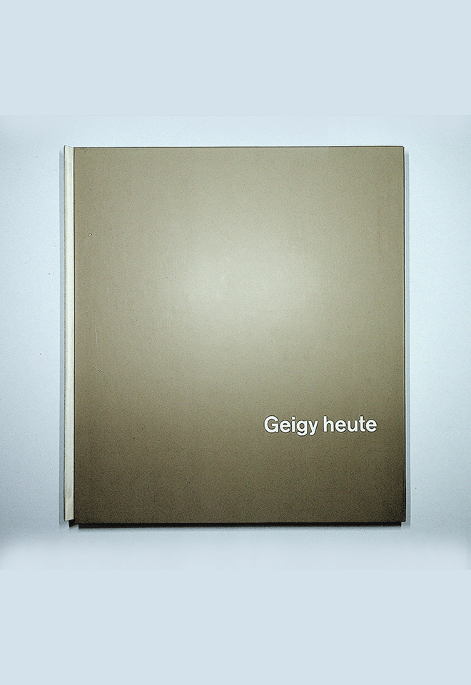
Max Bill + Karl Gerstner
Bookworm 2
Form, 1952
+
Geigy heute, 1958
Only for MED students
Swiss graphics led the international scene after the Second World War. In the 1950s and 1960s the Swiss style, a refined version of the New Typography, had become the universal solution to any visual communication need from book design to poster design to advertising and corporate image. Max Bill and Karl Gerstner, among many others, created a sophisticated language rooted in the avant-garde to communicate with the consumer society.
Modernism and Postmodernism are the driving forces that have shaped 20th century architecture, art and design.
The Modern Movement began at the end of the 19th century, ran vigorously through the century and began to be questioned at the beginning of the 1960s, before finally fading away in the 1990s with the advent of the Internet and the paradigm shift it brought with it.
The book has been the medium and the message of the diverse movements in the arts during the last century. The book, with its emphatic material presence, takes on a special value now that we are witnessing its dematerialization, reduced to digital data in electronic format.
Over the Bookworm sessions we will explore several iconic books that capture the spirit of the era in which they were designed. We will place the books in their context and try to define what makes them relevant in the history of 20th century book design. The Bookworm sessions are guided by Andreu Jansà, librarian and curator of the Enric Bricall Reserve Fund. The books that make up the collection are documented in the main accounts of the history of 20th century graphic design.


Novembre 29
↳ December 3, 2021

Martin Lorenz, TwoPoints.Net
Workshop
Systemic Type Design
Only for MVD students
Systemic Type Design
We live in a (new) golden age of systemic type design. New technologies and easy to use programmes leveled the playfield for emerging designers and gave them the chance to experiment with new ideas. The world of display fonts has witnessed a lot of new impulses in the last years. Type has become more flexible, variable and kinetic as ever, adjusting efficiently and effectively to new communication channels.
Systemic Type Design is more than designing fonts. A type system is an efficient design tool that helps designers to design. If done well, the act of writing is the act of designing without the need to further layout the text. In this course we will develop an experimental type system that almost automatically generates fantastic design applications.
Martin Lorenz
might as well have become a cook, a comic artist or an architect, were it not for an internship at Müller+Volkmann. Lorenz studied Graphic Design at the University of Applied Sciences in Darmstadt and the Royal Academy of Arts (KABK) in The Hague. After working four years at the design agency Hort, he moved to Barcelona to found TwoPoints.Net with Lupi Asensio and do his MA and PhD in Design Research at the UB. Lorenz has taught since 2006 for Elisava and still likes to cook.
Wednesday,
November 24, 2021
7.30 pm

Yehwan Song, Experimental Websites
Open Lecture
Experimental Websites
This lecture talks about the diverse trials faced when attempting to expand the range of our capacity within web environments by questioning standard web design templates. The talk features Anti-User-Friendly, an ongoing project that challenges the concept of user-friendliness by creating a content-focused website.
Web tools work as a bridge connecting the user and the device-website to narrow the world wide web down to a ‘village wide web’ and transform the web into an extended space.
Yehwan Song is a graphic web designer. She runs her own independent design studio focusing on the strategic use of technologies. Her work involves projects with multiple cultural organizations, including ifa, LIMA Media Art, Rhizome, Typojanchi, and Seoul Museum of Art.
She has participated in a number of exhibitions—Venice Biennale (Korean pavilion), Seoul Biennale(SBAU), and others; and her works have been featured in such magazines as Étapes, Monthly DESIGN, It’s Nice That, among others.
Yehwan Song Studio is a web design and a web development studio questioning standardized design and interface conventions that frame users’ behavior and the templates that make them lose their content awareness and become accustomed to oversimplification. We construct outside-the-frame devices and interfaces in order to challenge the notion of user-friendliness. We pursue diversity and variety in the web environment above efficiency.


Wednesday,
November 17, 2021

Esteve Padilla, 131
Showcase
Typography and collective memory
We will reflect from some projects elaborated in 131 during the last years, in which starting from typography we work to recover the local and collective memory.
Esteve Padilla.
Barcelona, 1983
Graphic designer, half of the 131 studio and occasional teacher at various universities. Graduated in graphic design at Eina (UAB).
131
(Pau Llop, Esteve Padilla) is a graphic design office based in Barcelona and Lleida. Typography understood as image, form or letter is a substantial element in all the projects we do. Our work includes art direction, identities, editorial projects, websites and typography.


Wednesday,
November 10, 2021

Anna Berbiela, Pràctica
Case studies
Pràctica: Process
Pràctica: Process
Pràctica does not have a style, but it follows a process; In this session, we will analyze, through the case studies of the latest studio projects, the process that Pràctica follows to develop its work.
Anna Berbiela
Graphic designer based in Barcelona. Anna founded the studio Pràctica together with Javier Arizu, Carlos Bermúdez and Albert Porta in 2018. With offices in Barcelona and New York, Pràctica is a studio that works for institutional, cultural, and commercial clients, developing communication projects in printed, digital, and environmental matters.
Pràctica is a full-service design studio based in Barcelona and New York. Working for institutional, cultural, and commercial clients, always seeks powerful concepts, bold visual codes, and customized solutions for each project. This is translated into a very eclectic job; Their style is the lack of one, it’s finding the best solution for each project.


Wednesday,
November 3, 2021

Miquel Hervás, Book Bindery Rietveld Academy
Showcase
The act of making something public
The act of making something public
This session addresses the methods, tools and implications of publishing activities.
— What does the publication does/mean? And how is it going to exist/circulate?
— How does it achieve its aspirations through form?
— How do content, editorial concept and design come together?
— How to think publishing as complement and supplement to working practices?
— In which terms can ‘making public’ act as a tool for bringing common shared interests and concerns?
Book Bindery
The BB allows the production of books and publications in small editions and specific manipulations of paper and cardboard. All processes are always done entirely by hand and pushing the limits of what is possible.
Next to being a technical workshop, the BB functions as a cross-departmental point in our institution. We believe the publishing practice is an emancipatory process. We support project such as: PUB.sandberg.nl, Radio Rietveld and Rietveld Journal.
Miquel Hervás Gómez
(Terrassa, 19 April 1985). Handy graphic design freelancer based in the www. Running as a workshop manager at the BB. Tutor for Disarming Design at the Sandberg Instituut and Preparatory Course at the Gerrit Rietveld Academie, while being member of fanfare and Carne Kids.


Wednesday,
November 3, 2021

Miquel Hervás, fanfare
Case studies
Spatial publishing
fanfare was established in the observation of a context, a network, within which design and art interactions resulted in projects not suiting within the existing platforms for presentation. fanfare creates a framework to connect already existing structures. What organically happened in this context was the creation of new structures, new networks, new initiatives. We allow ourselves in the context of today to speak about fanfare as framework for (non)physical publishing.
fanfare is a platform and design studio for cross-disciplinary collaboration and visual communication. Through an active programme, fanfare generates, explores, and curates environments for visual interactions.
Since the start in 2014, fanfare has created a unique space for experiments, explorations and collaborations in the realm of graphic design and related disciplines. Through their research and design practice, fanfare sharpens and challenges the notion of visual communication.
Miquel Hervás Gómez
(Terrassa, 19 de abril de 1985). Diseñador gráfico autónomo afincado en la www. Funcionando como jefe de taller en la BB. Tutor de Disarming Design en el Sandberg Instituut y del Curso Preparatorio en la Gerrit Rietveld Academie, a la vez que miembro de fanfare y Carne Kids.


Wednesday,
October 27, 2021
7.30 pm

Ruben Pater, CAPS LOCK
Open Lecture
CAPS LOCK
How capitalism took hold of graphic design,
and how to escape from it.
Ruben Pater (1977, NL) (he/him) works between journalism and graphic design. Under the name Untold Stories, Pater creates visual narratives that support solidarity, justice, and equality. Pater finds himself being a designer at a time when design is last thing the world needs. Until more ethical approaches present themselves, he designs, writes, and teaches. He is a tutor at the BA Graphic Design, and the MA Non Linear Narrative at KABK. The Politics of Design, is his first book about cultural bias in graphic design. His second book CAPS LOCK looks at the role of graphic design in capitalism.
CAPS LOCK
Capitalism could not exist without the coins, notes, documents, graphics, interfaces, branding and advertisements; artefacts that have been (partly) created by graphic designers. Even anti-consumerist strategies such as social design and speculative design are being appropriated within capitalist societies to serve economic growth. It seems that design is locked in a system of exploitation and profit, a cycle that fosters inequality and the depletion of natural resources.
CAPS LOCK uses clear language and striking visual examples to show how graphic design and capitalism are inextricably linked. The book contains many case studies of designed objects related to capitalist societies and cultures, and also examines how the education and professional practice of (graphic) designers supports the market economy and how design practice is caught within that very system.
CAPS LOCK is an inspirational book full of sources for design students, educators and visual communicators all over the world, just like Ruben’s first book The Politics of Design.


Wednesday,
October 27, 2021
László Moholy-Nagy + Jan Tschichold
Bookworm 1
Malerei, Fotografie, Film, 1925
+
Foto-Auge, 1929
Only for MED students
Two crucial works of New Typography, the avant-garde movement that revolutionised graphic design in the interwar period. The increasing availability of the photographic image played a fundamental role in this new approach to editorial design. Moholy-Nagy, a member of the legendary Bauhaus, and Jan Tschichold, author of the landmark work Die neue Typographie, radically changed the face of the printed page, producing a lasting impact whose effects continue to this day.
Modernism and Postmodernism are the driving forces that have shaped 20th century architecture, art and design.
The Modern Movement began at the end of the 19th century, ran vigorously through the century and began to be questioned at the beginning of the 1960s, before finally fading away in the 1990s with the advent of the Internet and the paradigm shift it brought with it.
The book has been the medium and the message of the diverse movements in the arts during the last century. The book, with its emphatic material presence, takes on a special value now that we are witnessing its dematerialization, reduced to digital data in electronic format.
Over the Bookworm sessions we will explore several iconic books that capture the spirit of the era in which they were designed. We will place the books in their context and try to define what makes them relevant in the history of 20th century book design. The Bookworm sessions are guided by Andreu Jansà, librarian and curator of the Enric Bricall Reserve Fund. The books that make up the collection are documented in the main accounts of the history of 20th century graphic design.


