Events are an integral part of the master programs: from workshops with guests professors to lectures series with relevant practitioners.
Apr 23 — 27, 2026
Workshop

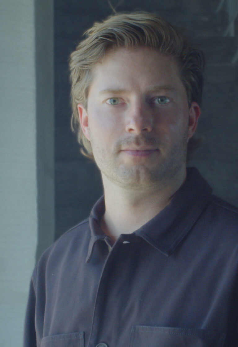
Serge Rompza, NODE Berlin Oslo
Beyond the Canon: Alternative Histories of Graphic Design
Only for MED students
Beyond the Canon: Alternative Histories of Graphic Design
Design history is not fixed — it is shaped by visibility, selection, and repetition.
This workshop revisits the canon of graphic design from a global perspective, focusing on historically relevant yet often underrepresented designers.
Each student will research and portray one designer, situating their work within its cultural, political, and technological context. Rather than simply presenting biographical information, participants will critically interpret and visually reframe these positions through editorial and typographic design.
The resulting works should not only communicate information but also respond visually to the designer’s attitude, working methods, and conceptual approach.
After graduating from Gerrit Rietveld Academie in Amsterdam, Serge Rompza has co-founded the Berlin and Oslo based design studio NODE in 2003, together with Anders Hofgaard. The two offices collaboratively focus on identity, print, exhibition and interactive work. Clients include Haus der Kulturen der Welt Berlin, Vitra, MIT Program in Art, Culture and Technology (ACT), Lithuanian Pavilion / La Biennale di Venezia, Office for Metropolitan Architecture (OMA).
Since 2004, he has regularly been teaching at art and design academies across Europe.


Feb 23 — 27, 2026
Workshop

Piero Di Biase, Formula Type
Modular approaches in Type Design: Resource or Restriction?
Only for MVD students
Modular approaches in Type Design: Resource or Restriction?
The workshop explores the possibilities that the module offers in structuring typographic forms, questioning whether it acts as a supportive framework or a creative constraint. Through the analysis of historical and contemporary modular typefaces, as well as the investigation of the module in art, design, and architecture, students will be guided to work within a modular system to design a display typeface. The aim is to understand how predefined structures can generate coherent visual languages while still allowing room for experimentation and expressive innovation.

© Andrea Arduini
Piero Di Biase is a graphic and type designer. He trained in the graphic arts sector and then became a graphic designer. After collaborating with various design agencies, in 2011 he co–founded Think Work Observe, where he worked for national and international clients until 2022, when he launched Formula Type, an independent digital foundry that produces and distributes retail and custom fonts. Since 2017, he has been a member of the Alliance Graphique Internationale (AGI).
Formula Type is a digital type foundry started in the wettest region in Italy. Formula is a potion blended especially for those who will drink it; Formula is a chemical equation that leads to a result. This playful yet precise idea captures the dual soul of Formula Type. Its past was graphic design, and its present is type design, but there’s no real separation between the past and the present. Our fonts are crafted with a flexible designer eye and in the fifteen years since our first releases they have evolved freely through experimentation. Our approach is that of expert beginners, always welcoming new partnerships and projects.


Wed, Apr 8, 2026
Graphic — Elisava lectures
7.30 pm — Sala Aleix Carrió
Open to the public

Bart de Baets
Paperclips
Paperclips
In his lecture, graphic designer Bart de Baets will show a large variety of works and elaborate more on the ways they find their form and are realized eventually. Although Bart’s practice is mostly spent working at the studio in Amsterdam, it is alternated by a parttime teaching position at the Royal Academy in The Hague, where he works with the first year students and the ones graduating. The way he teaches and cooks up his assignments is inspired by transforming everyday observations (at times obsessions) into educational exercises. The students are triggered to think of formal executions that evoke solutions close to Bart’s own practice visualizing abilities and editorial voice.
Although appearing less frequently today, Bart’s body of work’s been known to feature self initiated publications, such as Success and Uncertainty (together with Sandra Kassenaar), Dark and Stormy (together with Rustan Söderling), and Tabrat, a zine from 2022 in which de Baets confesses to be a tab hoarder (phone only, the browser tabs on his laptop are opened briefly and closed again efficiently) and shares them here with us in the charming A4-sized publication. His editorial assets have not been forlorn, and are frequently demonstrated more so in his collaborative works for artbook shop Page Not Found and exhibition space Nest (both are located in the city of The Hague). The talk at Elisava will prominently feature all of these works—and more—and provide insights into the developments of these designs by showing sketches, references and many inspirations.

Graphic designer Bart de Baets (1979, Knokke, BE) is based in Amsterdam. His design for the Sandberg Institute’s temporary master programme The Radical Cut Up was nominated for a Dutch Design Award. As a result, PostNL commissioned De Baets to design a series of stamps titled ‘Talk to the Hand’. With Sandra Kassenaar he designed the exhibition, campaign and catalogue for ‘Circulate’, an exhibition on photographic art acquisitions at the Stedelijk Museum Amsterdam. The two also design the graphic identity of Kunstmuseum Bochum. He designed ‘On the Necessity of Gardening: An ABC of Art, Botany and Cultivation’ (2021), which was published parallel to ‘The Botanical Revolution’, an exhibition at the Centraal Museum, Utrecht. That year, the Stiftung Buchkunst awarded the book with the highest prize in the category Best Book Design from all over the World. A second title in that series, Mothering Myths, an ABC of Art, Birth and Care was released in May of 2025, for which he collaborated once again with editors Laurie Cluitmans and Heske ten Cate. He holds a part-time teaching position at the Graphic Design department of the Royal Academy of Art in The Hague, and he has taught at the Gerrit Rietveld Academie in Amsterdam for fifteen years.
Being educated by notorious wild collaborator Will Holder, the radical typographic thinkers of Experimental Jetset and conceptual makers like Linda van Deursen, triggered Bart de Baets to think like an editor early in his graphic design studies, making zines with and for his peers, or whipping up catchy writings to go with his posters and projects. His design skills were fed ferociously when working with Maureen Mooren and Daniel van der Velden (now Metahaven) whose interest in art inspired him. For them, that always seemed to come first, then design. For the pages of Archis (an architecture magazine–now Volume), the layouts of existing periodical publications were used to give form to the magazine’s content, and Bart was taught to study their characteristics and so became an excellent copycat.
Over the years de Baets’ body of work has developed immensely mostly so by certain significant collaborations. A few early memorable ones have been those with Melanie Bonajo and Frank Koolen, two (then) Amsterdam-based artists not much older than himself and whose practice inspired an idea on which to work together, and which, in a way, kicked off de Baets’ career. The likes of Rustan Söderling and Sandra Kassenaar are of similar influence and remain crucial design partners; both are good friends to this day. Their influence on some self initiated works, such as Dark and Stormy and Success and Uncertainty is essential for de Baets’ current design approach and visual language. Kassenaar and de Baets nowadays share a studio and work together as designers regularly.
His designs are rooted heavily in a kind of conceptual thinking, and his abilities to think along editorially with commissioners has given Bart’s body of work an outspoken character. His work is distinctively playful and seemingly intuitive, giving the impression that the designs could be made quickly or hand-made. Yet, each one of the designs is a carefully put-together composition made according to a bunch of guidelines and often uses typography or visuals referencing things “found” on the street. For years Bart’s been a teacher in graphic design often working with the first year students, introducing them to the job. Surrounded by other designers, skilled coders, letter drawers and colour wizards, his teaching encourages to explore what it’s like to make art and design in today’s environments by demonstrating personal fascinations.


Wed, May 27, 2026
Masters’ Talks
7.30 pm — Event at DHub
Open to the public

Jonas Janke, b+
Love me one time, two times … x times !
Love me one time, two times … x times !
The lecture is not a conventional showcase of selected projects from our daily practice, but rather aims to provide a broader insight into the network of actors in which b+ (bplus.xyz) operates, how we understand the contemporary way of an architectural practice and scope of work of an architect, and how we approach our projects—in short: who b+ is and how we work, what our values are, and what our understanding of our duties and responsibilities as architects is.
Jonas Janke (DE, 1991) is an architect and partner at bplus.xyz (Berlin). He has a diverse background in architecture, was trained as an architectural draughtsman before pursuing his studies in Hamburg, Stockholm, and Berlin. He gained valuable experience as a tutor and assistant in various departments including design & typologies, building construction, and structural design. He was part of the team 2038, the German Pavilion at 17th Venice Architecture Biennale 2021.
His early teaching experiences include guest studios at the University of Innsbruck (Austria) and Politecnico di Milano (Italy). He is regularly invited to give lectures and guest critiques at universities, cultural institutions, and public institutions. His focus is on new ecological construction materials and methods for adaptive reuse and renovation projects, seeking pragmatic and efficient technical and mechanical solutions that use material and construction thoughtfully.
bplus.xyz (b+) is a collaborative architecture practice (led by Arno Brandlhuber, Olaf Grawert, Jonas Janke and Roberta Jurčić) that operates at the intersection of theory and practice, using different media and formats. The practice seeks to engage with the contemporary challenges of our time, particularly those related to the social-ecological transformation of existing buildings, offering economically viable solutions.
b+ understands architecture as an open process, and views buildings as part of larger systems that require a systemic approach. The practice sees the given framework of existing buildings and legislation as an active design tool with the potential for transformation. Thus, b+ celebrates the potential of the existing built environment and aims to reveal and activate the latent potentials within.
b+ emphasizes working with different actors and stakeholders in project development. The practice values their knowledge and expertise and aims to create spaces for exchange and collaboration. b+ seeks to advance a new value system in architecture, one that places greater emphasis on collective responsibility, systemic thinking, and ecologically and economically viable solutions.
The current project in the field of political activism is the European citizens’ initiative HouseEurope! – HouseEurope! wants to create incentives that make renovation the new norm. This will boost the renovation market and give new value to what is already there. The goal is to preserve homes and communities, ensure a fairer and more local building industry, save energy and resources, and preserve our memories and stories.


past events
Feb 17 — 21, 2025
interdisciplinary workshops

Luna Maurer
Manifesto for the imperfect human — Friction Circus—
Only of master students
[A tool] emphasising that what makes us human — our imperfections
As designers, entrepreneurs and architects of digital culture we feel the urge to refocus how we deal with our digital futures. Technology tries to create seamless experiences, even out all our wrinkles. AI is suggesting us a smooth and predictable future, chatGPT is writing us perfect texts, spelling mistakes getting extinct. This is an investigation in friction and human messiness – imperfection, and how we can revive it. The imperfect human manifesto is a call for resistance and thought of how we can use technology in the opposite way.

Luna Maurer is a mixed media designer, artist, lecturer and author with a focus on digital technologies’ impact on daily life. She explores human characteristics through installations, performances, web experiences, and films. She co-founded studio Moniker, known for participatory and web-based projects, and co-authored the influential manifesto Conditional Design. Currently, she’s redefining perspectives on digital technology and co-authored the Designing Friction manifesto, advocating friction in digital culture.


Feb 17 — 21, 2025
interdisciplinary workshops

Tereza Ruller, The Rodina
The Hazard Spaces
Only for master students
Designing a playful experience with critical board games
Games are a reflection of societal values, aspirations, and struggles—making them powerful tools for critical engagement. This workshop provides an opportunity to develop design skills while tackling contemporary issues through playfulness, storytelling, and interaction. Participants will gain hands-on experience in integrating game mechanics, visual communication, and narrativity into an engaging design project in the form of a board game.
By the end of the workshop, we aim to inspire participants to recognize the potential of game design as an apparatus for activism. We want them to see games not only as entertainment but as powerful tools for discussion, proposing alternatives, and encouraging collective reimagination of the world we live in.
Tereza Ruller (she/her) identifies as a mother, a communication designer, and an educator. In her practice
—The Rodina— she investigates the performative and critical approach toward communication design. Her transdisciplinary approach emphasizes the power of playfulness, active spectatorship, and relations between human and nonhuman actors. Ruller’s work thrives in the cultural context, weaving together participatory events, spatial installations, virtual environments, and visual identities.
Engaging with the ecological and social issues of our time, she seeks to foster collective reimagination and to embrace the interdependence that defines our shared world. Tereza Ruller is a professor of Communication Design and Digital Practices at HfG Karlsruhe and Critical Narratives tutor at Design Academy Eindhoven.


Feb 17 — 21, 2025
interdisciplinary workshops

Kaave Pour, 21st Europe
Shaping Societies Through Design
Only for master students
Explore how to better apply design and storytelling to shape strategy, systems, and public conversations.
The way we imagine the future shapes how it unfolds. From the worlds of film, media, and entertainment, we’ve seen how visions of the future can shift expectations and inspire action. Design plays a similar role today — not just creating functional solutions, but visualizing paths forward that feel real, relatable, and within reach.
This workshop gives students the opportunity to contribute to this process. By working within the context of a high-speed train, students will create visual narratives that transform broad societal ambitions — like connected infrastructure, collective well-being, and sustainable growth — into clear, actionable ideas. By providing clear parameters for creative exploration, the course encourages deeper thinking, sharper design concepts, and more refined outcomes.

Kaave Pour is a creative entrepreneur and the founder of several ventures focused on reimagining the future through design, policy, and collaboration. Previously, he was the co-founder, CEO, and Creative Director of SPACE10, the acclaimed R&D lab known for its pioneering design explorations in partnership with IKEA, Apple, and MIT.
Kaave also leads Sun-Sun, a venture focused on rethinking the home through thoughtful design and technology. His work spans design, culture, and innovation, with a focus on ideas that create new possibilities for how we live, work, and connect. As Chair of the Danish Design Awards, he advocates for design as a way to create thoughtful, tangible impact on how we live and interact with the world.


Wed, Feb 12, 2025
masters’ talks
7.30 pm — Event at DHub
Open to the public

Sougwen 愫君 Chung, Scilicet
Seeing Double – Bridging Dualities with Relational Intelligence
Where does “AI” end and “we” begin? Artist and researcher Sougwen Chung’s ever-evolving work in human and machine collaboration builds upon a decade-long international journey. Starting with a simple line, the process has led to interdisciplinary insights, philosophical inquiry, and technological invention through pioneering artistic practice. Intertwining perspectives in art and science, Chung’s practice envisions alternative futures for the relationship of humans and machines. “Embracing contradictions in art and research can pave the way to a third path, inspired by tradition and the development of new hybridities,” Chung says.

Sougwen 愫君 Chung is a Chinese-Canadian artist and (re)searcher based in London. Chung’s work explores the mark-made-by-hand and the mark-made-by-machine as an approach to understanding the dynamics of humans and systems. Chung is a former research fellow at MIT’s Media Lab and a pioneer in the field of human-machine collaboration. Sougwen’s work MEMORY is part of the permanent collection of the Victoria and Albert Museum, and is the first AI model to be collected by a major institution. Recently, Chung was recognized as a Cultural Leader at the World Economic Forum, one of four recipients of the TIME100 Impact award, and named one of TIME’s 100 Most Influential People in AI.
Scilicet is a studio exploring collaboration; engaging modes of sensing and mark-making between the human and machine, organic and synthetic, and improvisational and computational.
Founded by artist and researcher Sougwen Chung, Scilicet pioneers interdisciplinary collaboration between artists and robotic technologies, with a focus on experimentation, invention, and care.
By engaging technology not as a tool but as a collaborator, Scilicet develops configurations of human and machine beyond automation. We explore these ideas through installations, performances, experiences, and artefacts.


Jan 27 — 31, 2025
workshop

Daniel Wenzel, 26A1
Procedural Type Design
Only for MVD students
Five day workshop learning Procedural Thinking and how to develop systems instead of one-off solutions. This course is combining Type Design, Design Processes and Flexible Systems.It does not require any particular software knowledge or experience. The students will learn procedural workflows and develop flexible design systems.
The aim of the workshop is to introduce fundamentals of a procedural design workflow and to apply procedural thinking to develop letterforms and font systems.
Participants will be tasked to come up with processes and systems to create letters and fonts.This course is conceived as a crash course for students interested in acquiring processes and skills to incorporate Procedural Thinking into their workflows in a fun and creative way. This course should spark curiosity and open up new avenues of investigation.

Daniel Wenzel is a German designer and creative technologist based in New York. Specializing in typography and generative processes, he balances at the intersection of art, design, and technology.
He has been part of DIA Studio for seven years and currently operates independently. Throughout his career, he has contributed to projects that utilize procedural thinking for the benefit of coherent systems and technological advancement. He has worked for internationally renowned clients including Apple, Google, Louis Vuitton, MoMA, Nike and The New York Times. His work has been featured in publications and exhibitions worldwide and recognized with awards such as Young Guns 22.
In addition to his professional practice, Daniel teaches at the Pratt Institute and Cooper Union in New York. Previously, he has taught the Master Visual Design, Typography program at ELISAVA in Barcelona, given workshops at HEAD Genève and HS Mainz, and lectured at KABK, Weltformat, TDC Inscript, and the MIT Media Lab, among others.


Wed, Jan 29, 2025
graphic.elisava lectures
6.30 pm — Sala Aleix Carrió
Open to the public

Daniel Wenzel, 26A1
Procedural Typography
Procedural Typography Designing programmes and systems for typographic expression.
Exploring the role of tools in the design process and their influence on aesthetics, efficiency, and scalability—from mastering industry standards, learning new tools as part of a project’s problem solving efforts, misusing or making your own tools, to the influence of AI and its assistive potential.
Providing insights into procedural thinking applied to typography and other design disciplines, emphasizing the development of coherent and flexible visual systems and encouraging a methodical yet creative approach to design challenges.
Daniel Wenzel is a German designer and creative technologist based in New York. Specializing in typography and generative processes, he balances at the intersection of art, design, and technology.
He has been part of DIA Studio for seven years and currently operates independently. Throughout his career, he has contributed to projects that utilize procedural thinking for the benefit of coherent systems and technological advancement. He has worked for internationally renowned clients including Apple, Google, Louis Vuitton, MoMA, Nike and The New York Times. His work has been featured in publications and exhibitions worldwide and recognized with awards such as Young Guns 22.
In addition to his professional practice, Daniel teaches at the Pratt Institute and Cooper Union in New York. Previously, he has taught the Master Visual Design, Typography program at ELISAVA in Barcelona, given workshops at HEAD Genève and HS Mainz, and lectured at KABK, Weltformat, TDC Inscript, and the MIT Media Lab, among others.
26A1® is an independent type foundry, established in 2022. Our approach is experimental, expressive and with the intent to challenge conventions.
We strive to create typefaces beyond aesthetics but for functionality and innovation. By leveraging technology, we aim to bridge the gap between classical type design and the possibilities of the future.
Our research is about challenging the boundaries of type design. We are searching for a realm where form follows function, where ambition drives innovation, and where the intersection of art, design, and technology becomes a canvas for positive transformation.
We aim to create software to advance the field of design—tools that streamline the design process or offer new frameworks, that open up new vistas of design possibilities. By making these tools accessible, we intend to empower a broader spectrum of designers to innovate and challenge the status quo. While we are driven to make a direct impact through our own work, we also recognize the exponential potential of equipping others with innovative tools, allowing them to effect change in their own unique ways.

Wed, Jan 29, 2025
graphic.elisava lectures
8 pm — Sala Aleix Carrió
Open to the public

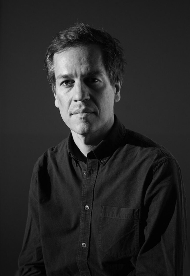
Serge Rompza, NODE Berlin Oslo
Loose Associations
Loose Associations explores key moments of NODE’s 22-year journey through the people, ideas, and projects that defined it. Using associative connections, the presentation highlights how collaborations and experiences interlink, building on one another to shape a dynamic practice. NODE invites you to discover how everything—and everyone—is interconnected in their creative process.

Serge Rompza graduated from the Gerrit Rietveld Academie in Amsterdam and co-founded the graphic design studio NODE in 2003 with his Norwegian partner Anders Hofgaard. Operating between Berlin and Oslo, NODE collaborates with clients like OMA, Diller Scofidio + Renfro, MIT (ACT) and Hermès.
Since 2004, Serge has been actively teaching at universities worldwide, fostering a new generation of designers. He has a long-standing connection with Elisava.
NODE is a Berlin- and Oslo-based design studio founded in 2003 by Anders Hofgaard and Serge Rompza. The studio works collaboratively across various media for a diverse range of clients from individuals to institutions, focusing on print, identity, exhibition and interactive work. Besides studio projects, NODE gives lectures and holds workshops at art & design academies.


Nov 20, 2024 → Jan 23, 2025
exhibition
Sala Àgora
Open to the public

NORM, TRIANGULATIONS
Two triangles sharing a side on a given grid
The grid has 4 x 4 coordinate points.
The points are alphabetised from A to P, from left to right, top to bottom.
The grid has 16 points.
The grid allows 120 connections of 2 points.
eg.
A to B,C,D,E,F,G,H,I,J,K,L,M,N,O,P (15)
B to C,D,E,F,G,H,I,J,K,L,M,N,O,P (14)
C to D,E,F,G,H,I,J,K,L,M,N,O,P (13)
etc.
The grid allows 560 connections of 3 points.
eg.
A–B to C,D,E,F,G,H,I,J,K,L,M,N,O,P (14)
A–C to D,E,F,G,H,I,J,K,L,M,N,O,P (13)
A–D to E,F,G,H,I,J,K,L,M,N,O,P (12)
etc.
41 combinations with a surface of zero are removed.
The remaining 519 are all the triangles possible on this grid.
For each of these 519 triangles, all the triangles they share a side with are added.
eg.
For the triangle A–B–C (for the sides containing A): A–B–C and A–B–C
side A–B to A–B to C,D,E,F,G,H,I,J,K,L,M,N,O,P (14)
side A–C to A–C to C,D,E,F,G,H,I,J,K,L,M,N,O,P (14)
Combinations containing a surface of zero are removed.
Initial triangles and added triangles are distinguished by color, colors do overprint.
Triangles sharing three sides, are part of triangles sharing one side.
These appear twice in a visually identical form, one of them is removed.
There are 12,981 combinations of 2 triangles, sharing 1 side, on a grid of 4 by 4 points.
In geometry, a triangulation is the division of a shape into triangles. In psychology, it is the practice of one person introducing a third person into their relationship in order to maintain control. We may be closer to the second point, though we are introducing a second triangle in order to lose control. It is a simple arrangement, the interaction of the two triangles creates instantly shapes of great dynamism that mock the basic right-angled system. All combinations are similar, all combinations are different, all beautiful and perfect in their complex simplicity and graphic clarity. It was impossible to resist to see them all.


Wed, Jan 22, 2025
showcase

David Vera, Vera Tamayo
Suburban Design
Only for MVD students
In this showcase I will review my career and that of Vera Tamayo, explaining how my partner Daniel Tamayo and I met and how, project after project, we defined our way of understanding design and the evolution of the creative process of our studio over the years. I will also talk about Monthly, the project that helps us communicate and define the character of the studio through its visual imagery. Finally, I will explain in depth some of our most representative projects, ranging from editorial design to brand identities and campaigns.

David Vera I was born in 1991 in Barberà del Vallès, a suburban city where also I grew up. From there I started to build my visual imaginary, ranging from Streetsharks, to Blade Runner, through Denis Rodman, Camarón de la Isla or Jean Paul Gaultier. In 2014 I graduated as a graphic designer at ESDI (Ramon Llull) and in 2019 I co-founded the Vera Tamayo design studio, of which I am now Creative Director. I have always enjoyed communication and I try to discover it in everyday conversations, but also writing, teaching, designing, boxing, in therapy and also in meditation. Since 2021 I also teach at ESDI (Ramon Llull). I love Northern Exposure.
Vera Tamayo is a graphic design studio based in Barcelona, founded in 2019 by Daniel Tamayo and me. The studio specializes in timeless design that adapts to the unique character of each brand. Our main goal is to ensure clients feel confident and deeply connected to the proposals. To achieve this, our team works closely with clients to find differential concepts that define the brand and create coherent discourses that give meaning to form.


Wed, Jan 22, 2025
bookworm

Joost Grootens books
Only for MED students
Joost Grootens is a Dutch graphic designer known for his innovative approach to book design, especially in the field of atlases and reference works. His publications are characterised by an ability to present complex information in an accessible and visually appealing way, promoting the idea that design should serve content and not compete with it. He uses infographics, graphs and maps to simplify and organise large amounts of data aimed primarily at scientific and academic audiences, providing them with an intuitive visual navigation that allows them to explore the book in a non-linear way. We will see several examples of his work that demonstrate that such books can be functional and beautiful at the same time. Grootens knows how to find beauty in information and poetry in data.
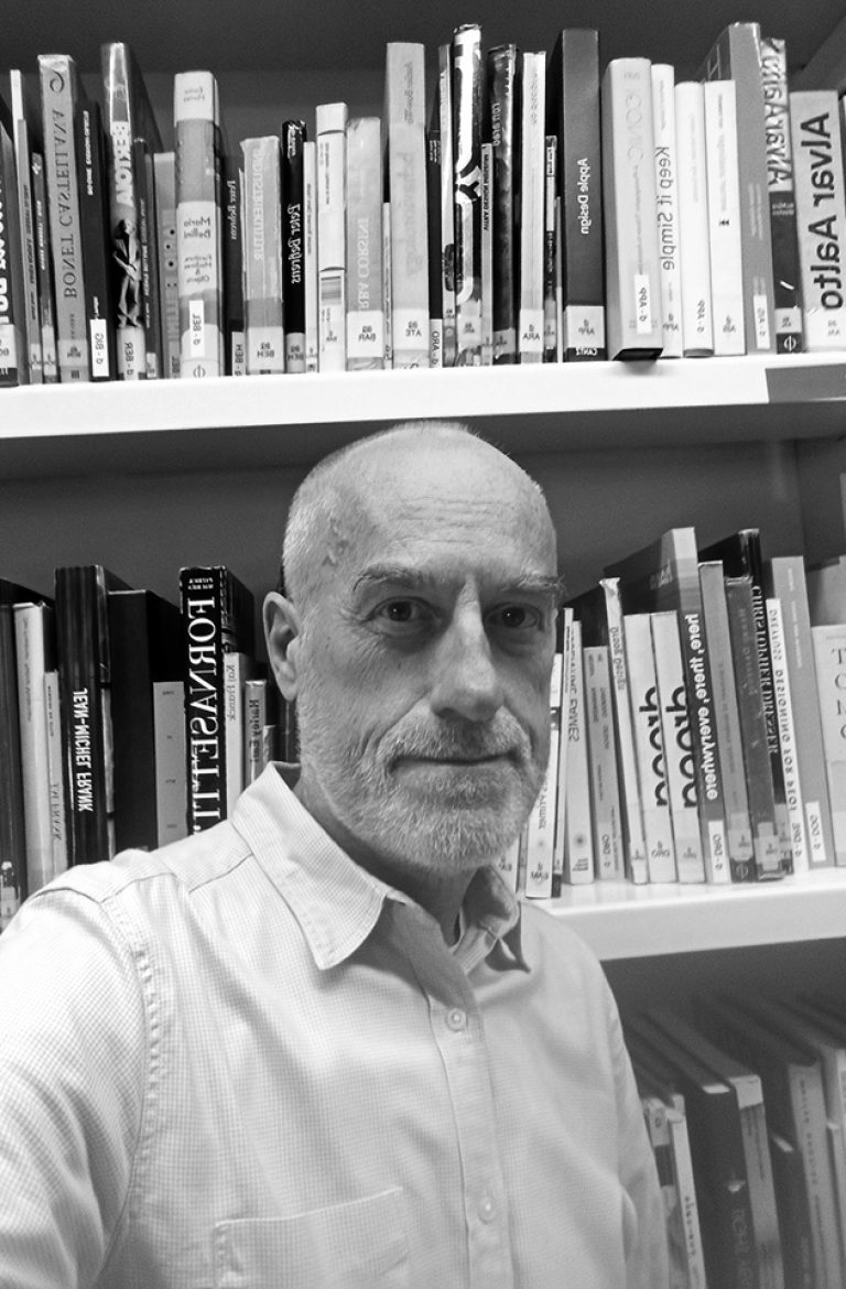
In the Bookworm sessions we will explore iconic magazines and books that capture the spirit of the era in which they were created. The material comes from Elisava’s library collections, especially from its Reserve Fund, which contains publications that, due to their design, constitute a journey through the best of the past and present of modern graphics applied to the field of editorial design.
The Bookworm sessions are guided by Andreu Jansà, librarian and curator of the Enric Bricall Reserve Fund.
We will place the publications in their context and try to define what makes them relevant in the history of editorial design in the 20th and 21st centuries. The direct contact with the books and magazines that we will see in each session will allow us to experience the printed document from a material point of view: binding, paper, lay out, illustrations, typography. We will also be able to assess the adequacy between form and content.


Wed, Jan 15, 2025
masters’ talks
7.30 pm — Event at DHub
Open to the public

Llisa Demetrios, Eames Institute of Infinite Curiosity
What can we learn from Ray & Charles Eames that might apply to the challenges we face today?
What can we learn from Ray & Charles Eames that might apply to the challenges we face today?
Ray & Charles Eames demonstrated—time and time again—design’s unique ability to address disparate clients’ needs, while finding ways to improve quality of life for all. What can we as designers and creatives learn from the Eameses that might apply to the challenges we face today?

Llisa Demetrios is the youngest granddaughter of iconic designers Charles & Ray Eames. She began her archiving career at the Mies van der Rohe Archive at MoMA in New York, and has since dedicated herself to extending her grandparents’ most important gifts to the world: their infinite curiosity and iterative design process. Her personal mission is to equip everyone with lessons of Charles & Ray so that anyone can use design to solve problems at all scales. Today, as Chief Curator at the Eames Institute, Llisa continues to share learnings from her legacy through exhibitions, events, and public tours at the new public space in Richmond.
Llisa Demetrios has spent decades caring for the Eames Collection and curating the Eames Ranch, initially alongside her mother, Lucia Eames, and now as Chief Curator alongside the Eames Institute of Infinite Curiosity team. Llisa loves welcoming guests, be they Eames aficionados or people entirely unfamiliar with design. Before the advent of the Institute, Llisa facilitated loans for “The World of Charles & Ray Eames” exhibition that started at the Barbican Centre in England in 2015 and continued to Sweden, Portugal, Belgium, Germany, Michigan, and the Oakland Museum of California in February 2019. She is also a founding and current member of the Eames Foundation Board of Directors, which oversees the historic Eames House in Los Angeles, and also a shareholder of the Eames Office.
Eames Institute of Infinite Curiosity
The overarching goal of the Eames Institute of Infinite Curiosity is to unpack the way that Ray & Charles Eames worked, the way they infused their designs and lives with curiosity and discovery at every turn to solve problems at any scale. “We don’t do ‘art’ – we solve problems,” said Charles. Then he added “How do we get from where we are to where we want to be?” They demonstrated—time and time again—design’s unique ability to address disparate clients’ needs, while finding ways to improve quality of life for all.
Being able to share the legacy of Ray and Charles in this way, to showcase their incredible process and wide-angled vision of design, is the dream of a lifetime. Their boundless curiosity and relentless pursuit of solving problems in furniture, film, exhibits, architecture, and textiles is in the name of the Institute. The Institute aspires to be a home for curious problem-solvers, both on-line and on-land. I hope the Institute’s efforts will help people find inspiration for solving problems in their own world.


Wed, Dec 18, 2024
graphic.elisava lectures
7:30 pm — Sala Aleix Carrió
Open to the public

Laurenz Brunner, Source Type
In 2022 Brunner launched Source Type, a platform for typographic research and visual literacy. Through Source Type he has published Rapid (2022), Karl (2022), and Reform (2023). Additionally he is a member of the Swiss type foundry Lineto where he published Akkurat (2004), Circular (2014) and Bradford (2018).
Brunner previously taught graphic design at the Rietveld Academie and has been a guest critic at Yale School of Arts, US; Werkplaats Typografie, NL and ECAL, CH. He has twice received the Swiss Federal Design Award (2006, 2012), as well as several distinctions from The Most Beautiful Swiss Books, The Best Dutch Book Designs and The Best Books from all over the World.


