Events are an integral part of the master programs: from workshops with guests professors to lectures series with relevant practitioners.
Apr 23 — 27, 2026
Workshop

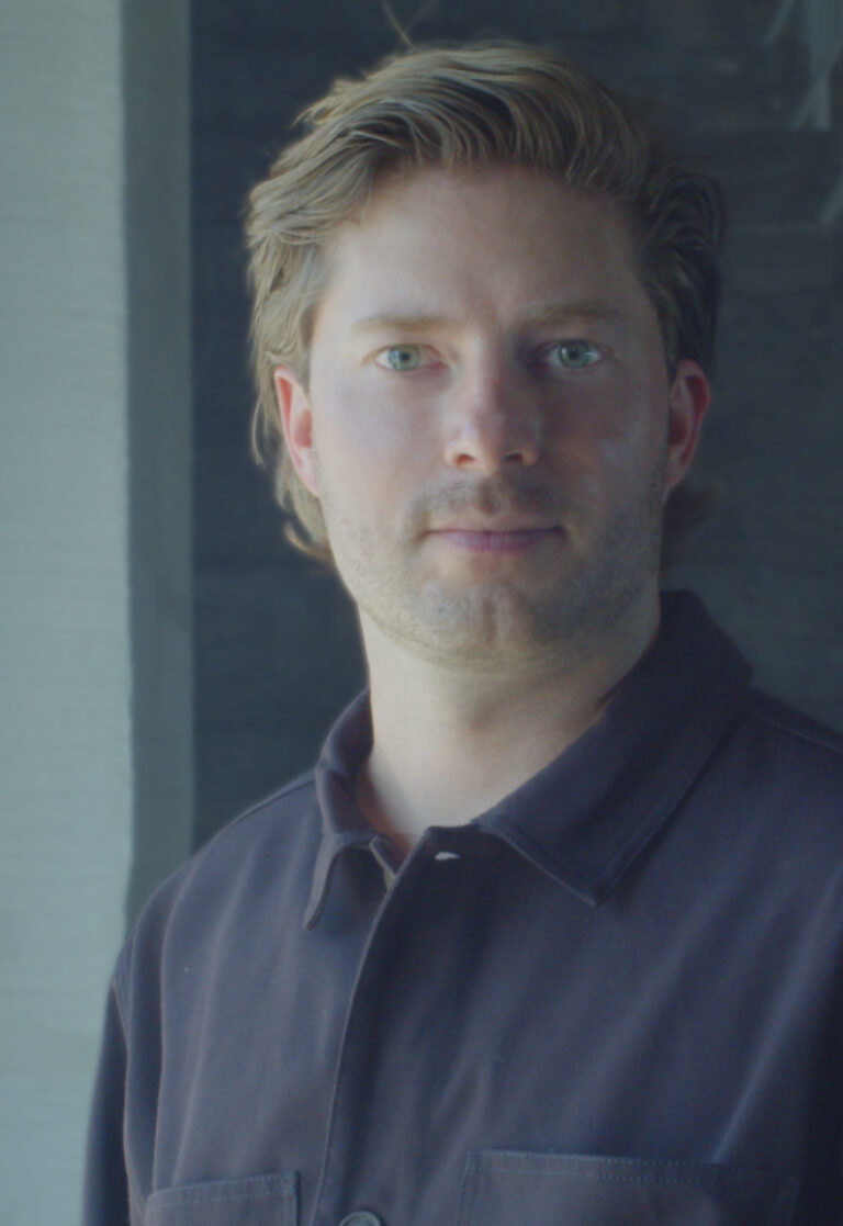
Serge Rompza, NODE Berlin Oslo
Beyond the Canon: Alternative Histories of Graphic Design
Only for MED students
Beyond the Canon: Alternative Histories of Graphic Design
Design history is not fixed — it is shaped by visibility, selection, and repetition.
This workshop revisits the canon of graphic design from a global perspective, focusing on historically relevant yet often underrepresented designers.
Each student will research and portray one designer, situating their work within its cultural, political, and technological context. Rather than simply presenting biographical information, participants will critically interpret and visually reframe these positions through editorial and typographic design.
The resulting works should not only communicate information but also respond visually to the designer’s attitude, working methods, and conceptual approach.
After graduating from Gerrit Rietveld Academie in Amsterdam, Serge Rompza has co-founded the Berlin and Oslo based design studio NODE in 2003, together with Anders Hofgaard. The two offices collaboratively focus on identity, print, exhibition and interactive work. Clients include Haus der Kulturen der Welt Berlin, Vitra, MIT Program in Art, Culture and Technology (ACT), Lithuanian Pavilion / La Biennale di Venezia, Office for Metropolitan Architecture (OMA).
Since 2004, he has regularly been teaching at art and design academies across Europe.


Feb 23 — 27, 2026
Workshop

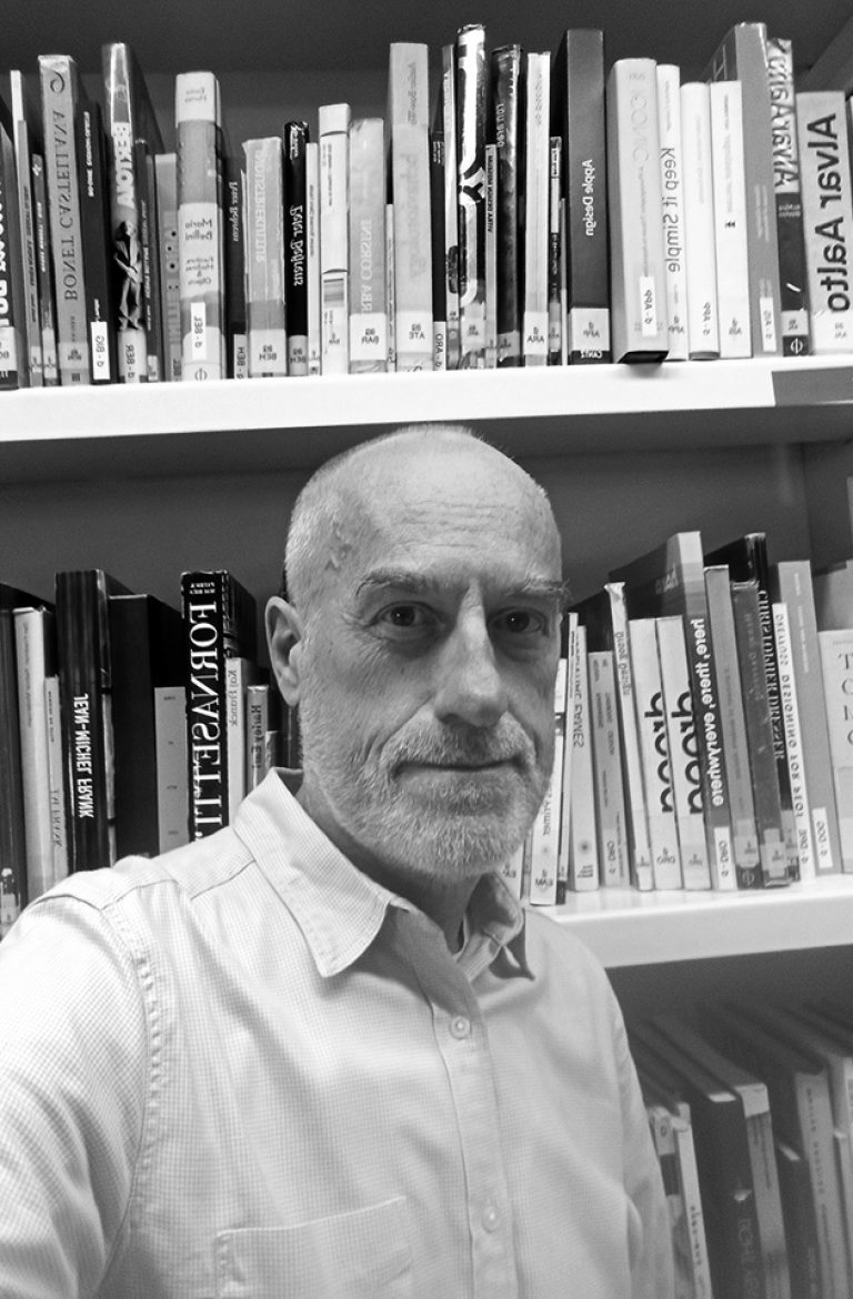
Piero Di Biase, Formula Type
Modular approaches in Type Design: Resource or Restriction?
Only for MVD students
Modular approaches in Type Design: Resource or Restriction?
The workshop explores the possibilities that the module offers in structuring typographic forms, questioning whether it acts as a supportive framework or a creative constraint. Through the analysis of historical and contemporary modular typefaces, as well as the investigation of the module in art, design, and architecture, students will be guided to work within a modular system to design a display typeface. The aim is to understand how predefined structures can generate coherent visual languages while still allowing room for experimentation and expressive innovation.

© Andrea Arduini
Piero Di Biase is a graphic and type designer. He trained in the graphic arts sector and then became a graphic designer. After collaborating with various design agencies, in 2011 he co–founded Think Work Observe, where he worked for national and international clients until 2022, when he launched Formula Type, an independent digital foundry that produces and distributes retail and custom fonts. Since 2017, he has been a member of the Alliance Graphique Internationale (AGI).
Formula Type is a digital type foundry started in the wettest region in Italy. Formula is a potion blended especially for those who will drink it; Formula is a chemical equation that leads to a result. This playful yet precise idea captures the dual soul of Formula Type. Its past was graphic design, and its present is type design, but there’s no real separation between the past and the present. Our fonts are crafted with a flexible designer eye and in the fifteen years since our first releases they have evolved freely through experimentation. Our approach is that of expert beginners, always welcoming new partnerships and projects.


Wed, Apr 8, 2026
Graphic — Elisava lectures
7.30 pm — Sala Aleix Carrió
Open to the public

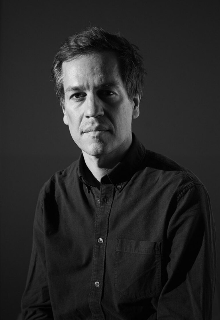
Bart de Baets
Paperclips
Paperclips
In his lecture, graphic designer Bart de Baets will show a large variety of works and elaborate more on the ways they find their form and are realized eventually. Although Bart’s practice is mostly spent working at the studio in Amsterdam, it is alternated by a parttime teaching position at the Royal Academy in The Hague, where he works with the first year students and the ones graduating. The way he teaches and cooks up his assignments is inspired by transforming everyday observations (at times obsessions) into educational exercises. The students are triggered to think of formal executions that evoke solutions close to Bart’s own practice visualizing abilities and editorial voice.
Although appearing less frequently today, Bart’s body of work’s been known to feature self initiated publications, such as Success and Uncertainty (together with Sandra Kassenaar), Dark and Stormy (together with Rustan Söderling), and Tabrat, a zine from 2022 in which de Baets confesses to be a tab hoarder (phone only, the browser tabs on his laptop are opened briefly and closed again efficiently) and shares them here with us in the charming A4-sized publication. His editorial assets have not been forlorn, and are frequently demonstrated more so in his collaborative works for artbook shop Page Not Found and exhibition space Nest (both are located in the city of The Hague). The talk at Elisava will prominently feature all of these works—and more—and provide insights into the developments of these designs by showing sketches, references and many inspirations.

Graphic designer Bart de Baets (1979, Knokke, BE) is based in Amsterdam. His design for the Sandberg Institute’s temporary master programme The Radical Cut Up was nominated for a Dutch Design Award. As a result, PostNL commissioned De Baets to design a series of stamps titled ‘Talk to the Hand’. With Sandra Kassenaar he designed the exhibition, campaign and catalogue for ‘Circulate’, an exhibition on photographic art acquisitions at the Stedelijk Museum Amsterdam. The two also design the graphic identity of Kunstmuseum Bochum. He designed ‘On the Necessity of Gardening: An ABC of Art, Botany and Cultivation’ (2021), which was published parallel to ‘The Botanical Revolution’, an exhibition at the Centraal Museum, Utrecht. That year, the Stiftung Buchkunst awarded the book with the highest prize in the category Best Book Design from all over the World. A second title in that series, Mothering Myths, an ABC of Art, Birth and Care was released in May of 2025, for which he collaborated once again with editors Laurie Cluitmans and Heske ten Cate. He holds a part-time teaching position at the Graphic Design department of the Royal Academy of Art in The Hague, and he has taught at the Gerrit Rietveld Academie in Amsterdam for fifteen years.
Being educated by notorious wild collaborator Will Holder, the radical typographic thinkers of Experimental Jetset and conceptual makers like Linda van Deursen, triggered Bart de Baets to think like an editor early in his graphic design studies, making zines with and for his peers, or whipping up catchy writings to go with his posters and projects. His design skills were fed ferociously when working with Maureen Mooren and Daniel van der Velden (now Metahaven) whose interest in art inspired him. For them, that always seemed to come first, then design. For the pages of Archis (an architecture magazine–now Volume), the layouts of existing periodical publications were used to give form to the magazine’s content, and Bart was taught to study their characteristics and so became an excellent copycat.
Over the years de Baets’ body of work has developed immensely mostly so by certain significant collaborations. A few early memorable ones have been those with Melanie Bonajo and Frank Koolen, two (then) Amsterdam-based artists not much older than himself and whose practice inspired an idea on which to work together, and which, in a way, kicked off de Baets’ career. The likes of Rustan Söderling and Sandra Kassenaar are of similar influence and remain crucial design partners; both are good friends to this day. Their influence on some self initiated works, such as Dark and Stormy and Success and Uncertainty is essential for de Baets’ current design approach and visual language. Kassenaar and de Baets nowadays share a studio and work together as designers regularly.
His designs are rooted heavily in a kind of conceptual thinking, and his abilities to think along editorially with commissioners has given Bart’s body of work an outspoken character. His work is distinctively playful and seemingly intuitive, giving the impression that the designs could be made quickly or hand-made. Yet, each one of the designs is a carefully put-together composition made according to a bunch of guidelines and often uses typography or visuals referencing things “found” on the street. For years Bart’s been a teacher in graphic design often working with the first year students, introducing them to the job. Surrounded by other designers, skilled coders, letter drawers and colour wizards, his teaching encourages to explore what it’s like to make art and design in today’s environments by demonstrating personal fascinations.


Wed, May 27, 2026
Masters’ Talks
7.30 pm — Event at DHub
Open to the public

Jonas Janke, b+
Love me one time, two times … x times !
Love me one time, two times … x times !
The lecture is not a conventional showcase of selected projects from our daily practice, but rather aims to provide a broader insight into the network of actors in which b+ (bplus.xyz) operates, how we understand the contemporary way of an architectural practice and scope of work of an architect, and how we approach our projects—in short: who b+ is and how we work, what our values are, and what our understanding of our duties and responsibilities as architects is.
Jonas Janke (DE, 1991) is an architect and partner at bplus.xyz (Berlin). He has a diverse background in architecture, was trained as an architectural draughtsman before pursuing his studies in Hamburg, Stockholm, and Berlin. He gained valuable experience as a tutor and assistant in various departments including design & typologies, building construction, and structural design. He was part of the team 2038, the German Pavilion at 17th Venice Architecture Biennale 2021.
His early teaching experiences include guest studios at the University of Innsbruck (Austria) and Politecnico di Milano (Italy). He is regularly invited to give lectures and guest critiques at universities, cultural institutions, and public institutions. His focus is on new ecological construction materials and methods for adaptive reuse and renovation projects, seeking pragmatic and efficient technical and mechanical solutions that use material and construction thoughtfully.
bplus.xyz (b+) is a collaborative architecture practice (led by Arno Brandlhuber, Olaf Grawert, Jonas Janke and Roberta Jurčić) that operates at the intersection of theory and practice, using different media and formats. The practice seeks to engage with the contemporary challenges of our time, particularly those related to the social-ecological transformation of existing buildings, offering economically viable solutions.
b+ understands architecture as an open process, and views buildings as part of larger systems that require a systemic approach. The practice sees the given framework of existing buildings and legislation as an active design tool with the potential for transformation. Thus, b+ celebrates the potential of the existing built environment and aims to reveal and activate the latent potentials within.
b+ emphasizes working with different actors and stakeholders in project development. The practice values their knowledge and expertise and aims to create spaces for exchange and collaboration. b+ seeks to advance a new value system in architecture, one that places greater emphasis on collective responsibility, systemic thinking, and ecologically and economically viable solutions.
The current project in the field of political activism is the European citizens’ initiative HouseEurope! – HouseEurope! wants to create incentives that make renovation the new norm. This will boost the renovation market and give new value to what is already there. The goal is to preserve homes and communities, ensure a fairer and more local building industry, save energy and resources, and preserve our memories and stories.


past events
Wed, Nov 27, 2024
bookworm

Nest magazine
Only for MED students
Published between 1997 and 2004, Nest revolutionised the approach to interior design and decoration with its innovative and unconventional approach. The magazine focused on interiors that told personal stories and explored the concept of ‘home’ in creative and sometimes quirky ways. Its pages included a variety of contexts that provided insight into a wide range of lifestyles and how a person’s environment reflects their identity. It pioneered the use of unconventional printing and graphic design techniques including the use of different paper textures, unusual inserts, cut-outs and unique formats that transformed the experience of reading the magazine into something interactive. Ironic and sophisticated, Nest challenged the notion of good taste prevalent in standard decorating magazines.
In the Bookworm sessions we will explore iconic magazines and books that capture the spirit of the era in which they were created. The material comes from Elisava’s library collections, especially from its Reserve Fund, which contains publications that, due to their design, constitute a journey through the best of the past and present of modern graphics applied to the field of editorial design.
The Bookworm sessions are guided by Andreu Jansà, librarian and curator of the Enric Bricall Reserve Fund.
We will place the publications in their context and try to define what makes them relevant in the history of editorial design in the 20th and 21st centuries. The direct contact with the books and magazines that we will see in each session will allow us to experience the printed document from a material point of view: binding, paper, lay out, illustrations, typography. We will also be able to assess the adequacy between form and content.


Fri, nov 22, 2024
workshop

Alberto Feijóo
Club Collage
Only for MED students
A “club” is a physical place where people share interests, experiences and stories about a territory and/or reality. The Club Collage is a collective experience in which we ask ourselves how we live and interpret the images that surround us daily, making collages using images from my archive. Thinking of a participatory proposal, my intention with this workshop/club is to put in common my creative process, adapting a role of mediator of a work made by multiple hands. In this case, the students made a series of pieces taking as a starting point the geometric shapes of traffic signs together with common elements of diverse urban spaces.

Alberto Feijóo (Alicante, 1985) is a collector, accumulator, apprentice and visual artist interested in the field of photography and its relationship with other disciplines such as collage, installation or design.
He holds a degree in Communication from the University of Alicante in 2009 and a postgraduate degree in Contemporary Photography; Practices and Philosophies from the University of Arts London.
His work has been exhibited individually at the IVAM (Centro Julio González) in Valencia, Sala Kursala of the University of Cadiz and in the galleries Luis Adelantado and Punto in Valencia.
He has also participated in group exhibitions at Centro Conde Duque Madrid, LABoral Centro de Arte de Gijón, Centro Cívico Can Felipa in Barcelona, Sala Canal de Isabel II in Madrid, Sala de Arte Joven Comunidad de Madrid, ARCO 23, Fotomuseum Winterthur or The Photographers’ Gallery in London.
As a teacher he has conducted workshops and educational activities in IVAM Valencia, CCCC Valencia, Tate Modern in London, among others.
In 2021 he started the project “Club Collage” in multiple environments such as museums, galleries, prisons or schools.


Wed, Nov 20, 2024
graphic.elisava lectures
7.30 pm — Sala Aleix Carrió
Open to the public

Dimitri Bruni & Manuel Krebs, NORM
Mirror, Mirror on the Wall
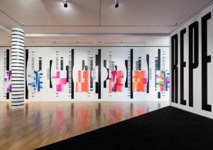
NORM discusses their installation TRIANGULATION (on view in the Elisava project space) and places it in the context of their book trilogy ‘NORM: Introduction, The Things, Dimension of Two.’
Further on, NORM will talk about: their love-hate relationship with digital tools, the tension between intuition and combinatorics, the struggle for a common visual language, the ongoing seduction of fonts, the end of grid systems, good and bad and ugly commissions, the value of printed matter and the poetry of precision.
© Jason Klimatsas
Dimitri Bruni and Manuel Krebs studied graphic design at the School of Applied Arts in Biel-Bienne. They established the graphic design studio NORM in Zurich in 1999. In 2005 Ludovic Varone joined the studio. They are based in Zurich.
NORM focuses on designing and publishing books and typefaces. Book design includes self-commissioned research in the field of type and graphic design, the most relevant being ‘Norm: Dimension of Two’ (2020), ‘NORM: The Things’ (2002), and ‘Norm: Introduction’ (2000). Commissions include collaborations with galleries, museums (MoMA, Tate Modern; Louvre; Centre Pompidou; Museum for Gestaltung Zurich), and artists (Arthur Jafa, Fischli & Weiss, Shirana Shahbazi, Simon Starling).
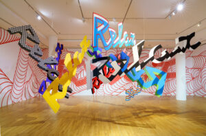
Examples of typedesign include the ‘Simple’ typeface for Cologne/Bonn airport, the corporate typeface for Omega watches, the typeface ‘Replica,’ the corporate typeface for Swatch, and the recent typeface ‘Riforma’ and ‘Riforma-Mono’ (2018, 2024).
In 2020, NORM presented the solo exhibition ‘It’s not complicated’ at the Museum of Design in Zurich, in 2024, ‘Disorder is more probable than order’ at Grafill, Oslo.


Wed, Nov 13, 2024
masters’ talks
7.30 pm — Event at DHub
Open to the public

Yosuke Ushigome, Normally
Making data speak human
Making data speak human
Designers across domains must increasingly engage with data. With the rise of AI, there is an opportunity to humanise data in innovative ways. In this presentation, I will introduce recent projects that explore these possibilities, ranging from an experimental tool translating energy forecasts into proverbs, to an internal application enhancing organisational efficiency. To bridge technology and human experience and decision making, data needs to speak human.

Yosuke Ushigome (yoh-skay oo-shee-goh-meh) is a London-based designer/technologist, currently working for Normally as Lead Interaction Designer. He works across disciplines with a focus on interaction design, digital prototyping, and futures research. For over 10 years, he has been involved in various R&D and visioning projects with organisations worldwide such as the NHS, Hitachi and Swarovski. He also writes about more equitable and sustainable ways we interact with technology on design publications such as Core77 and ICON magazine.
Normally unlocks the transformative potential of AI for clients, including IKEA, Google, Panasonic, and the NHS. We have a decade of experience at the intersection of human-centred design and AI engineering, applying AI to enhance operational efficiency and growth, and deliver innovative AI-enabled products and services


Wed, Nov 6, 2024
showcase

Joan Alvares, Putos Modernos
“Spam para hoy, hambre para mañana”.
Only for MDV students
Advertising annoys. Advertising interrupts. Because advertising is, in the end, the price a brand pays for not having a memorable product. Through humor, the shortest way between two people, and a recognizable graphic style based on text and sobriety, PutosModernos converts the commercial message into content that people choose to see and, on many occasions, share. In this session, entitled “Spam for today: hunger for tomorrow” Joan will explain his vision of communication through a selection of commercial projects, reflections and learnings, accompanied with the history of the evolution of the brand, the construction of an audience of its own in the digital environment and some anecdotes of its successes and failures.

Joan Alvares
Journalist by training, publicist by profession and copywriter by obligation, Joan Alvares (Sabadell, 1983) is a copywriter and creative director. In 2009 he founded Poko, an independent creative agency with which he worked for clients such as Nike, Artfutura, Ray-Ban, Persol, Garmin, Trident or Warner Bross. He is currently partner and creative director of PutosModernos.
In advertising he has directed campaigns for Converse, Lacoste, Beefeater, Nike, FC Barcelona, Cabify, Roxy, Damm, Pepsi, Absolut, Red Hat, Torres, Imagin, Pompeii, Deutsche Bank, Malpaso Ediciones, Penguin Random House, Mobile World Capital, Teatro de la Maestranza, Spotify, Danone, Skate Agora, Arrels, Motorola or the Generalitat de Catalunya, among others. His work has been distinguished with 4 Laus Awards (ADG-FAD), with the Graffica 2021 Award, with the recognition of Creative of the Year (Agripina) or at the International Advertising Festival Cannes Lions. In 2023 Forbes included him in the list of the 100 Most Influential Creatives in the business world. He has been a professor at Istituto Europeo di Design, University of Westminster (London) or Elisava-UPF (Barcelona) and speaker at national and international festivals.
Putos Modernos is a self-parody of modernity to itself. And what is modernity? Modernity is running stressed out to your mindfulness class, searching for cheap flights from an expensive cell phone or combining down and ankles in the air. Modernity is you, modernity is all of us. With a community that today exceeds half a million followers in networks, PutosModernos creates content, products and advertising campaigns for brands and people willing to laugh at themselves. Among other milestones, PutosModernos has represented Spain at the International Poster Biennial, held in Santa Cruz (Bolivia), and has released its own series on Filmin (2023).
Some media have defined PutosModernos as “the art of making the simple viral” (Emprendedores magazine), “a form of post-postureo” (La Vanguardia), “daily doses of fine irony” (El Español), “reality without filters or autotune” (El País) or “the closest thing to a modern advertising agency”, according to Toni Segarra.


Wed, Oct 30, 2024
showcase

Marc Torrell, Usted
I don’t write very well
Only for MVD students
In this session, I will share the stories and the behind-the-scenes details of some of the projects I have participated in throughout my career from a strategy and verbal identity perspective. The goal is to showcase the key aspects of my work and the impact it has on the design and visual creation processes of the teams I collaborate with.
It’s going to be mostly about words, but please don’t panic, I’ll be showing some images too.

Marc Torrell
I’ve loved writing since I was a kid. As I grew older, I wrote less. The novels and poems I once dreamed of writing turned into headlines, simple concepts, and brand names. I graduated in Advertising and Audiovisual Communication, worked for large international agencies and dinosaur clients, and later discovered the meaning of design through collaborations with studios like Mucho, Hey, Lo Siento, Querida, and Pràctica. In 2013, I co-founded Usted with my friend and partner, Martí Pujolàs.
We consider Usted a hybrid between a traditional advertising agency and a design studio. The focus, whatever the project is, is always the same: strategic thinking, concept with longevity and carefully crafted art direction. We work straight with clients or collaborate with fellow studios in conceptualization and verbal identity tasks for clients of all sizes and markets.


Wed, Oct 30, 2024
bookworm

Awarded books
Only for MED students
In this first session we will try to find out what makes a well-designed book and what factors determine excellence in editorial design. We will look at recent examples of award-winning publications from the Most Beautiful Swiss Books, Best Book Design From All Over The World and the LAUS Awards. By browsing through the books we will be able to feel their material presence and examine the elements that make them up: binding, paper, composition, typography and the fit between form and content. Moreover, through the verdict of these prestigious prizes awarded by specialists, we will be able to analyse current trends in editorial design. Each student will be able to express their opinion and choose their own favorites according to his or her own sensibility.
In the Bookworm sessions we will explore iconic magazines and books that capture the spirit of the era in which they were created. The material comes from Elisava’s library collections, especially from its Reserve Fund, which contains publications that, due to their design, constitute a journey through the best of the past and present of modern graphics applied to the field of editorial design.
The Bookworm sessions are guided by Andreu Jansà, librarian and curator of the Enric Bricall Reserve Fund.
We will place the publications in their context and try to define what makes them relevant in the history of editorial design in the 20th and 21st centuries. The direct contact with the books and magazines that we will see in each session will allow us to experience the printed document from a material point of view: binding, paper, lay out, illustrations, typography. We will also be able to assess the adequacy between form and content.


Wed, Oct 23, 2024
masters’ talks
7.30 pm — Event at DHub
Open to the public

Sissel Tolaas, Smell RE_searchLab
Smell Molecules are the Air’s Alphabet
Sissel Tolaas is a Smell RE_searcher and artist, born in Norway, based in Berlin, Germany.
Tolaas has been intensively researching, experimenting with, and working on the topic of smell since 1990. A pioneer in the field, she is renowned for her innovative and unique approach to advancing the science and understanding of olfaction.
Drawing on her expertise in forensic chemistry, chemical communication, sensory ecology, linguistics, and visual art, she has developed a broad range of ground- breaking interdisciplinary projects involving smell, implemented worldwide.
In January 2004, Tolaas founded the professional smell chemistry lab: SMELL RE_searchLab in Berlin – supported by the industry and various universities.
Her expertise includes advanced smell recognition, analysis, and reproduction, as well as the coding and functional understanding of smell molecules. She has created novel methods for coding abstract smell molecules and studying linguistic responses to both individual smells and olfactory experiences in general. Tolaas has explored the science and art of smell in diverse contexts, applying her knowledge to a variety of purposes and formats.
Her research and projects have won recognition through numerous national and international scholarships, honours, and prizes. She is very capable at collaborating intensively with those of other disciplines across the globe.

Tolaas has shown her projects in many museums and institutions including Museum of Modern Art, MOMA, New York; National Gallery of Victoria NGV, Melbourne; DIA Art Foundation, New York; CCA Singapore, Tate Modern London; Shanghai Minsheng Art Museum, Shanghai; MORI Museum, Tokyo. She has worked with universities such as MIT, Nanyang Technical, Tsinghua, Stanford, Harvard, and Oxford. She has built up several types of smell archives such as: Smell & Communication/ language; Smell & Coding, Smell & Anthropocene; Smell & Extinction; Smell & Sensory Ecology; Functional Smell Molecules. Tolaas’ collections of smell molecules; smell complex structures and smell para data from 1990 and ongoing are including up to 20,000 smell recording samples and formulas.
Smell Molecules are the Air’s Alphabet
How much of what we communicate is influenced by what we see? And what happens to our stories when sight is no longer an option?
How can we activate the hidden information in the air that surrounds us all? Air is a shared medium, connecting all living beings. Where there is air, there is life, and with life comes the language of smell. Air is both information and emotion in motion.
Could the details carried by smell molecules transform how we communicate? How can we engage with critical topics from an entirely new perspective through olfactory information? What if the essence of content could be revealed through smell, offering a new way of perceiving the past, present, and future?
Working with experts and scholars worldwide, I focus on developing a new approach to understanding, communicating, and displaying the chemistry of smell in diverse contexts. I capture smell molecules from various sources, analyze them, build precise databases, and create innovative ways to narrate their stories. These molecules reveal dimensions often overlooked.
The goal is to inspire a shift towards a more sensory-driven perception of the world. The transformative power of smell has shown me that change is not just possible—it is essential. Smell, deeply linked to emotion and memory, has a profound significance in human experience. Its connection to the amygdala-hippocampal complex enhances its ability to evoke emotions and memories, making it a powerful yet neglected tool for understanding life.
Life is everywhere and constant. We all breathe the same air, collectively shaping it. My work serves as a reminder of this shared reality.
Historical, sociological, and cultural influences have led us to neglect parts of our potential. Education is vital for reawakening these dormant capacities, tapping into our sensory abilities.
Smell unites us and kindles joy, which is often overlooked today. Across cultures, it enriches social rituals and gatherings, shaping human connections. In a world dominated by virtual and artificial intelligence, we must remember that our senses are our most advanced interface—intrinsically intelligent and grounding us in our humanity.
Our emotional depth distinguishes us from machines, and smell plays a central role in that.
The essence of life lies in reconnecting with our olfactory senses. Training this sense provides fresh perspectives on societal challenges and brings optimism. With growing global instability, recalibrating our communication and decision-making processes is more crucial than ever.
We need a sensory reboot—an approach to interpreting sensory inputs constructively. Engaging our sense of smell activates memories and emotions, fostering learning and action. Instead of being constantly online, we should strive to be “on-life,” rooted in genuine experiences. Addressing global challenges begins by reconnecting with our senses, cultivating tolerance, and rediscovering what it truly means to live.


Wed, Oct 23, 2024
showcase

Thierry Brunfaut, Base Design
Secret files: The first impression
Only for MVD students
In this special session, Thierry will share content you won’t find online or on social media: the initial client presentations. He will explain how we developed these at Base, focusing on objectives, flow, and storytelling. Using examples from both the cultural and commercial sectors, Thierry will emphasize a key principle at Base: the importance of crafting each presentation uniquely for each client and context, avoiding any standardization of the creative process.

Thierry Brunfaut is a creative director and one of the founding partners of Base Design, the international network of branding studios based in Brussels, New York, Geneva, and Melbourne. He is the author of the renowned 5–minute poster series, a professor, and a regular speaker at design and branding conferences around the world. Thierry bears a striking and seemingly contradictory resemblance to Moby and Kermit the Frog.
Base Design is an international network of studios that creates brands with cultural impact. Located in Brussels, New York, Geneva, and Melbourne, our team of 80+ creatives, strategists, and digital experts design and develop simple yet powerful brands and build unique personalities. Founded in the early ‘90s, the company has evolved continuously over the years and is now steered by partners across all four studios. Clients include Apple, The New York Times, The Institut Français de la Mode, la Fondation Cartier, Studio Brussel, MoMA, Bob Dylan Center, Dior Galerie, La Monnaie Opera, IFAW, The Prince Estate, Orior,
Bozar, NY Mets, Caran d’Ache, Caudalie, the JFK Terminal 4, and many more. Base Design is B–Corp certified since 2023.


Wed, Oct 16, 2024
case studies

Pau Aleikum Garcia, Domestic Data Streamers
Designing for the unknown
Only for MVD students
We, humans, struggle to build empathy towards large amounts of information. ¿How do we solve these challenges when the problems we face today are so inherently big, interconnected, wicked, and globalized? In this talk, we will explore some humble experiments done to overcome this lack of empathy through art, technology, and participatory experiences.

Pau Aleikum Garcia is a media designer and the co-founder of Domestic Data Streamers, a 25 people studio that since 2013 has been focused on creating info-experiences. He also leads de Master in Data Design at Elisava. He is a guest lecturer at The New School (NYC), Hong Kong Design Institute, the Royal College of Arts (London), Politecnico di Milano and the Barcelona School of Economics. He built and permanently lives in the Residence for Artists HeyHuman! and is part of the Posttraumatic Collective. Usually, he doesn’t speak in the third person.
Domestic Data Streamers is an award-winning studio exploring how to express data through film, robotics, code, theater, or architecture in schools, prisons, cinemas, the streets of many cities, and even the United Nations Headquarters. They work for commercial brands and all kinds of old-school and new-kinky institutions. They truly believe data can be a real trigger of change and build bridges in a polarized society.


Wed, Oct 9, 2024
masterclass

Danae Gómez Lois, Vandals
Strategic Tools for Decision-Making
Only for MVD students
Welcome to our back room! This Masterclass is like a deep dive into Vandals’ essential tools that will take you from understanding the “why” to figuring out the “what.” By integrating design and innovation methodologies, we’ll help you uncover needs and explore new possibilities. You’ll gain key insights to expand your knowledge, incorporate diverse perspectives, engage stakeholders, reflect on strategies, communicate effectively, and experiment with iteration.
In this session, you’ll develop strategic thinking skills to foster creativity and make informed, objective decisions. You’ll also acquire practical techniques for structured problem-solving, inclusive decision-making, and embracing iteration to continuously refine your approach.

Danae Gómez Lois
As a Design Strategist and Business Designer, Danae seeks to transform client’s businesses by articulating their purpose and growth territories, creating services, experiences, and business models that pivot around the differential value that they bring to the world. Through her life, she has immersed herself in diverse cultural landscapes across South and Northern America, the Caribbean, and Europe. Drawing upon these experiences, she applies her insights to drive transformative changes in businesses. Fueled by a passion for comprehending behavior, culture, experience, and forward-thinking, currently, she is shaking perspectives together with her partner at Vandals, a research and strategy service designed to challenge conventional thinking, while also contributing as a Master’s lecturer at Shifta by Elisava.
Vandals
Our research and strategy services are designed to challenge conventional thinking, emphasizing the unique value each business brings to the world. Allergic to absolute ideas, we reject rigid thinking and embrace the tough questions. Our goal is to inspire and guide companies, teams and entrepreneurs through method, reason and boldness in the following stages: [01] Where are you now? [02] Where do you want to be? [03] How to get there? We can assist you by designing or revamping your business concept, connecting you with what people value, ushering you to new areas of opportunity, positioning and articulating your company’s identity, shaping service or product experiences while dynamizing the people, culture & processes that run behind scenes.


Wed, May 22, 2024
graphic.elisava lectures
7.30 pm — Sala Aleix Carrió
Open to the public

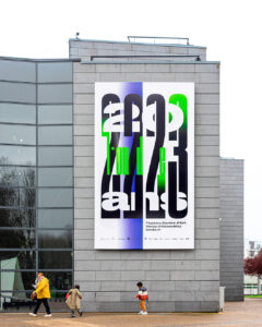
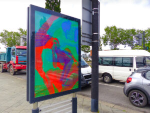
Anette Lenz
À propos
Anette Lenz recent solo exhibition at the Museum Angewandte Kunst in Frankfurt, Germany (2021), is the foundation for this conference where she will share her perspective on culture, society and life throughout her designwork.
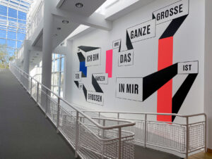
The graphic work “I am part of the big picture and the big picture is part of me” by Anette Lenz serves as a fitting prelude to her concept of a design resonance that, in today’s times, could hardly be more topical.”
Quote from the Museum Angewandte Kunst website: “In her first large-scale solo exhibition in Germany, Anette Lenz contextualizes, ironizes, and comments on her own attitude towards life. She transforms the Museum spaces into immersive graphic worlds that make visual communication a tangible experience: sensual, poetic, and thought-provoking. The title “à propos” – which means “by the way” – does not merely allude to the fact that she has something to add, a comment of her own to make, but also lays claim to relevance, to a comment made at exactly the right point and time. (…) Rather than turning us into consumers, the impact of her work enables us to participate in graphic design’s inventiveness and power of expression, in a sophisticated game of ever-new interrelationships between information and imagery.
© Waldo Lenz
Anette Lenz is a german graphic designer based in Paris, France.
She concentrates on work with cultural institutions.
Thinking up a project, structuring a singular and evolving visual identity at the heart of the public space are issues that she has always invested in. She views graphic design as a powerful means of both poetic and political connection. Her poster-work is included in important international collections.
Anette Lenz teaches at HEAD — Geneva University of Art and Design, Switzerland. She is a member of AGI.